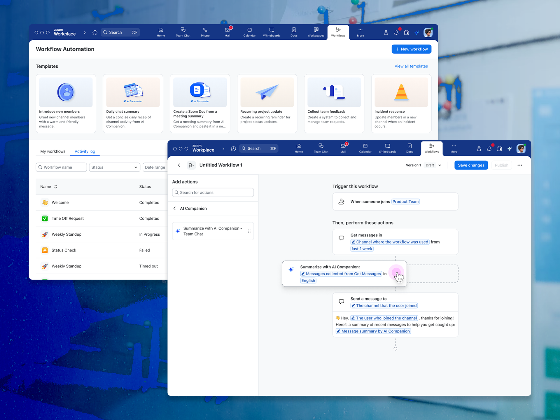
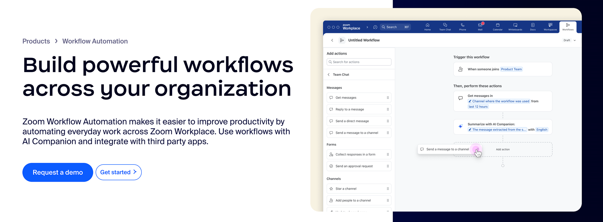
Save time by automating everyday tasks across Zoom Workplace
Led end-to-end design for Zoom Workflow Automation, a new product that lets users automate everyday tasks with a simple drag-and-drop editor.
Highlights
– Designed a new product from concept to GA in under 10 months
– Simplified drag-and-drop editor with intuitive UI and scalable components
– Introduced workflow identity features to improve clarity and trust across organizations
– Built dashboards and admin controls for workflow monitoring
– Launched in February 2025, closing a key competitive gap with Slack and Teams
Project details
Role
Sole product designer (UI/UX, components, usability testing, content design)
Sole product designer (UI/UX, components, usability testing, content design)
Platforms
Mac, Windows
Mac, Windows
Tools
Figma, Photoshop, pen & paper
Figma, Photoshop, pen & paper


How it started
TL;DR: Workflow Automation enables users to create “if this, then that” workflows, automating repetitive tasks across Zoom and third-party tools.
This was a critical gap versus Slack and Microsoft Teams that prevented companies from migrating to Zoom.
In mid-2024, I was pulled into a startup-like team that was formed to close this gap. The plan was to ship a new Workflow Automation tool for Zoom Workplace. The core of this experience would be based on an existing tool used by Zoom Contact Center, itself adapted from Netflix Conductor. However, ZCC was highly technical and constrained. We aimed to make an alternative that any Zoom user could learn and benefit from.
Hypothesis
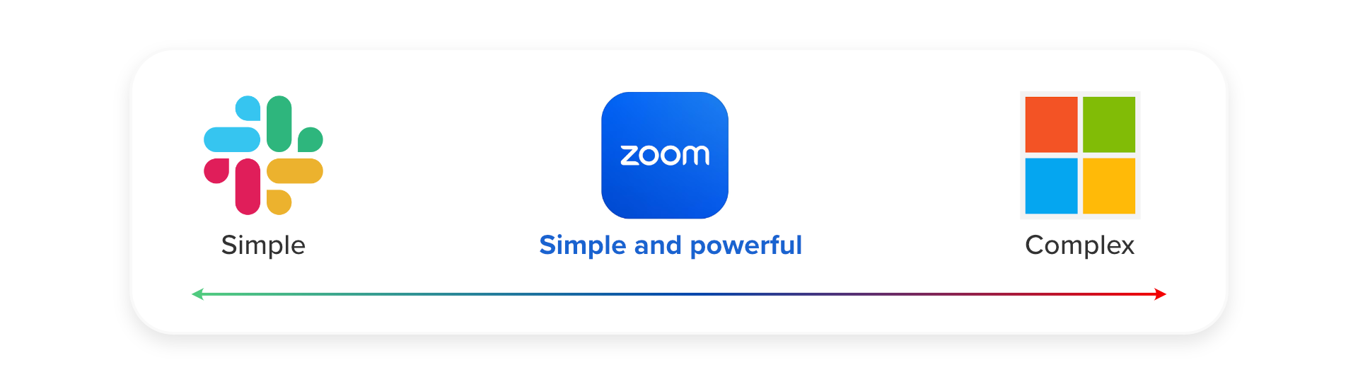
By delivering a powerful and easy-to-use Workflow Automation solution, we could empower organizations to automate repetitive daily tasks across Zoom and beyond, thus increasing their productivity and saving time. Ultimately, this would close a major competitive gap and a roadblock to migration from Slack and Teams.
Product goals
🚀 Powerful and simple
Design an automation tool more powerful than Slack yet simpler to use than Microsoft PowerAutomate, thus removing friction for non-technical users.
Design an automation tool more powerful than Slack yet simpler to use than Microsoft PowerAutomate, thus removing friction for non-technical users.
🏢 Third-party integrations
Integrate with third-party connectors like Google Drive, Outlook, and Jira, empowering users to accomplish more no matter what tools they use.
Integrate with third-party connectors like Google Drive, Outlook, and Jira, empowering users to accomplish more no matter what tools they use.
📑 Prioritize templates
Encourage users to start from templates, empowering them to publish workflows and experience the benefits more quickly.
Encourage users to start from templates, empowering them to publish workflows and experience the benefits more quickly.

Designing the end-to-end journey
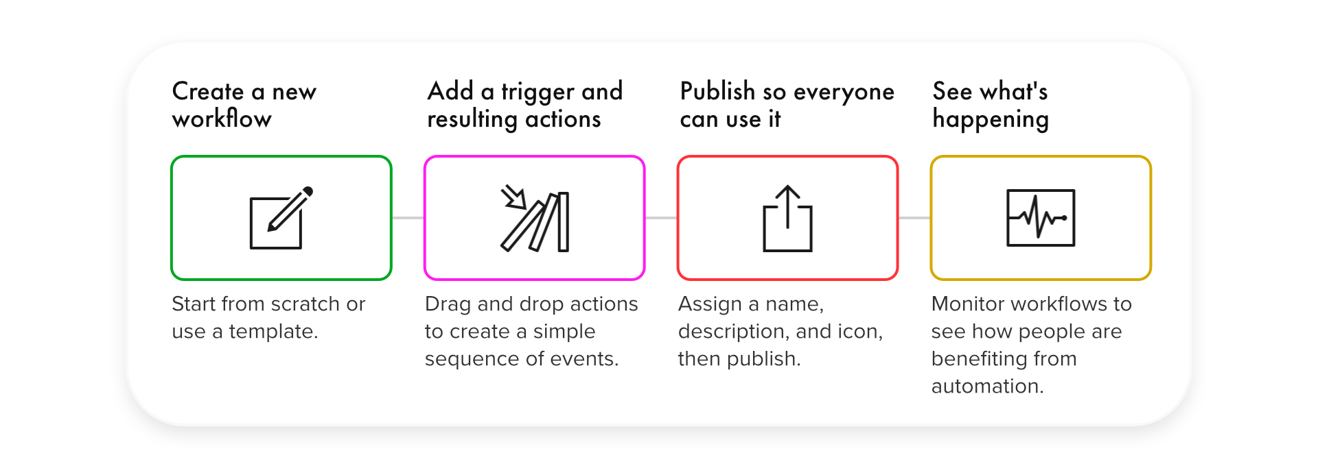
My objective when designing this new product was to prioritize the core, end-to-end user journey. This journey consisted of the following key interactions:
🏠 Onboard and create
Design a new product home page that onboards new users and allows returning users to manage their existing workflows.
Design a new product home page that onboards new users and allows returning users to manage their existing workflows.
✏️ Build workflows
Simplify the canvas, letting users drag and drop actions to assemble powerful workflows without training. This UI should scale to accommodate future actions.
Simplify the canvas, letting users drag and drop actions to assemble powerful workflows without training. This UI should scale to accommodate future actions.
🎨 Personalize and publish
Let users customize their workflows before publishing, enhancing identification and trust.
Let users customize their workflows before publishing, enhancing identification and trust.
📈 Monitor usage
Implement dashboards and admin controls allowing users to monitor the usage of workflows.
Implement dashboards and admin controls allowing users to monitor the usage of workflows.
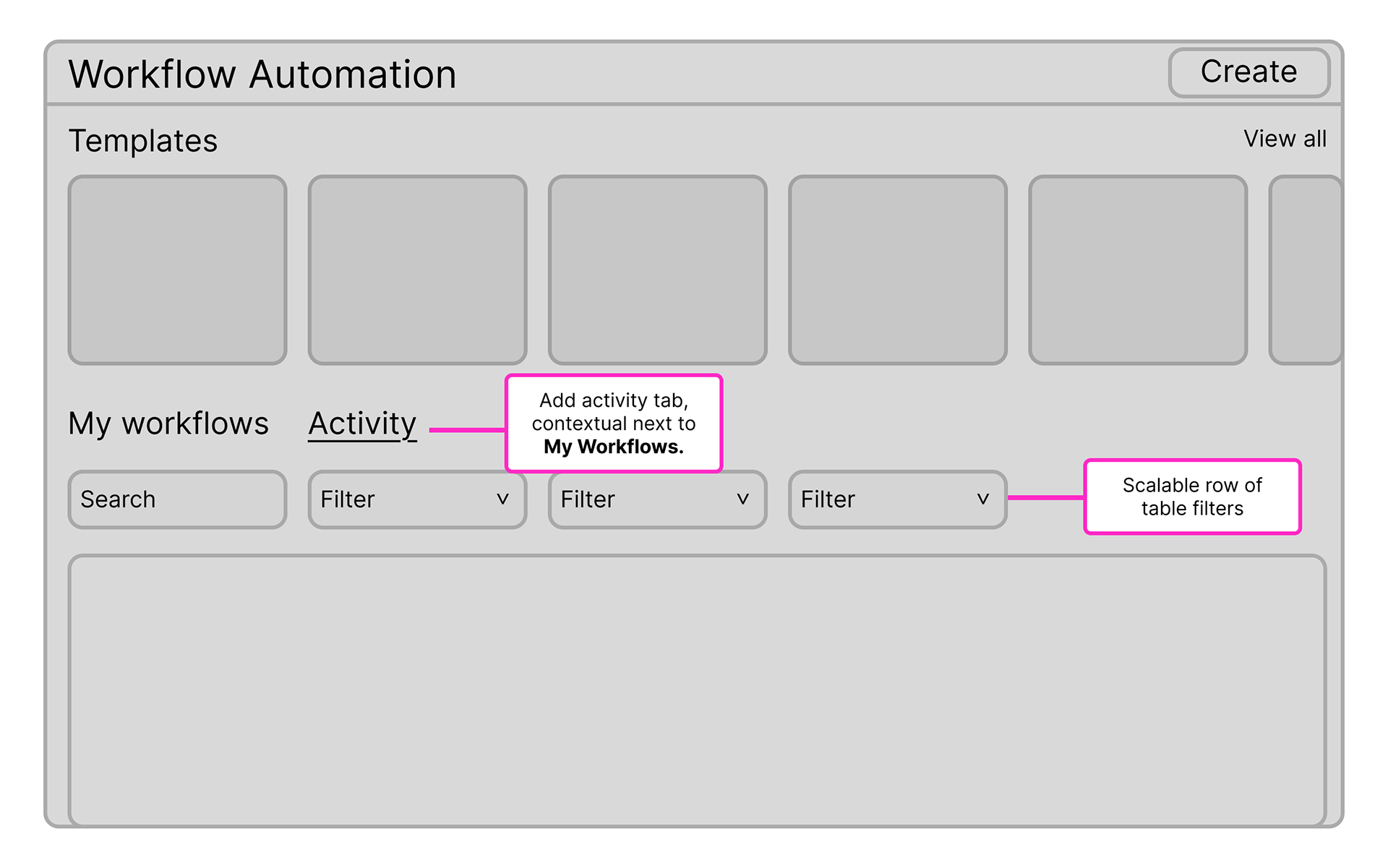
🏠 Helping users get started
Problem: As a brand-new product, Workflow Automation needed to help users onboard quickly and start building workflows with minimal friction. Without clear guidance, users could struggle to realize value or understand where to begin.
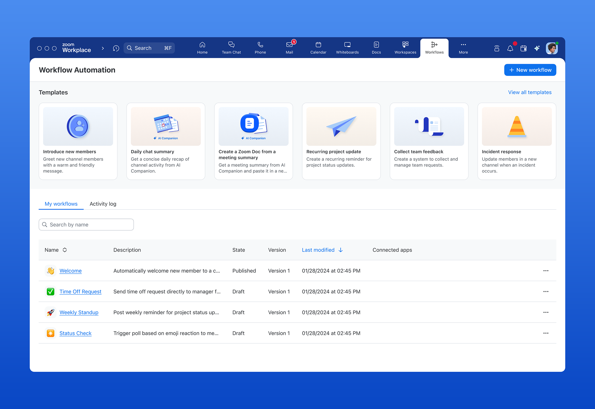
Solution: To reduce barriers to entry, I designed a home page that served both new and returning users. Our team identified templates as a key entry point for quick adoption, so I prioritized them at the top of the layout. I drew inspiration from familiar tools like Google Docs and PowerAutomate to create a familiar structure, while aligning the new components with Zoom’s Prism design system.
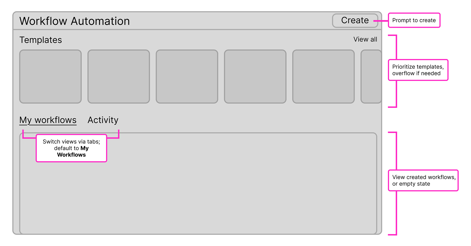
Result: Early adopters said this home page was welcoming and intuitive. In particular, they appreciated the eye-catching template images, which encouraged them to try out the templates.
✏️ Workflow editing made easy
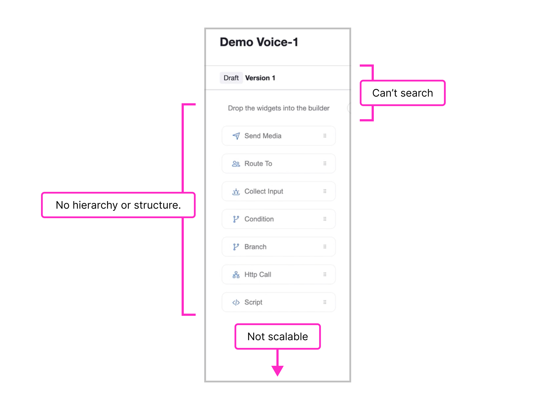
Problem: Users found the freeform canvas used in tools like Contact Center and PowerAutomate overwhelming and difficult to learn.
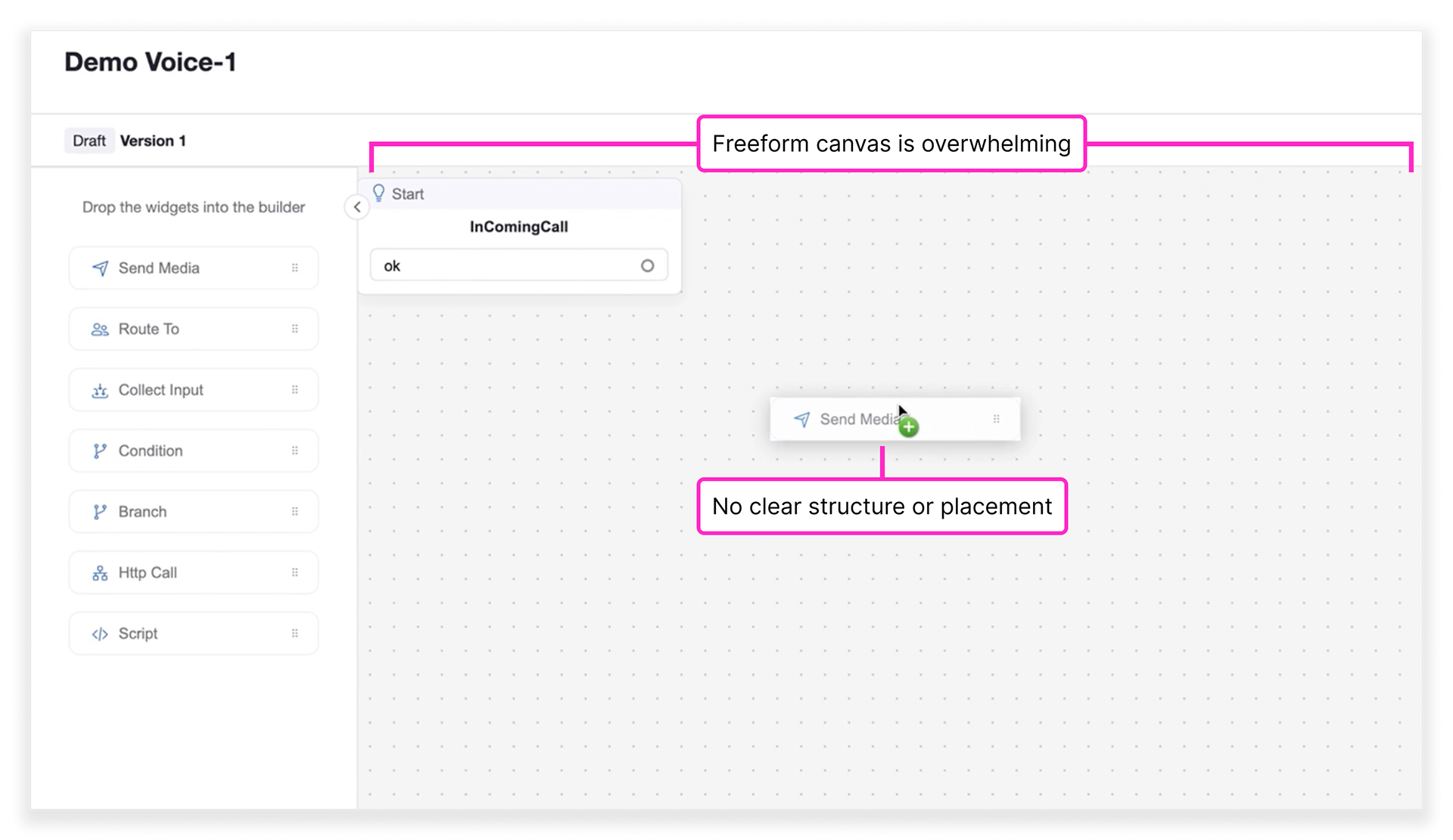
Screenshot from Contact Center's workflow tool.
Solution: I simplified this experience by replacing the freeform canvas with a linear, top-down layout inspired by Slack, reinforcing the step-by-step process of workflows.
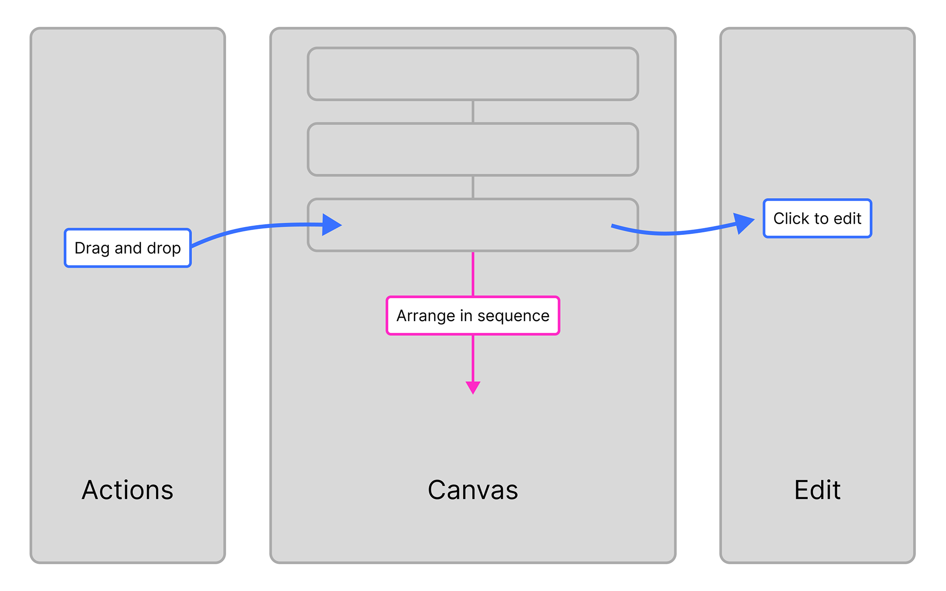
Result: This linear structure improved usability and made it easier for users to build workflows with confidence. Users said this format was easier to learn, encouraging them to dive into the product and build workflows faster.
Thinking ahead with scalable navigation
From the start, I designed the navigation with scalability in mind, ensuring it could support growing user needs and future third-party integrations.
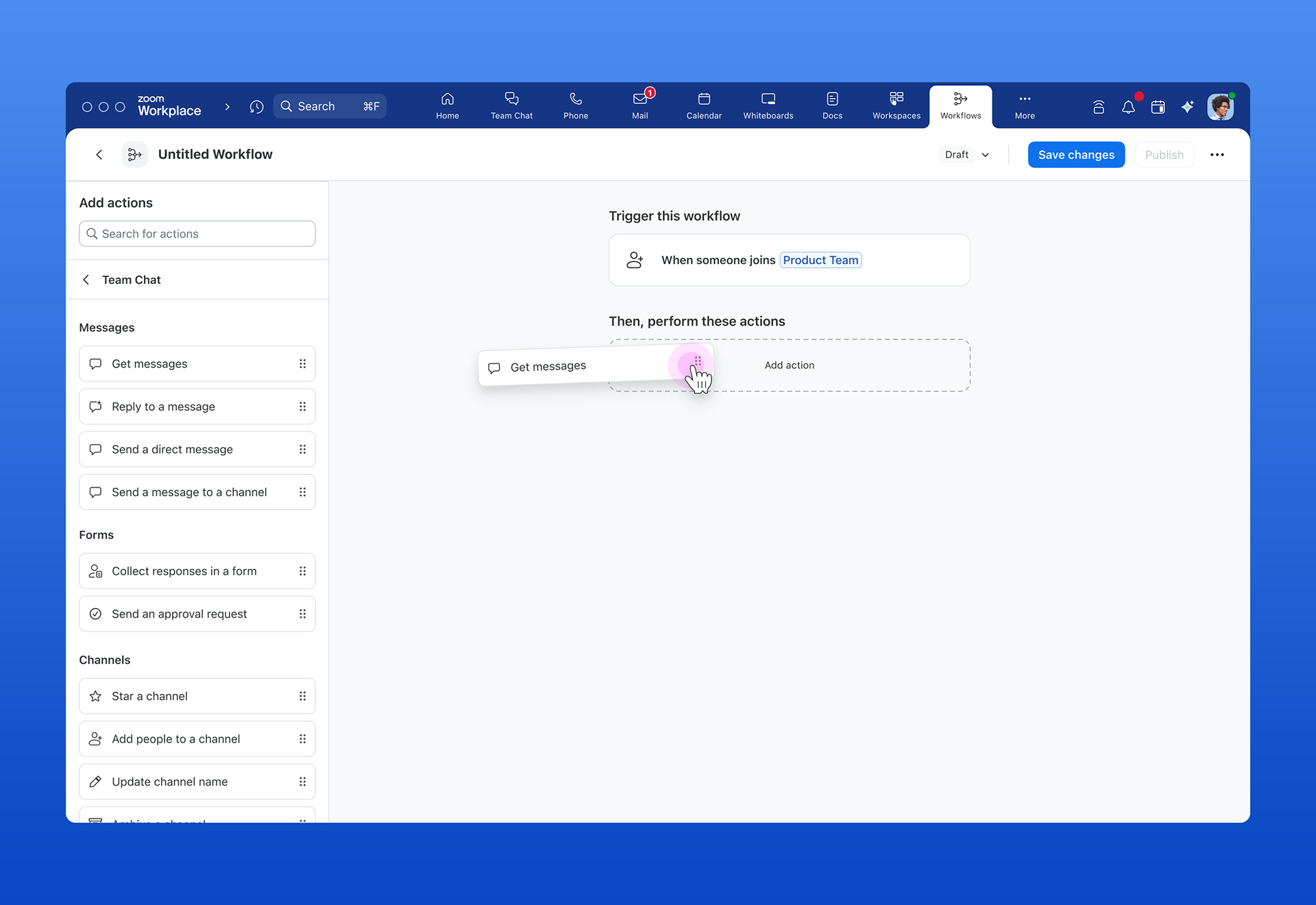
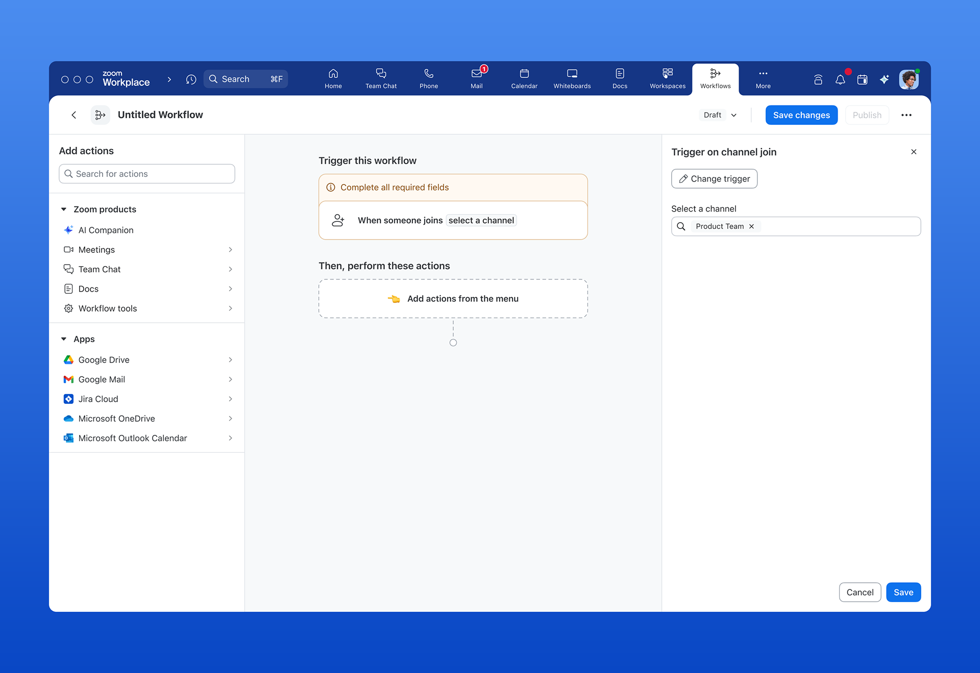
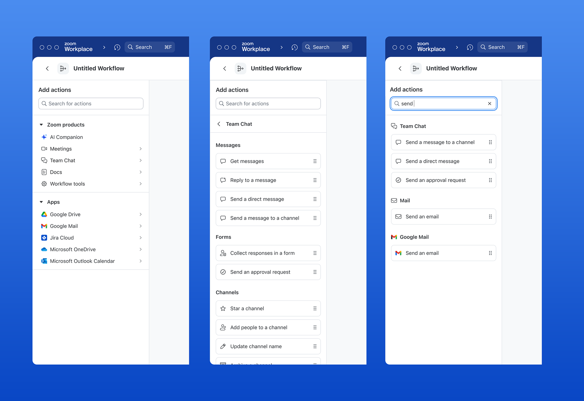
Problem: The original structure was flat and limited to a small set of first-party actions. I realized that this structure would not scale to a large variety of actions. A new structure was required.
Solution: I redesigned the navigation using a tiered hierarchy that grouped actions by type and category. I also added a global search to help users quickly find actions by keyword. The new structure is built to scale effortlessly as the scope expands.
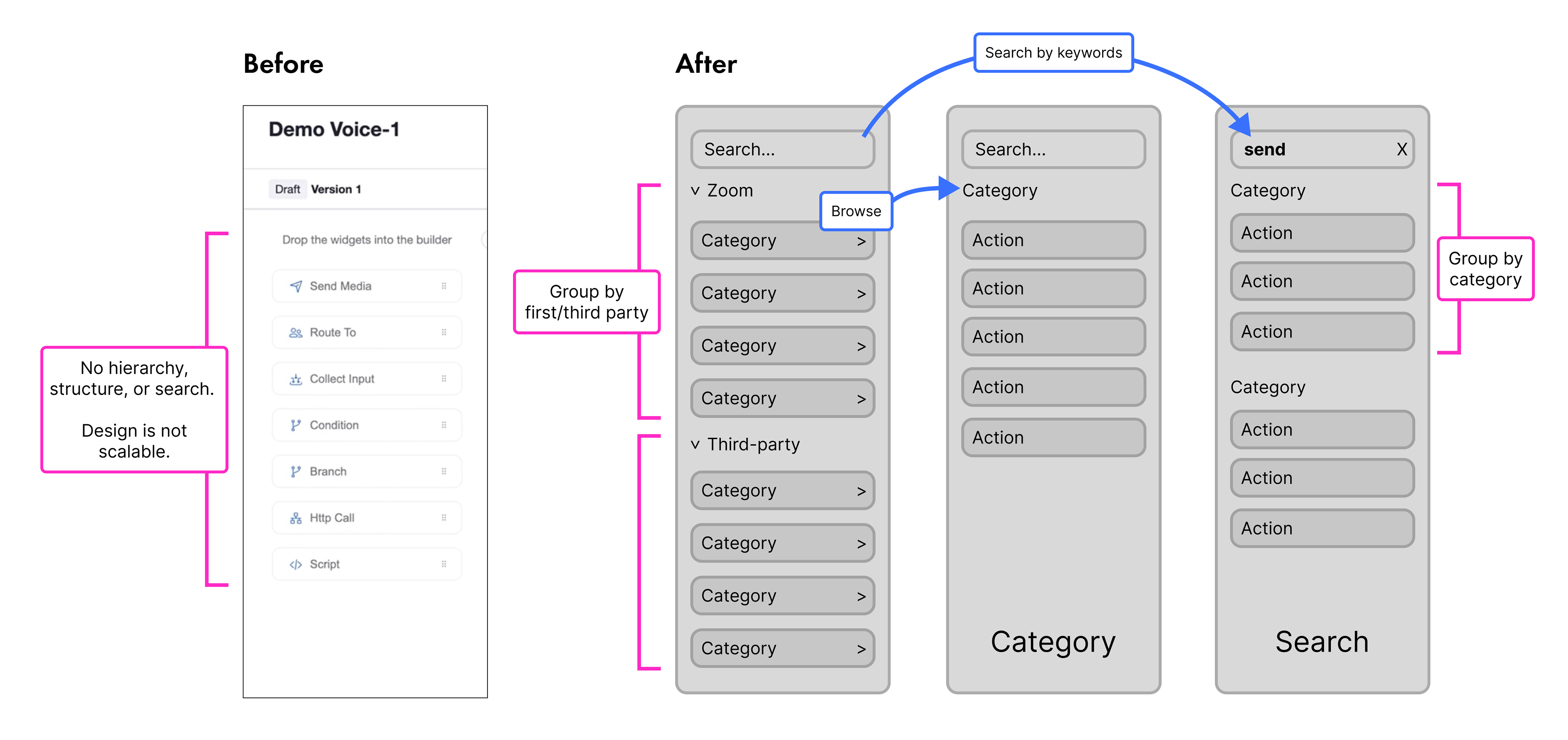
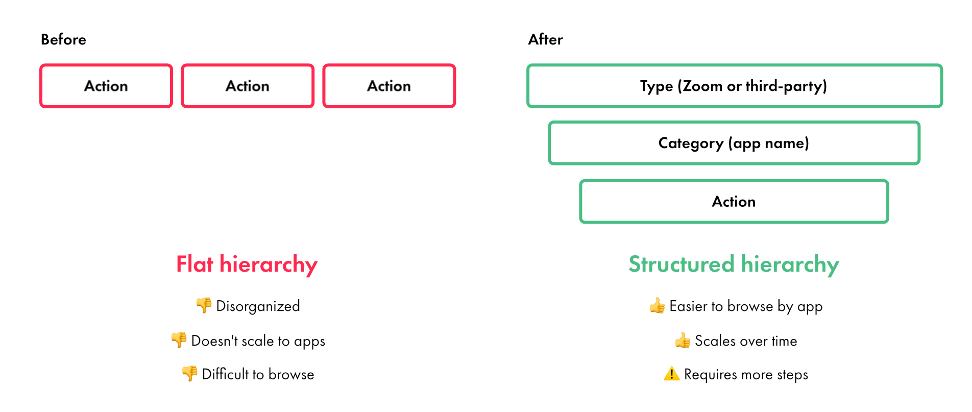
Result: The improved structure made it easier for users to navigate a growing number of actions. No additional effort is required to incorporate new apps and actions, saving time for both design and engineering.
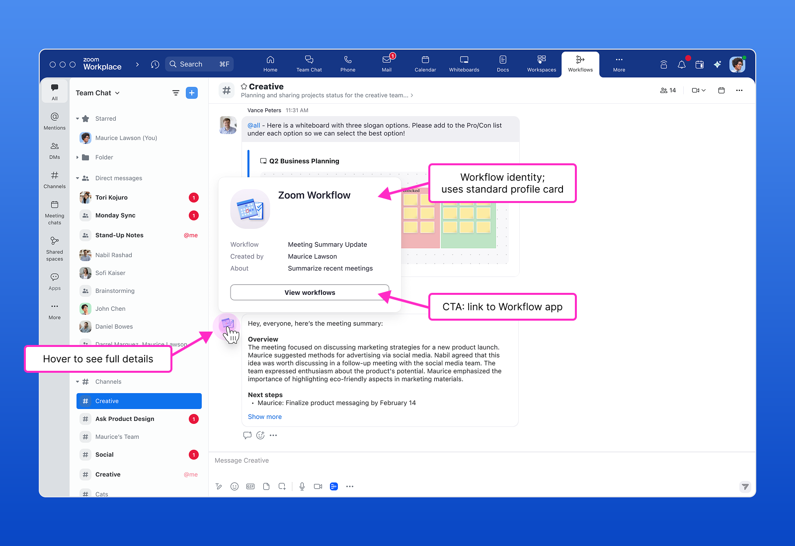
🎨 Building trust via personalization
Problem: Users had difficulty identifying published workflows, thus posing potential trust and safety concerns, especially at the organizational level.
Solution: I introduced clear identity markers for each workflow, including name, description, and visual iconography. For consistency and delight, I used emojis as the default icon format, with the option to upload a custom image.
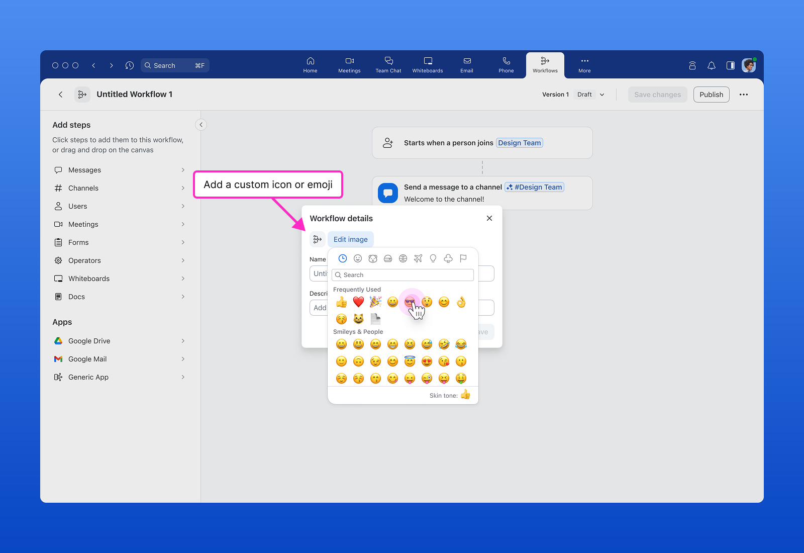
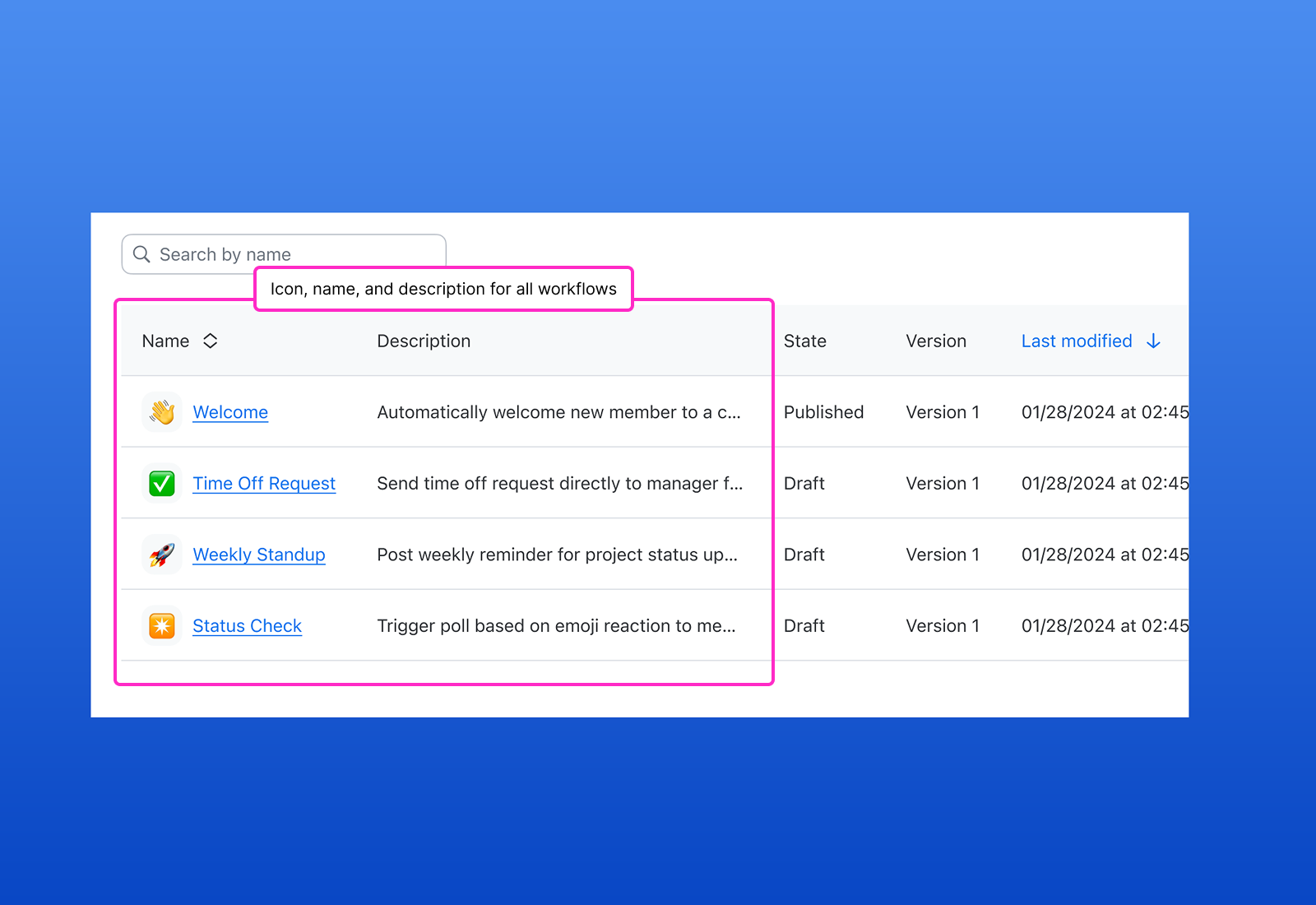
Result: These enhancements made workflows easier to recognize and manage across product surfaces, improving clarity for both individual users and admins while adding delight and personality.
📈 Tracking usage to ensure safety
Problem: Users and admins had no way to track workflow usage across their organization. Users couldn’t see if others were engaging with their workflows, while admins lacked visibility into how workflows were being used (or misused), posing a potential security risk.
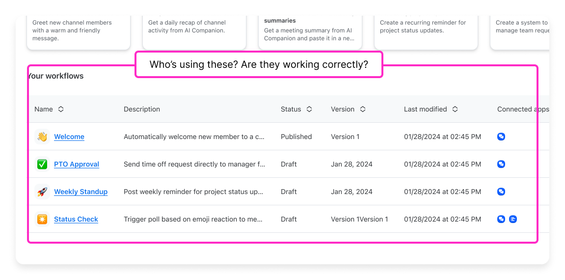
Solution: For users, I designed a dedicated activity view, placed alongside “My Workflows” to provide contextual insight into workflow performance. This view includes filters for time and status (such as failed executions), helping users quickly understand and troubleshoot activity.

For admins, I expanded this into a new page within the admin portal, offering organization-wide visibility, tools to disable problematic workflows, and scalable data visualizations to support future enhancements.
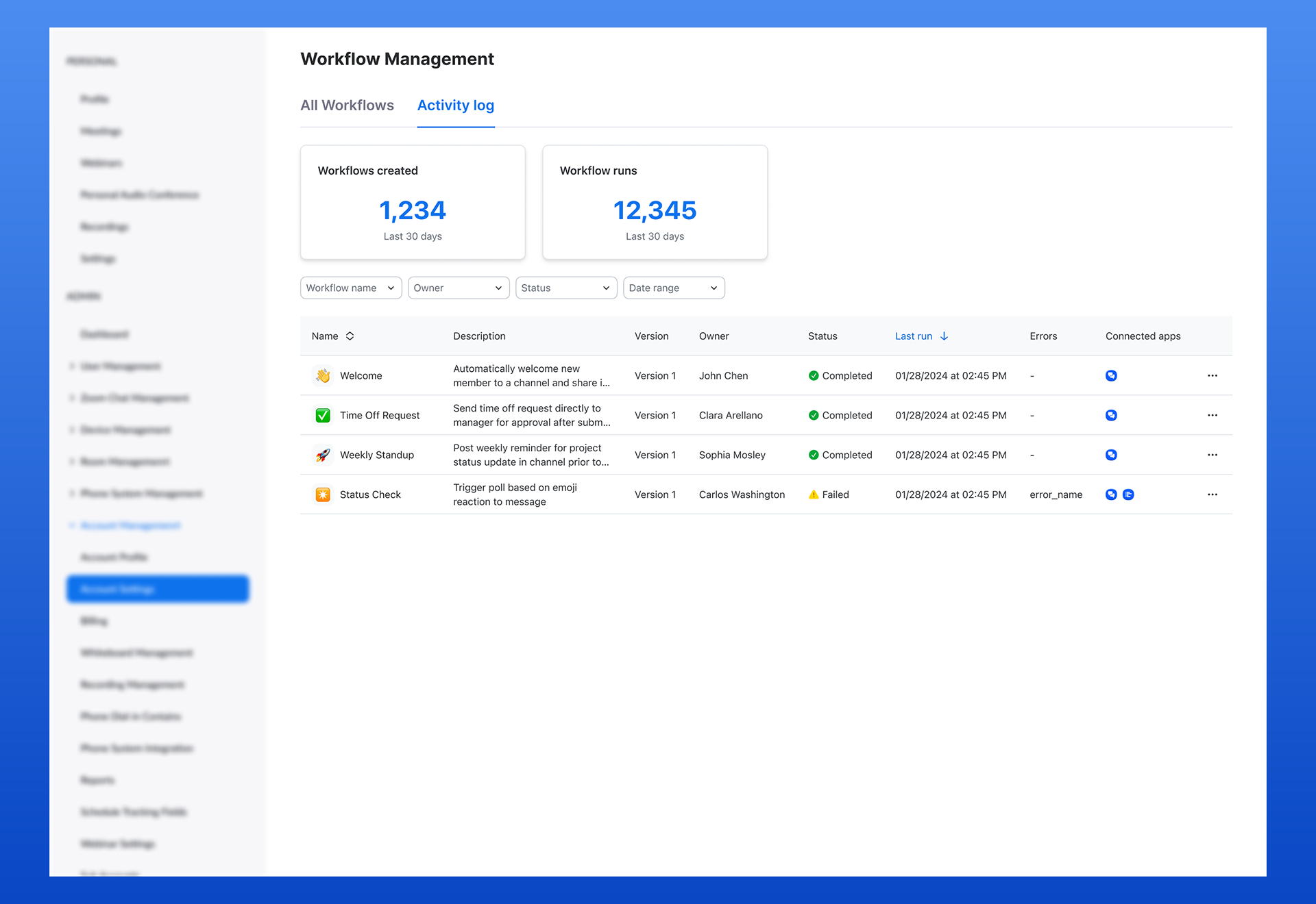
Result: These views improved clarity, accountability, and trust. Users could monitor how their workflows were being used, while admins gained essential oversight and control to ensure secure, effective adoption across the organization.

Outcome
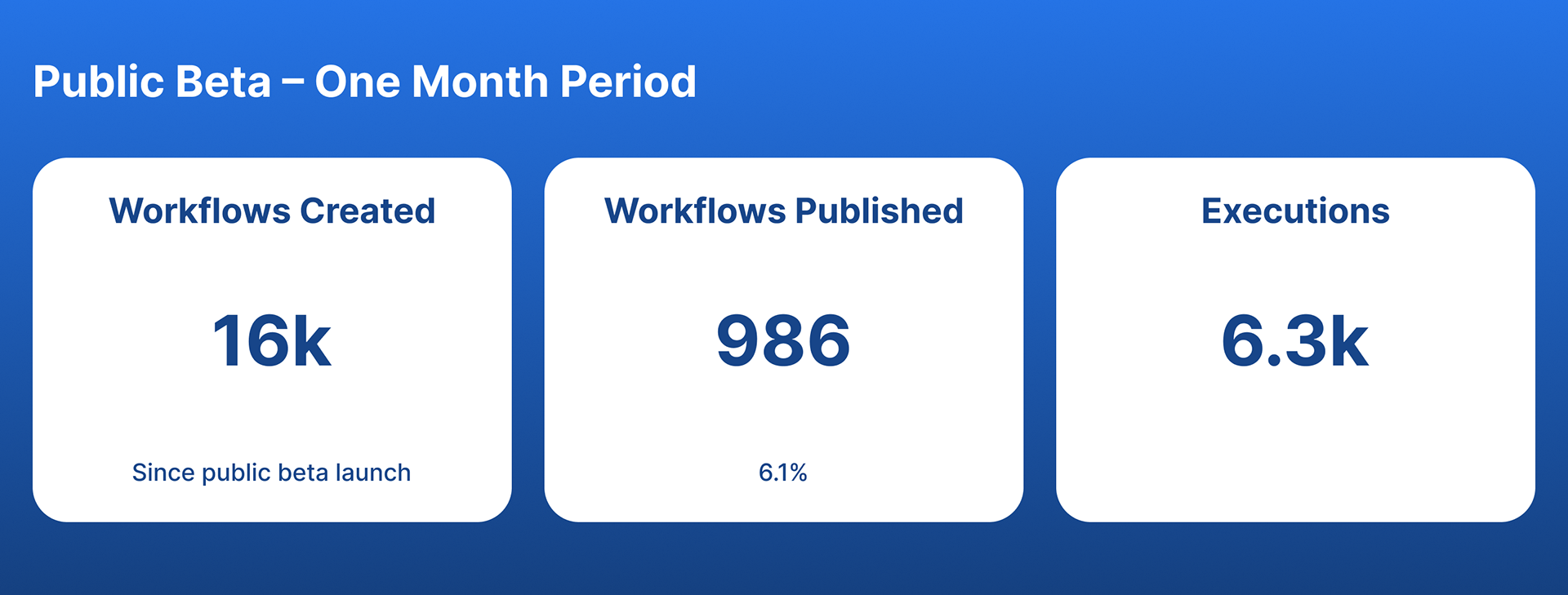
Workflow Automation was launched as a new product in February, 2025.
Initial feedback was overwhelmingly positive. Early adopters found the tool exciting and were already using it successfully with their teams. Users described the design as delightful and easy to use, especially highlighting the template images as warm and inviting. A major customer cited it as a key factor when migrating to Zoom. Executive leadership also praised our team's rapid, iterative work.

What I learned
This project challenged me to lead end-to-end design for a complex, high-impact product in a fast-moving, ambiguous environment. I strengthened my ability to advocate for users, align cross-functionally, and design for long-term scalability.
One key lesson was that early design decisions can dramatically affect internal workflows. For example, my custom image pattern for templates proved unsustainable, leading me to later design a more scalable emoji-based system post-GA.