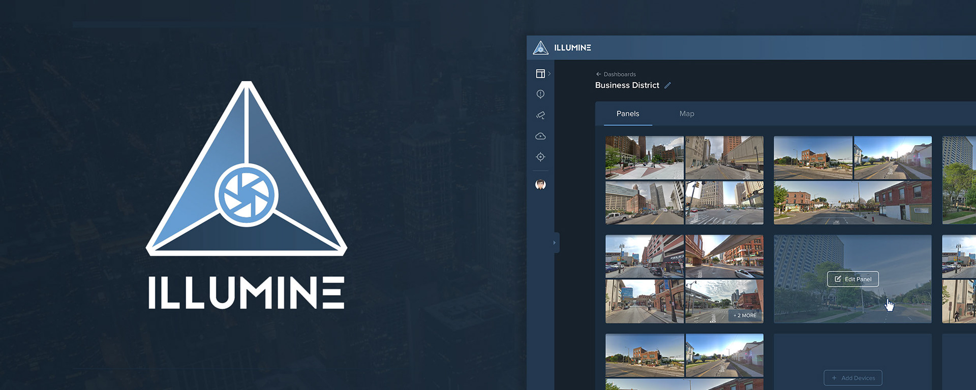
Intelligent video security platform
Designed a functional MVP, design system, and brand identity for an AI-powered security platform.
Highlights
– Led end-to-end design, developed a functional MVP from scratch in under 6 months
– Developed a scalable, reusable UI pattern library in Sketch to ensure consistency across the product and future team workflows
– Created the product logo and brand identity
Project details
Role
Sole product designer (UI/UX, graphic design, design system, components, icons)
Sole product designer (UI/UX, graphic design, design system, components, icons)
Platforms
Responsive web
Responsive web
Tools
Sketch, Photoshop, Illustrator, pen & paper
Sketch, Photoshop, Illustrator, pen & paper

How it all started
In 2018, leadership at Sportsrocket conceived a new product to empower security professionals by seamlessly integrating cameras, notifications, and machine learning into a unified platform that could save time and make everyone safer.
This product was a functional beta before the company dissolved in early 2019.
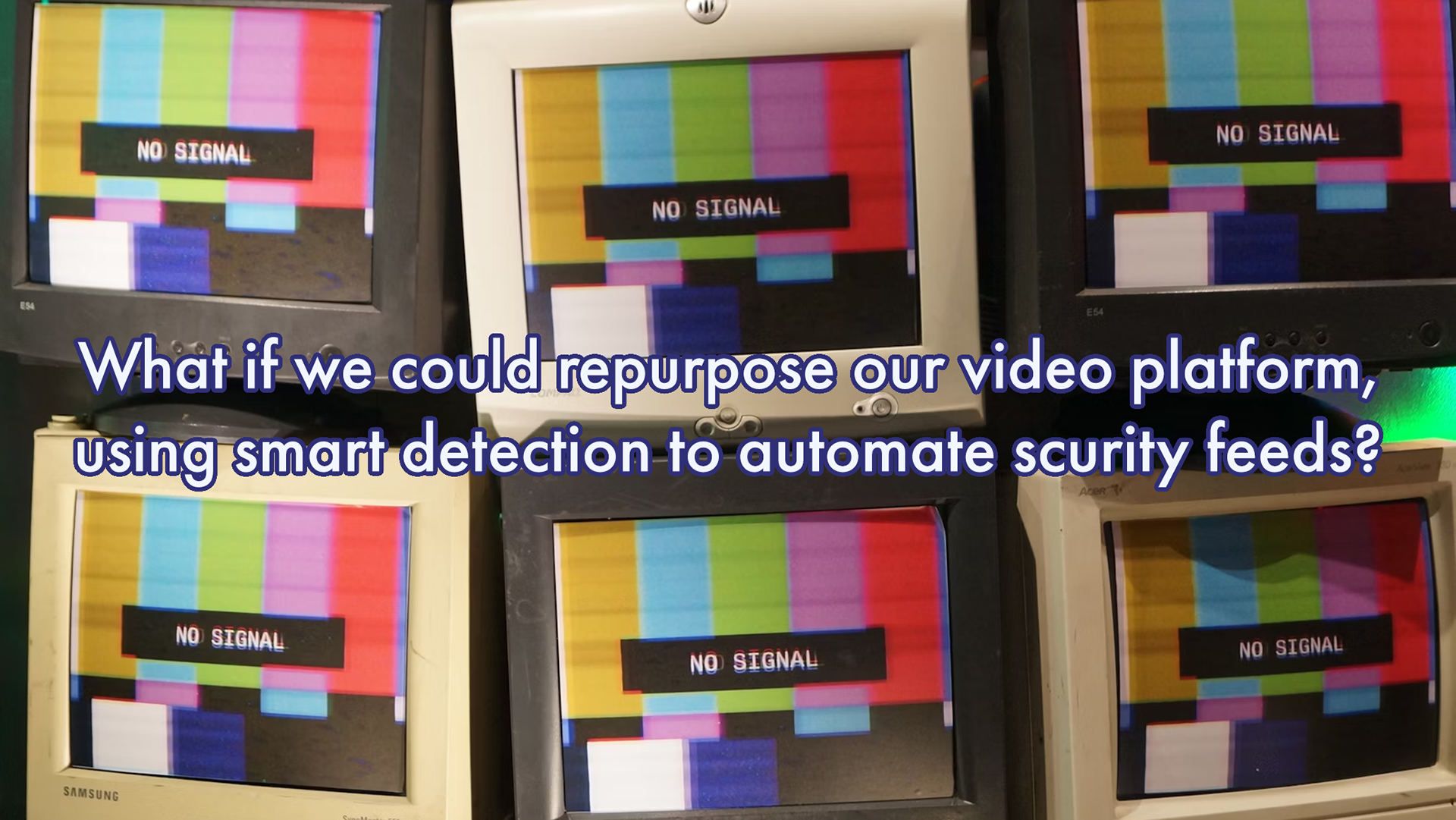
Problem
In many urban environments, safety depends on fast reactions. But monitoring dozens of surveillance feeds is exhausting, slow, and prone to human error. Illumine aimed to change that by combining real-time video, AI detection, and intuitive design into a single innovative product.
Hypothesis
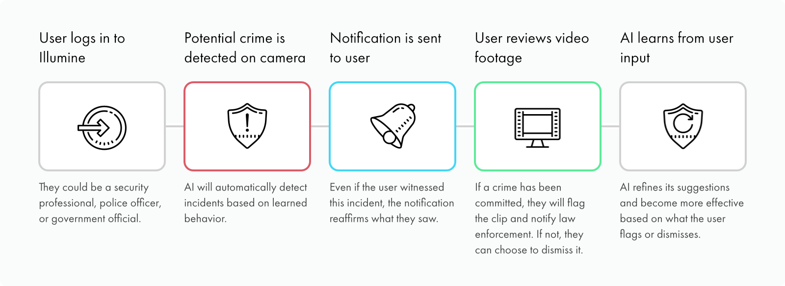
If we used our video platform to integrate with security cameras with AI detection, we could develop an innovative product that would help security professionals keep everyone safe.

🏗️ Building a new product from scratch
This was a highly unique project that required building an entirely new platform from zero to one. As the lead designer on this project, I was tasked not only with end-to-end product design, but also systems and branding.
I won't lie, I was a bit intimidated, but I took the challenge in stride.
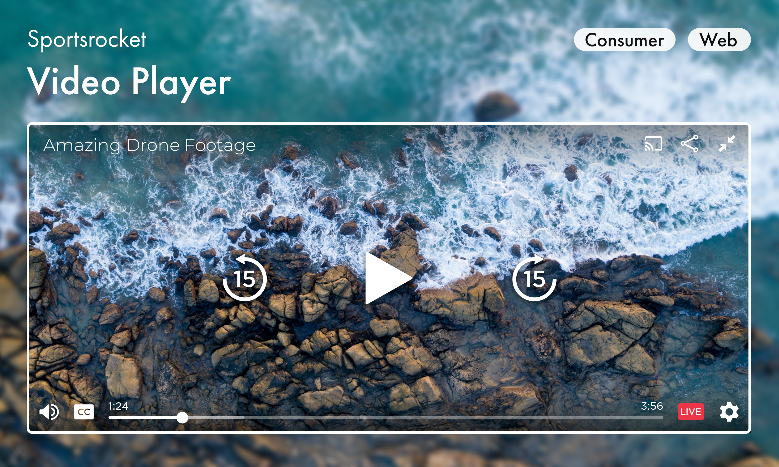
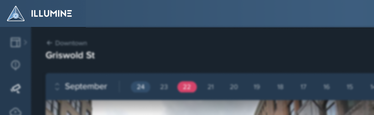
👀 Seeing every event from one dashboard
Problem: Security teams needed to monitor dozens of camera feeds without missing key moments.
Solution: After much experimentation and feedback from stakeholders, I designed a rigid grid system that ensured all feeds stayed in view at all times, balancing this with customizable density controls.
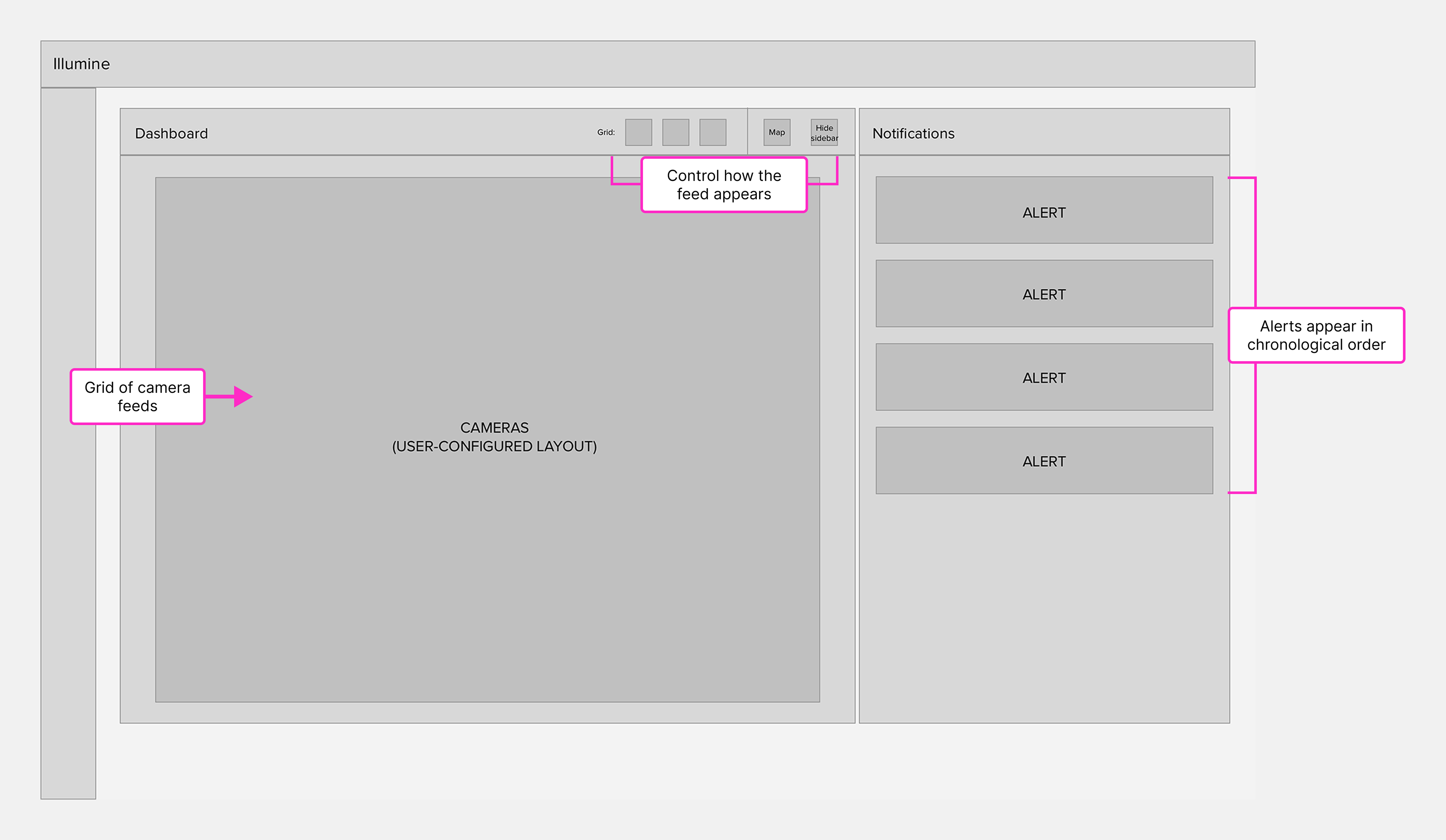
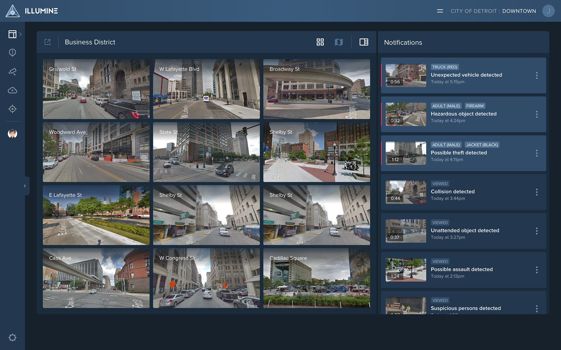
Dashboards are the main working space for users, combining a fixed grid of cameras with a notification feed.
🛠️ Customization
In my initial wireframes, users could freely add as many cameras as they wanted to a scrolling list. After we moved to a fixed grid layout, I had to rethink that approach. This shifted us to the concept of "panels." Each panel could group multiple cameras and would automatically cycle through them at set intervals. This idea also prompted a completely new panel editor to support the updated functionality.
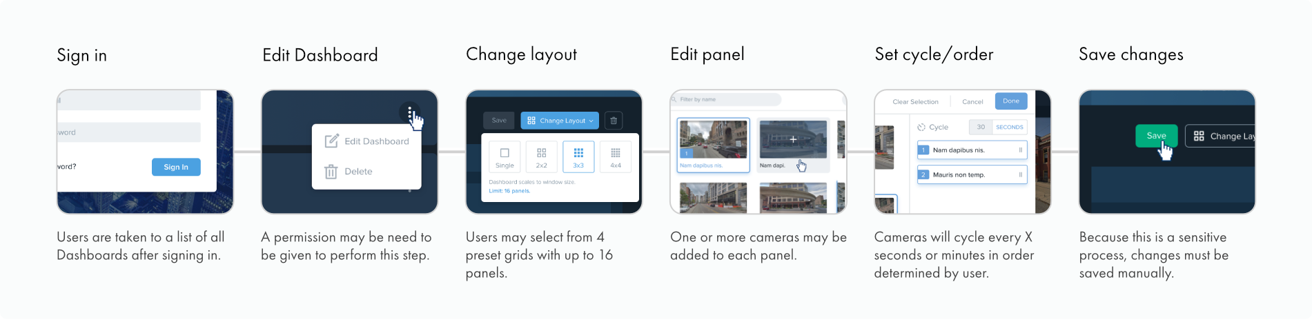
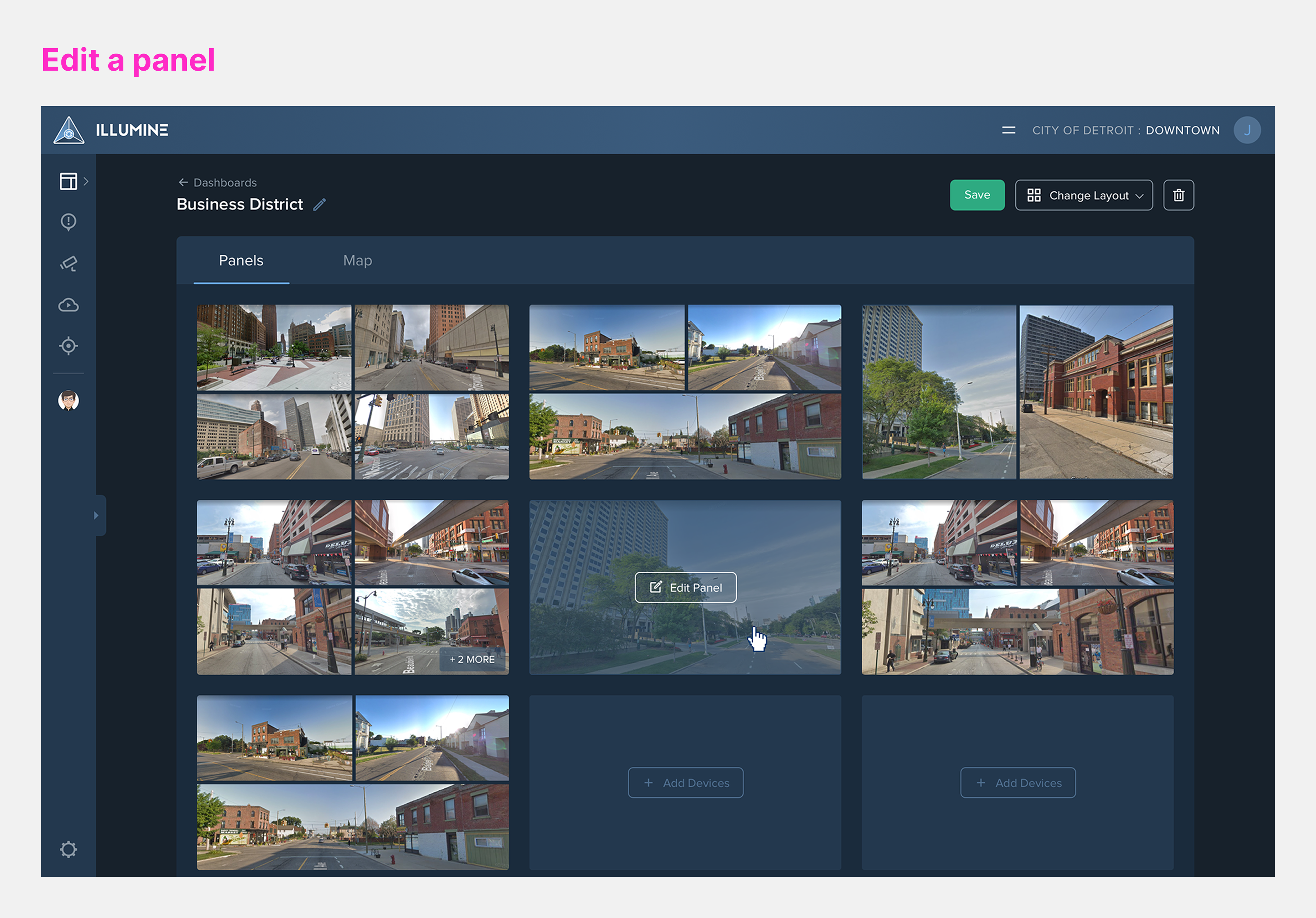
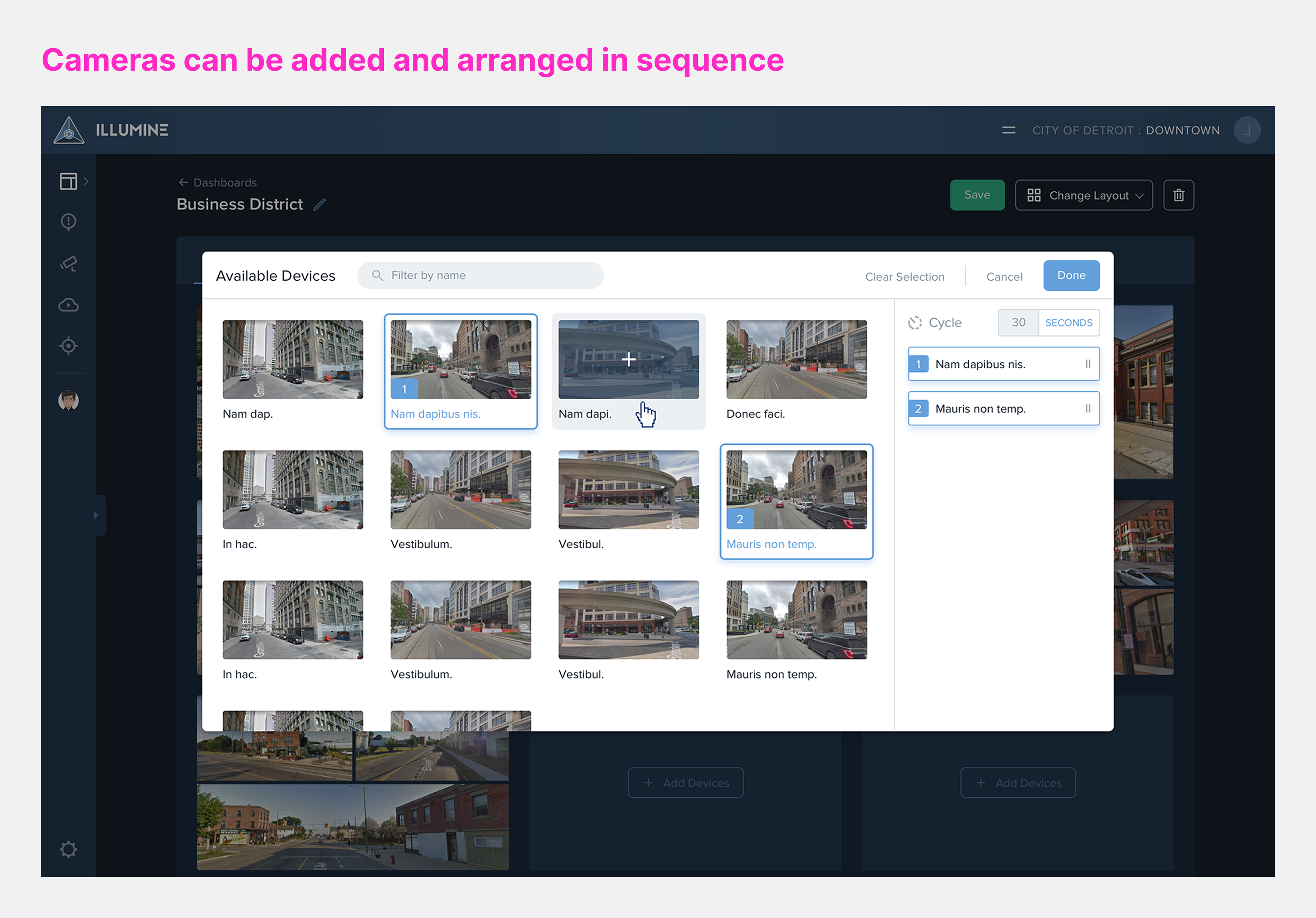
Result: Users could confidently monitor all feeds in a single dashboard, improving awareness without sacrificing flexibility.

🖍️ Defining the visual style
As this was a brand-new product, we aimed to establish a bold, modern, and eye-catching identity. I led the design of the branding and product visual patterns.
To reduce eye strain, I chose a palette of cool, muted tones. I also produced an asset library that ensured visual consistency, making it easy for others to implement the same patterns. All icons were designed from scratch, and UI components were implemented as dynamic symbols in Sketch.

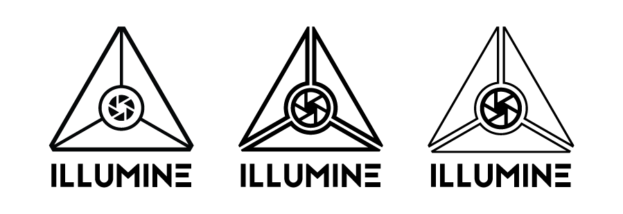
🎨 Creating the brand identity
To complete the project, I was asked to design the logo and brand identity. The product's working name was a reference to the Illuminati.
(Yes, you've read that correctly.)
For my portfolio, I’ve renamed the product “Illumine”—a word that means to illuminate or shed light—which I believe better reflects the product’s use case.
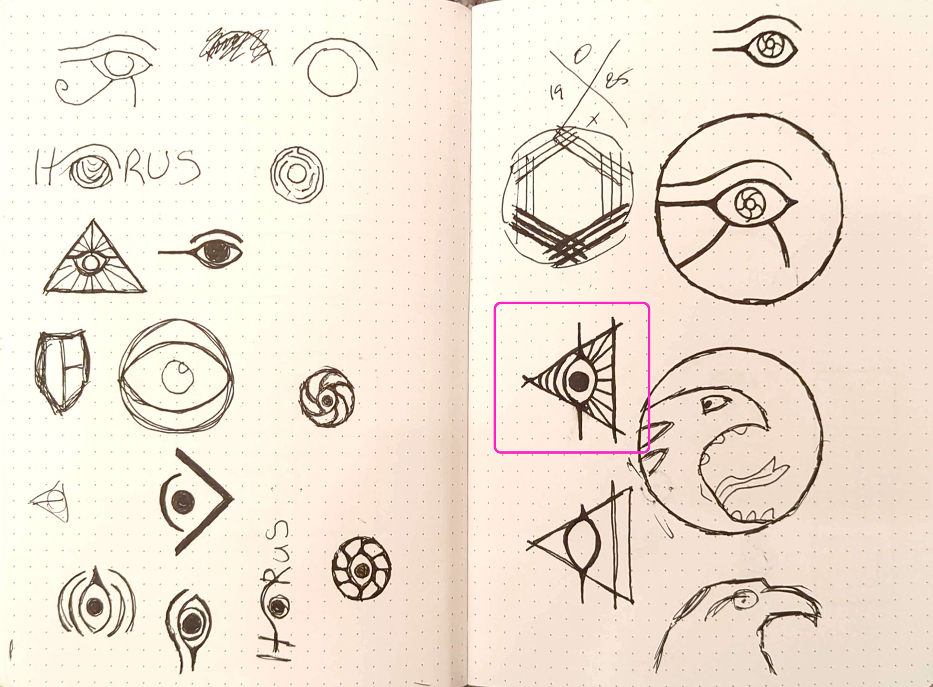
Process
I drew inspiration from themes relating to eyesight, lenses, and the Eye of Horus, attempting to distill the concept of an intelligent AI casting light on its surroundings.
Ultimately, my goal was to funnel this inspiration into a logo that was clean, professional, and adaptable. To achieve this, I stripped away unnecessary references, stripping away unnecessary elements, focusing instead on only the key visuals. Throughout, I maintained a highly geometric, minimalist style.

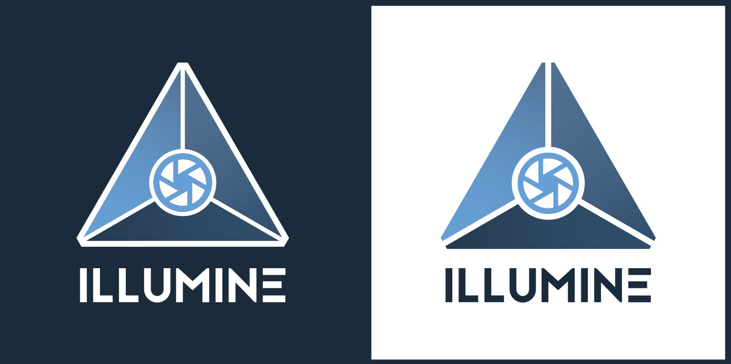
Final logo
The identity for Illumine conveys a sense of stability and vision, centered around an intelligent core. The color palette and typography align seamlessly with the interface guidelines.
I created multiple size and color variations to ensure clarity across the UI and adaptability for other mediums like emails and letterheads. Overall, feedback was very positive—company leadership described the design as original, innovative, and a strong reflection of the product’s purpose.

Outcome
I led the design of Illumine from concept to a fully functional prototype. The product was built and tested internally, enabling our team to validate core workflows. Internal feedback was highly positive, particularly around the visual clarity of the dashboard, the streamlined layout, and the visual style of the brand system.
Although Illumine never launched publicly due to the company’s closure in early 2019, the project accomplished most of the key goals we set out to solve.

What I learned
This was one of the most comprehensive projects I’ve worked on—designing a full SaaS product from the ground up, starting with only a name and some early team insights. It pushed me to collaborate closely with colleagues to plan, design, and validate every feature from scratch. While we developed a working prototype, the company unfortunately ran out of funding before we could bring it to market.
If I had more time, I would have explored the user journey beyond crime detection—specifically, what actions users would take next and how the app could support those critical moments.