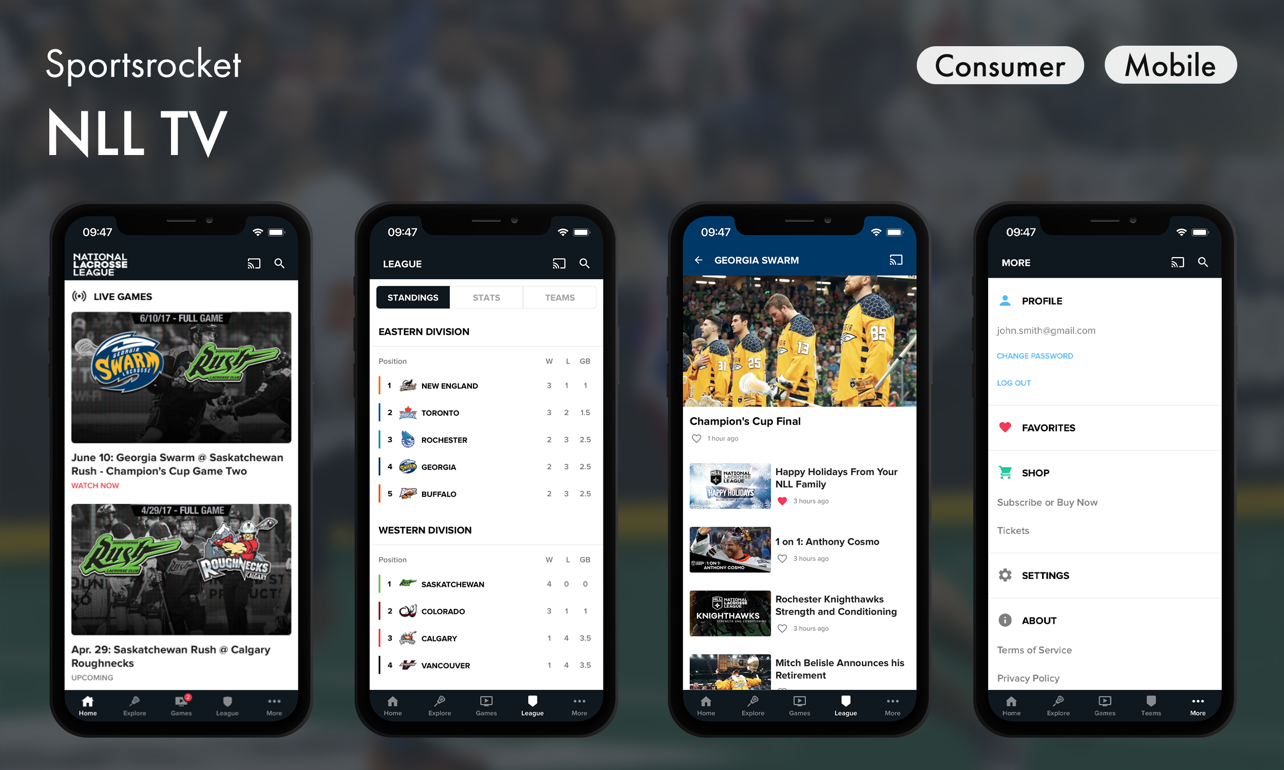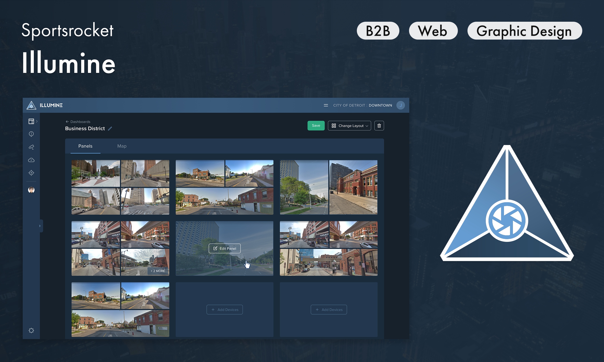

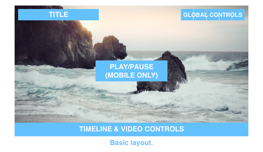
One video player for every screen
Redesigned Sportsrocket’s video player to be mobile-friendly, brand-adaptable, and more engaging across platforms.
Highlights
– Led end-to-end redesign of Sportsrocket’s core video player across mobile, web, and smart TV platforms
– Improved accessibility and mobile usability with enhanced controls and tap targets
– Boosted discoverability with playlist navigation and share functionality
– Delivered a clean, brand-neutral design for client reuse across websites
Project details
Role
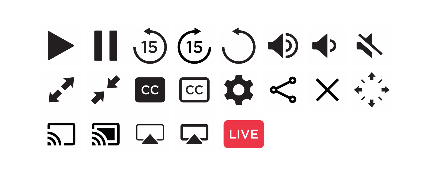
Sole product designer (UI/UX, icons, design system, motion design)
Sole product designer (UI/UX, icons, design system, motion design)
Platforms
Mobile (iOS, Android), responsive web, Apple TV, Chromecast
Mobile (iOS, Android), responsive web, Apple TV, Chromecast
Tools
Sketch, Photoshop, Illustrator, Principle, After Effects, pen & paper
Sketch, Photoshop, Illustrator, Principle, After Effects, pen & paper

How it started
Sportsrocket’s in-house video player was core to delivering content across our partners’ platforms, but it was clunky on mobile, branded too heavily, and failed to keep viewers engaged.
Sometime in 2017, our CTO asked me to lead a redesign for the video player with the goal of creating a cleaner, more engaging viewing experience that scaled across all platforms. As a lover of digital media, I was eager to jump into this project and make it accessible for all viewers.
Problem
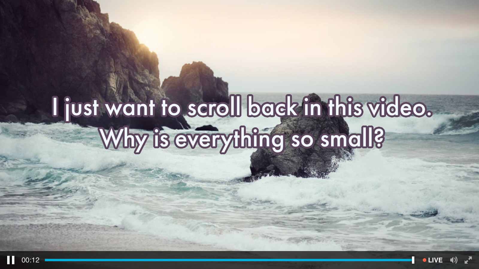
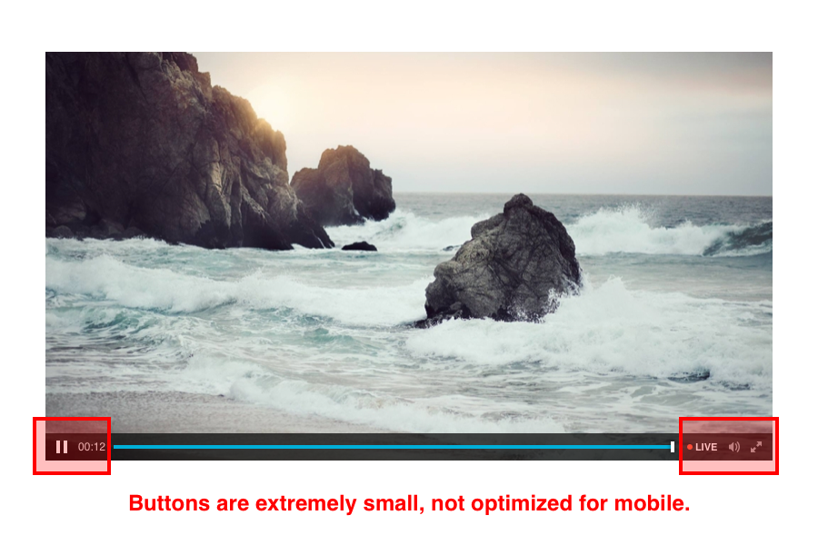
Viewers on mobile devices said it was difficult to interact with buttons due to small touchpoints. Essentially, the desktop UI had been scaled down to mobile with no regard for touch. Furthermore, controls were not organized into logical groups, making it difficult to quickly find key actions.

Usability issues
📵 Mobile optimization
The video player scaled poorly to mobile devices. Touch targets failed to meet web accessibility guidelines.
The video player scaled poorly to mobile devices. Touch targets failed to meet web accessibility guidelines.
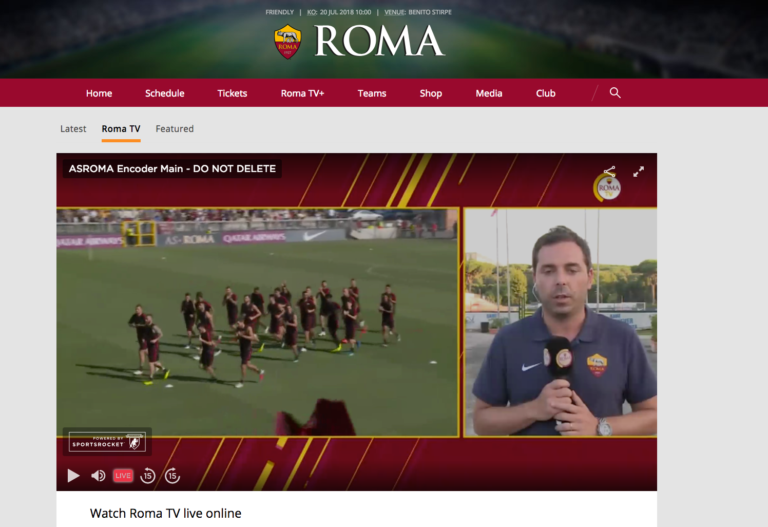
🦁 Heavy branding
The design featured obvious Sportsrocket branding. This was an issue for customers who licensed the video player. They desired a more neutral design.
The design featured obvious Sportsrocket branding. This was an issue for customers who licensed the video player. They desired a more neutral design.
🥱 Poor engagement
Viewers were dropping off because the video player did not drive sufficient attention to related content.
Viewers were dropping off because the video player did not drive sufficient attention to related content.

Goals
📲 Optimize for all devices
Optimize the video player for all devices with an emphasis on mobile.
Optimize the video player for all devices with an emphasis on mobile.
🔥 Drive engagement
Increase discoverability and engagement for related videos and social platforms.
Increase discoverability and engagement for related videos and social platforms.
🎨 Neutral design
Implement a neutral design language that doesn't clash with customer branding.
Implement a neutral design language that doesn't clash with customer branding.

📲 Optimizing for all devices
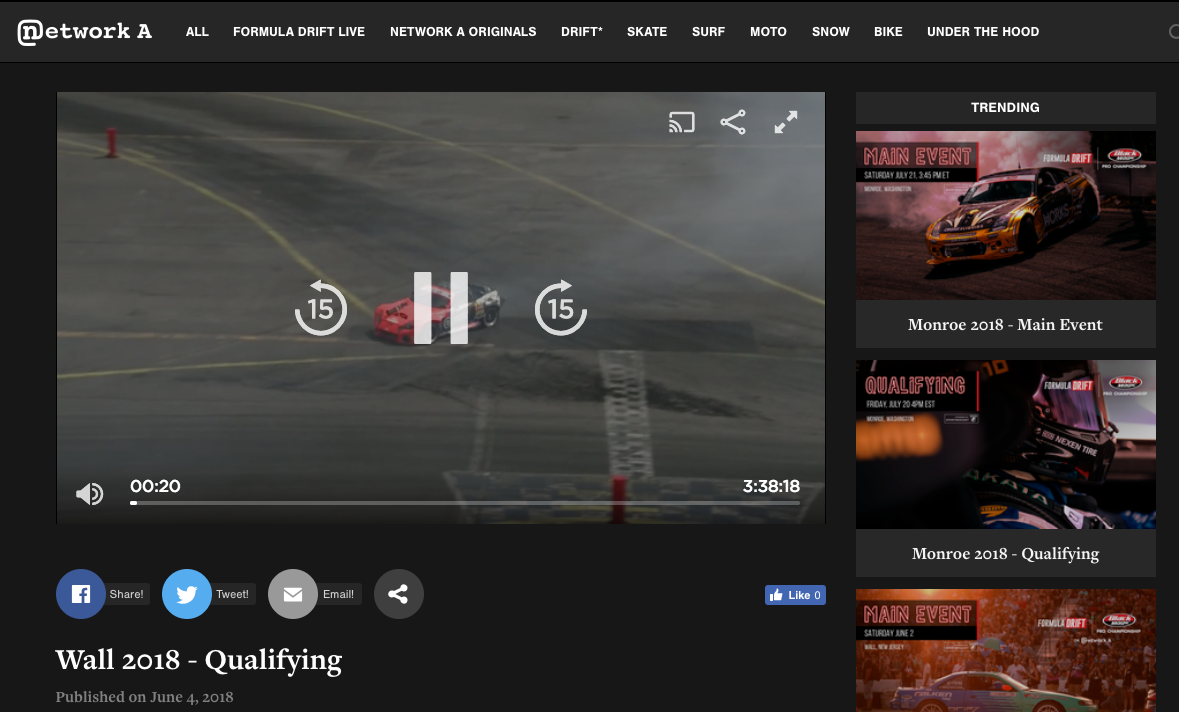
Problem: The video player was not designed with mobile in mind, resulting in poor scaling and touchpoint interactions. However, nearly two-thirds of views came from the desktop player. Therefore, it was vital to unify the experience across all platforms.
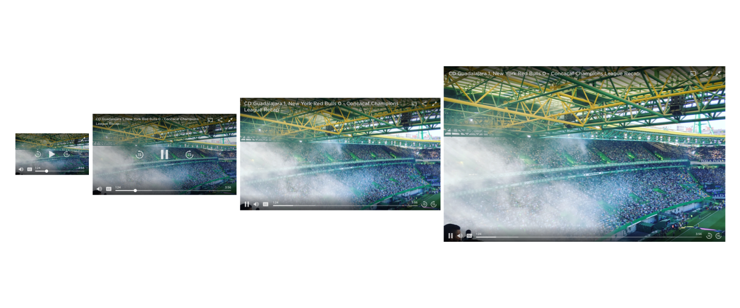
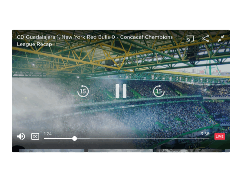
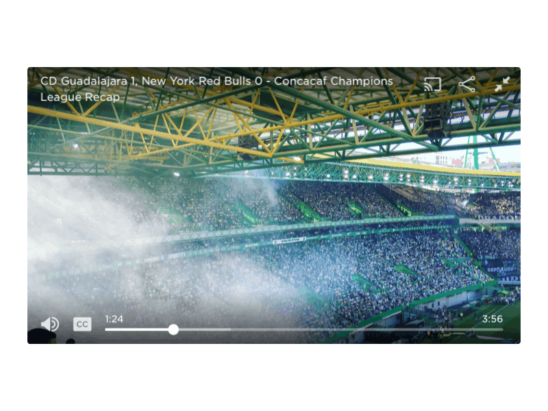
Solution: For mobile, I focused on improving touch targets through increased button sizes with expanded padding. For desktop, I maximized the viewing area by moving obstructive UI elements to the peripheries of the screen.
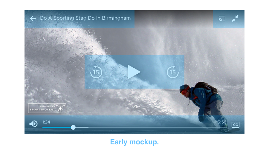
Result: The final video player featured a single, scalable design for all devices and screen sizes. Viewers were pleased with the larger buttons and logical layout.
🔥 Driving engagement
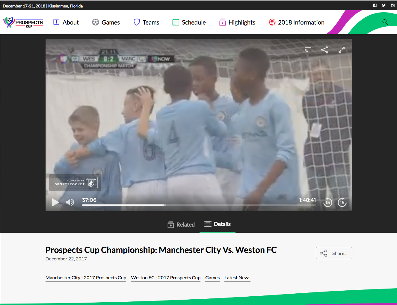
Problem: Our old video player didn't direct viewers to related videos and playlists, missing out on a vital method to drive engagement. Focusing on this issue would benefit both our company and our customers.
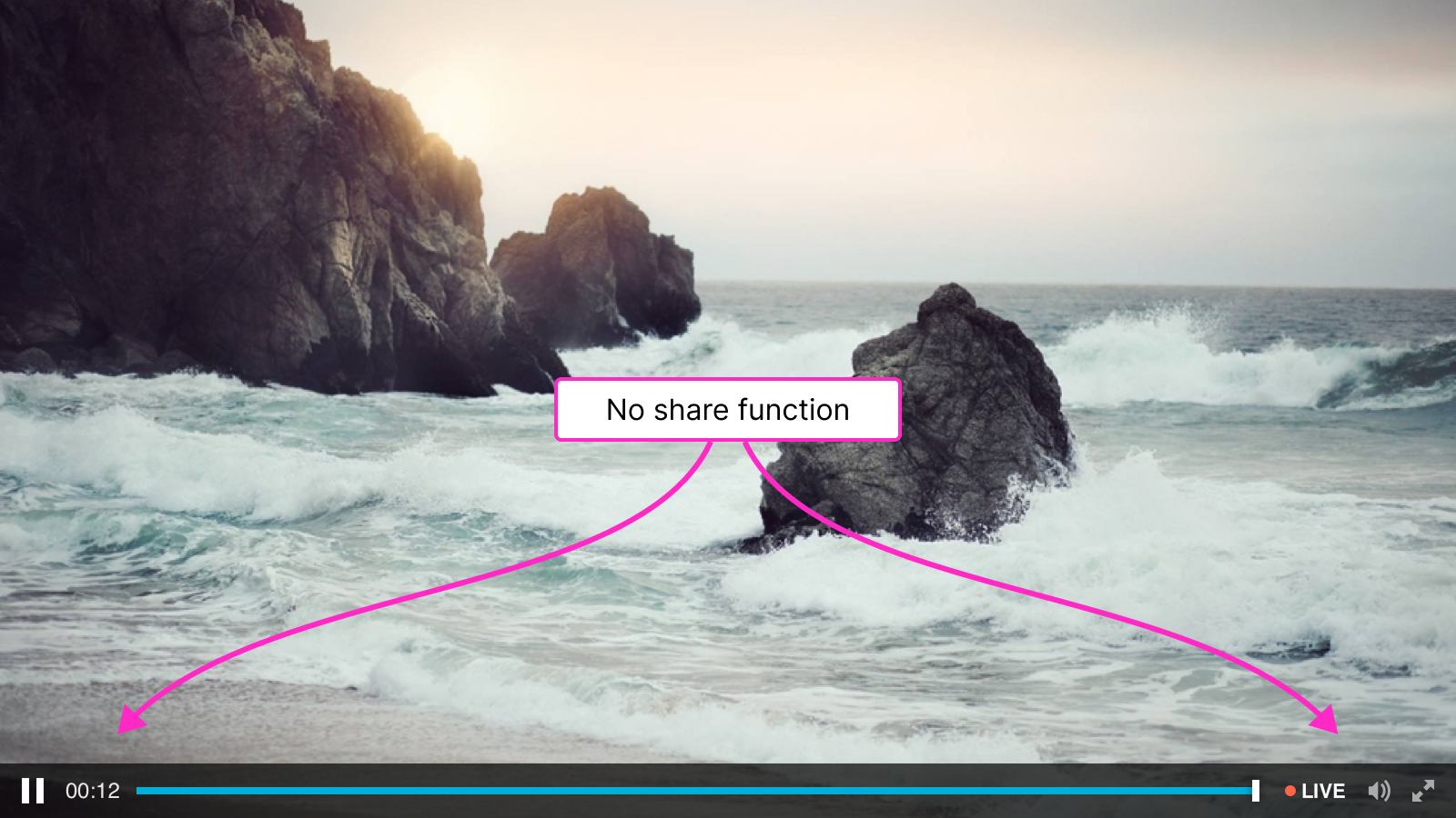
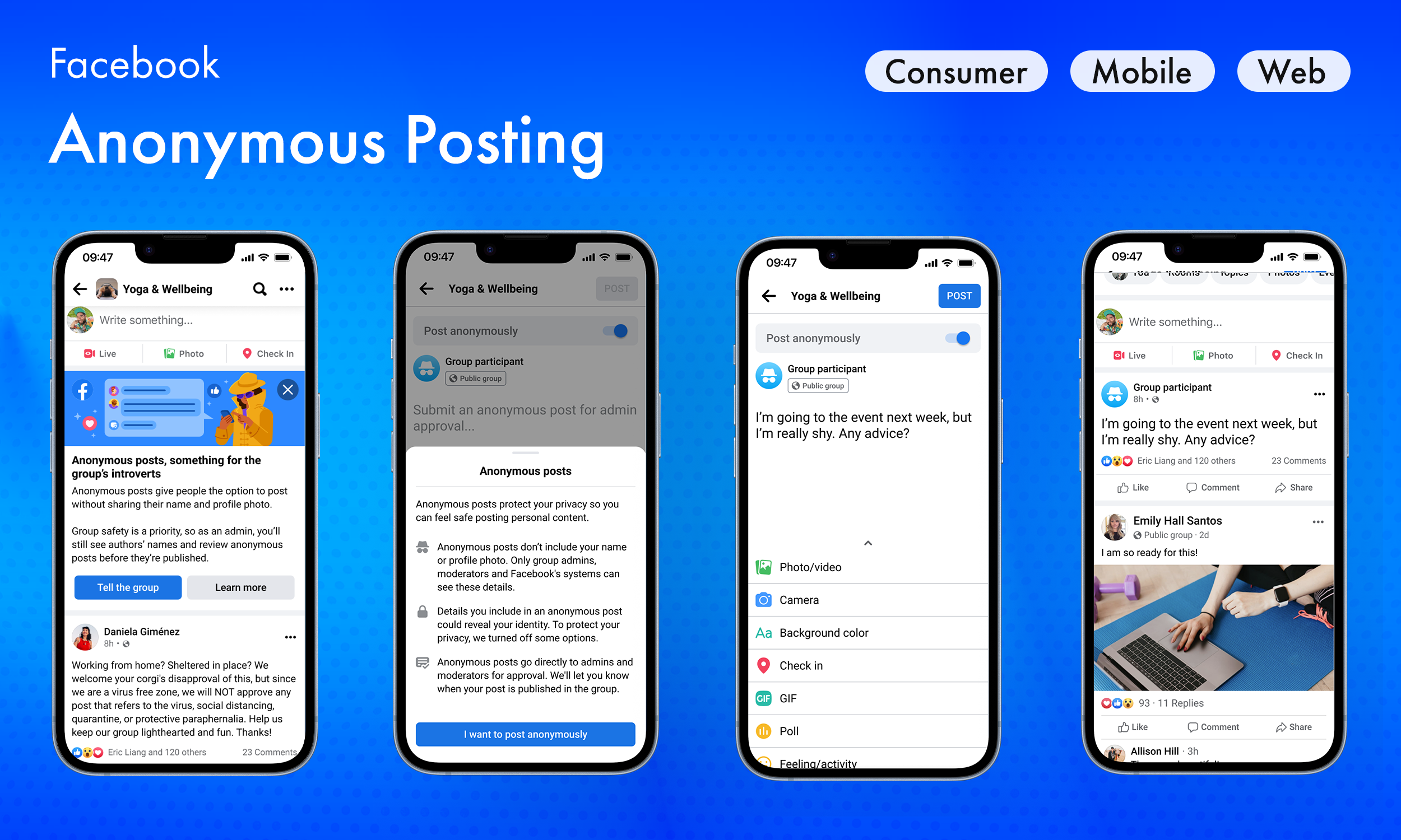
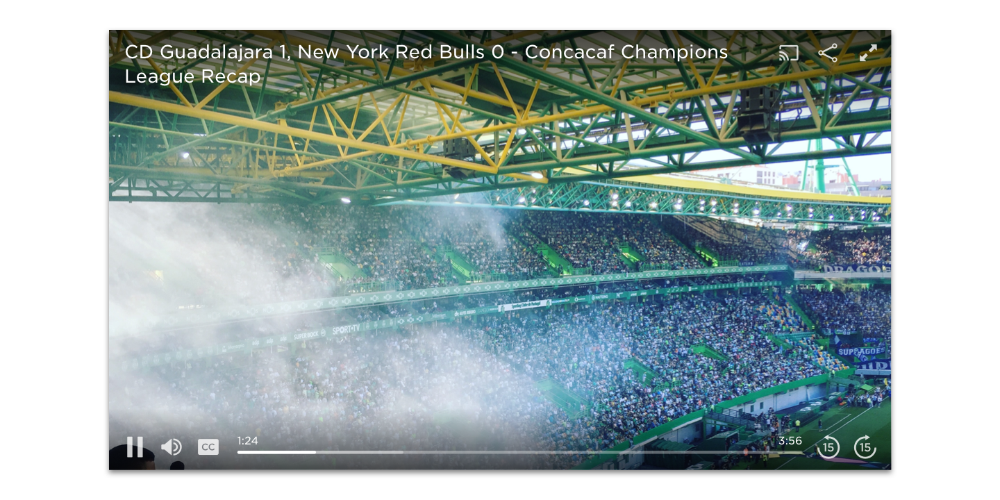
Solution: I added seamless playlist browsing via a pull-up nenu in the video player, along with autoplay so the next video would start automatically. I also redesigned the share modal with one-tap actions for social platforms and a quick-copy link option.
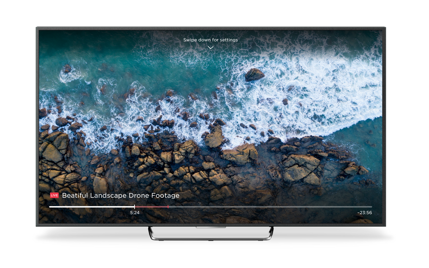
In response to strong user demand—especially from NLL fans wanting to watch live matches on a larger screen—we integrated Chromecast directly into the video player.
Other enhancements included thumbnail previews and closed captions.


Result: These additions allowed users to more easily consume content and share to external platforms, successfully driving higher viewership.
🎨 Crafting a neutral design language
Problem: Customers complained about the heavy branding of our old player which clashed with their own. In other words, the player they were paying for wasn't "theirs." They desired a more neutral experience that would more easily blend in with their websites and brands.
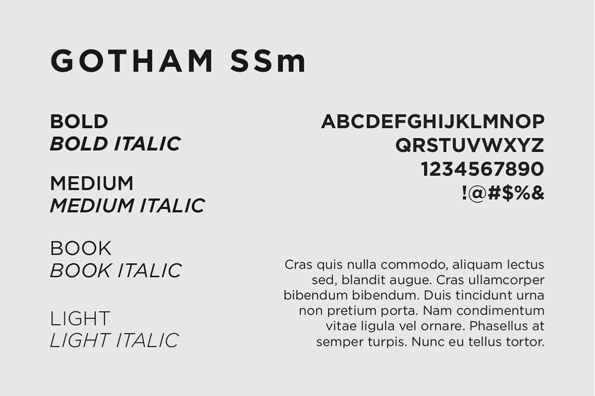
Solution: I eliminated strong branding elements, replacing them with a neutral design system. This included streamlined, modern typography and a custom icon library.
Result: This simplified look and feel allowed customers to successfully integrate the video player into their contexts.
Adding organic motion for a more human experience
I paid close attention to motion, adhering to a philosophy of organic animation and creating transitions that appeared smooth, snappy, and lively. I created detailed animations in Principle and sent detailed keyframe values to our engineers.


Outcome
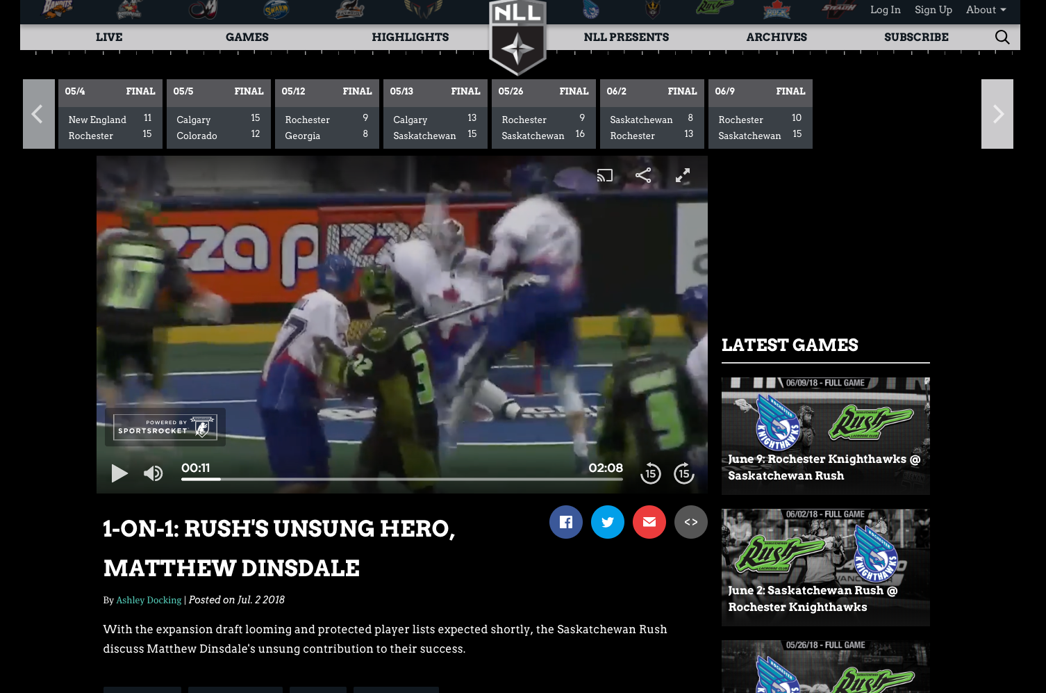
The redesigned video player was adopted by all Sportsrocket customers, including prominent customers like AS Roma, the National Lacrosse League, and the Big Ten. Viewers were pleased with the enhanced mobile usability and new feature integrations like playlists and Chromecast.

What I learned
This was my first opportunity to work closely with engineers on a daily basis. Sitting next to them, I quickly learned how valuable it is to iterate collaboratively, build trust, and solve problems in real time.
I also gained hands-on experience designing for mobile accessibility, something I hadn’t explored in depth before. It pushed me to think critically about touch targets, screen sizes, and responsive behavior.
In hindsight, I wish I had focused more on growth metrics. Driving views was a core business goal, but I didn’t track engagement closely enough to validate whether our improvements made the impact we hoped for. If I could revisit this project, I’d work more closely with PMs to define success metrics and measure outcomes more rigorously.