Invite anyone, from anywhere
Redesigned Team Chat’s invite system to support seamless collaboration with external users via sharable links and QR codes.
Highlights
– Unified the invite link experience across 3 platforms and 5 product surfaces
– Simplified user flows for inviting, joining, and approving external members
– Introduced QR codes for seamless in-person sharing
– Helped position Team Chat for broader adoption among SMB and hybrid teams
Project details
Role
Sole product designer (UI/UX, strategy)
Sole product designer (UI/UX, strategy)
Platforms
Mobile (iOS, Android), Desktop (Mac/Windows)
Mobile (iOS, Android), Desktop (Mac/Windows)
Tools
Figma, Photoshop, Zoom Whiteboard, pen & paper
Figma, Photoshop, Zoom Whiteboard, pen & paper

How it started
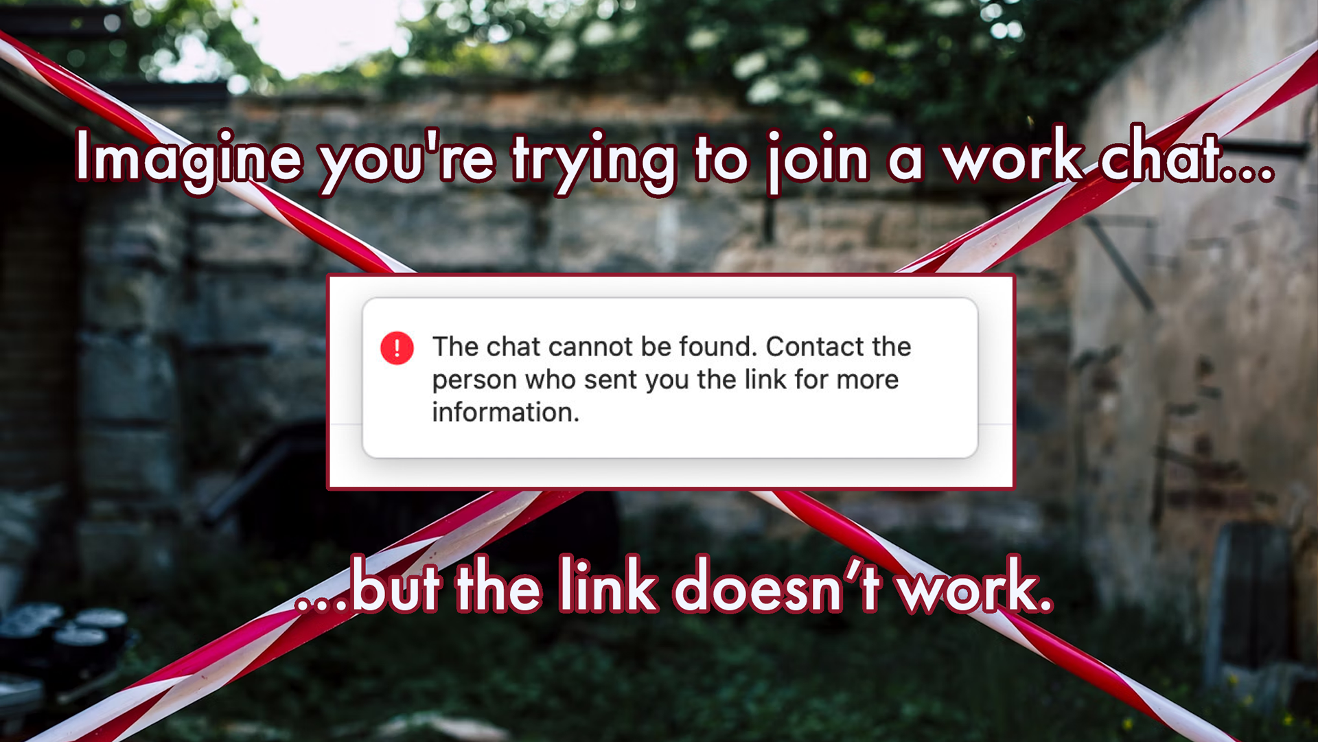
Zoom Team Chat lacked a reliable method to invite external users, something that competing tools like Slack and Teams handled elegantly. Invite links were inconsistent across platforms, links expired unpredictably, and there was no support for QR codes.
In short, users didn't know what to expect when they sent or received a link. This should have been dead simple, but it wasn't.
I was tasked with designing an improved, cross-platform link experience that would streamline invitations, align with industry standards, and position Zoom Team Chat as a competitive, modern collaboration tool.
Product strategy
🪴 Grow user base
Increase adoption and stickiness of Team Chat as a central communication hub of Zoom Workplace.
Increase adoption and stickiness of Team Chat as a central communication hub of Zoom Workplace.
🚀 Easier than competitors
Compete with Slack and Teams by making it easy to connect with external users.
Compete with Slack and Teams by making it easy to connect with external users.
👥 Small business
Expand beyond enterprise customers and appeal to SMBs by embracing a more open "community" model.
Expand beyond enterprise customers and appeal to SMBs by embracing a more open "community" model.
💼 Embrace hybrid work
Align with customers by embracing experiences for hybrid and in-person work.
Align with customers by embracing experiences for hybrid and in-person work.
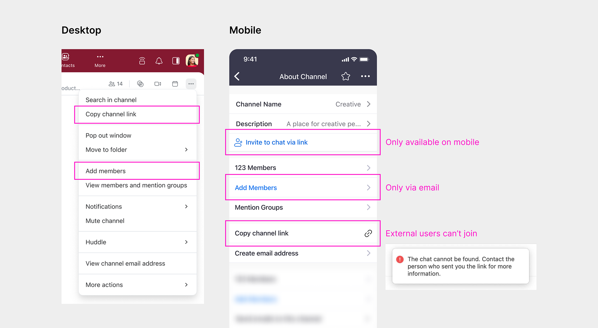
How the experience fell short
🧩 Fragmentation
Invite links were only available on mobile, and the join experience varied across platforms.
Invite links were only available on mobile, and the join experience varied across platforms.
😶🌫️ Hidden logic
External users couldn't use channel links, and there was no explanation for why.
External users couldn't use channel links, and there was no explanation for why.
📆 Expiration
Links were generated for every user and automatically expired after 30 days, making them unreliable for later reference and hindering the potential for community growth.
Links were generated for every user and automatically expired after 30 days, making them unreliable for later reference and hindering the potential for community growth.
📵 No QR code
Unlike competitors, Zoom did not allow users to scan a QR code to join a channel.
Unlike competitors, Zoom did not allow users to scan a QR code to join a channel.

Looking at our competitors
Before setting our goals, I conducted a competitive analysis of our competitors. I found that most leading chat apps allow users to easily invite external participants via shareable links and offer a dedicated URL for ongoing access. They were also consistent across all platforms.
Diving deep into discovery
Before jumping into design solutions, I went deep into discovery to better define the exact problems that needed to be solved. I mapped out end-to-end flows, set priorities, and validated logical consistency with existing settings.
It became apparent that this would be a highly complex challenge, spanning numerous personas and touchpoints across Team Chat.
Weighted priorities
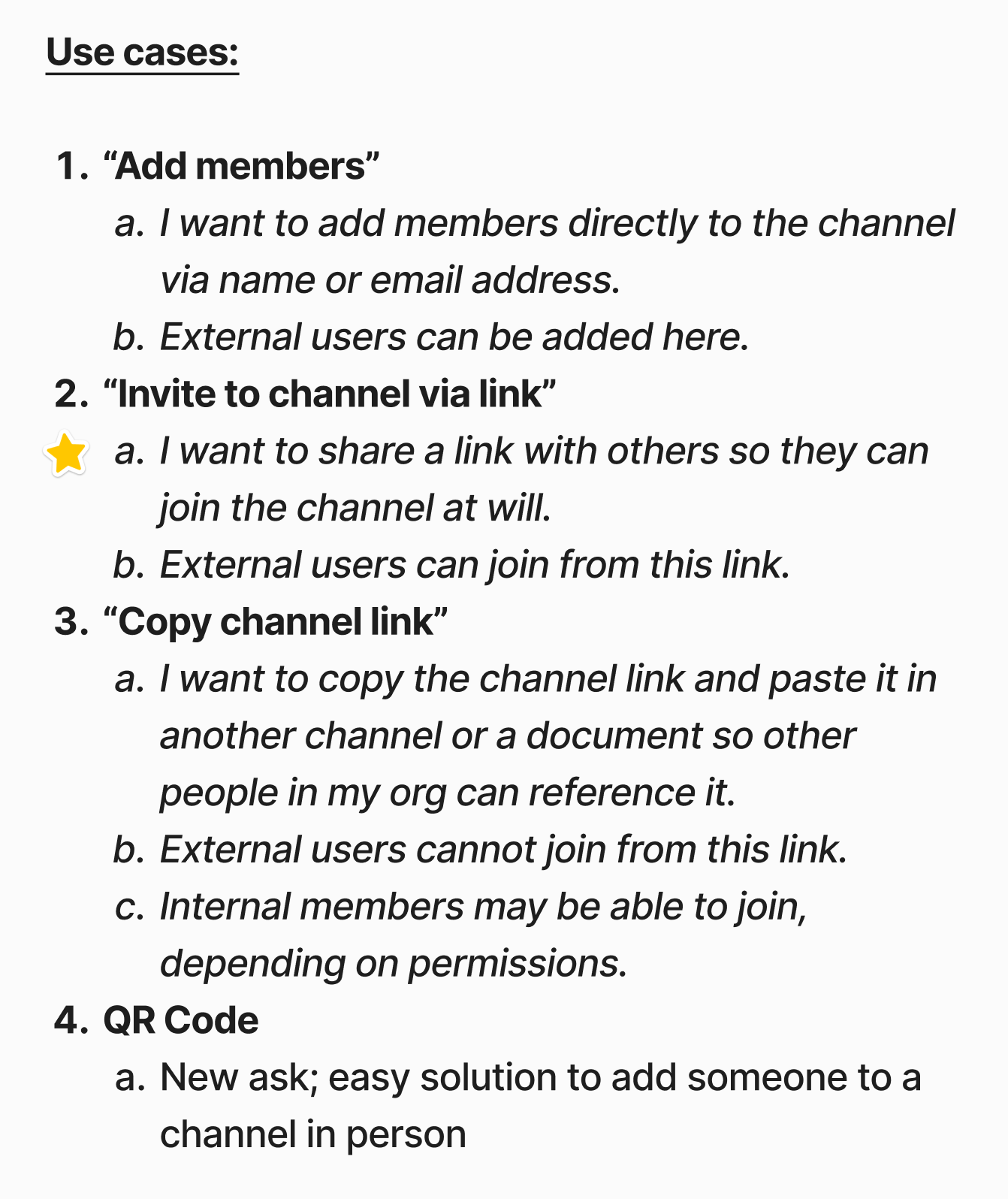
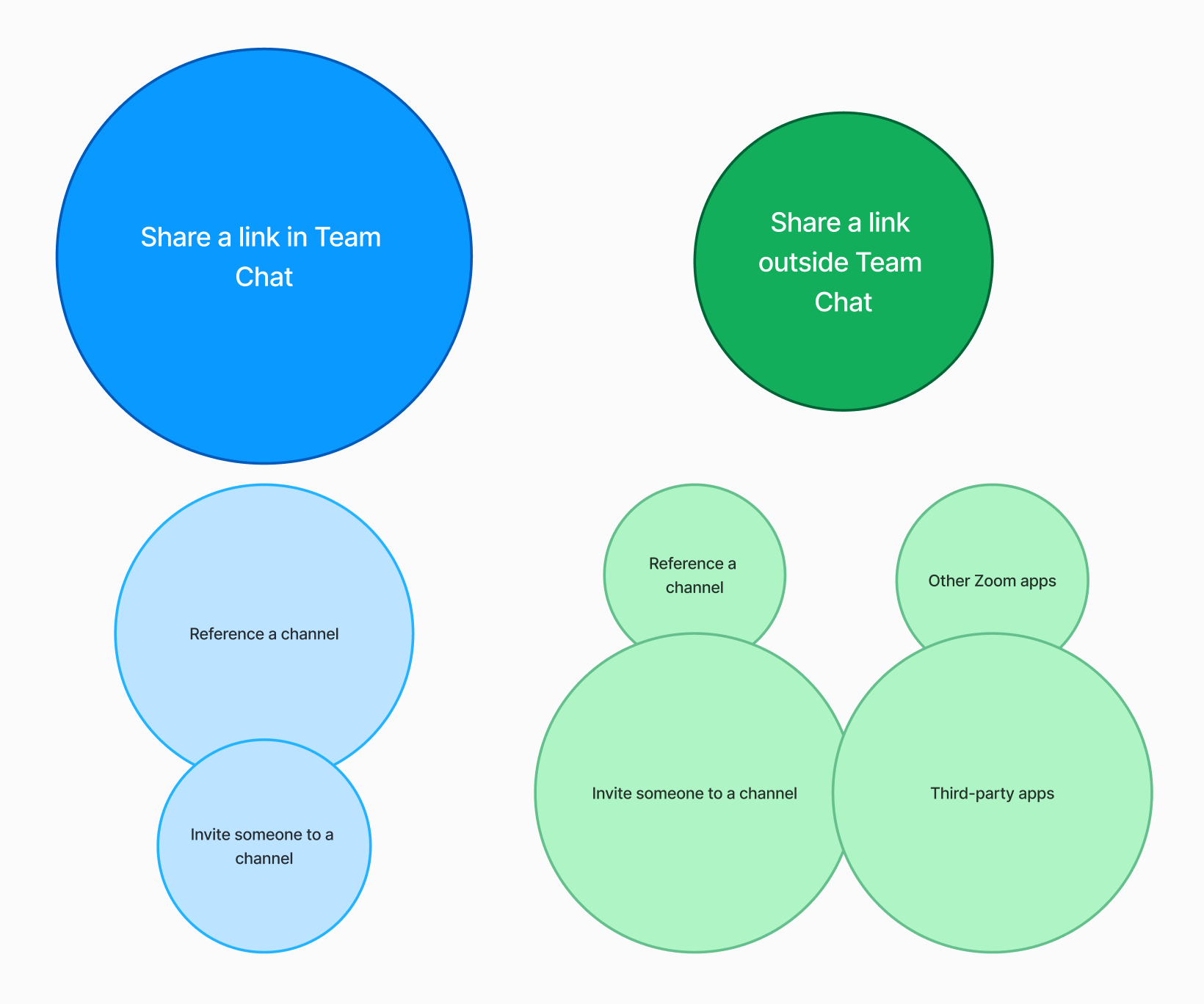
Use cases
Mapping the product

Public/private settings
During this process, I advocated for streamlining our experience down to a single shareable invite link that could be used for both reference and joining, meaning users wouldn't have to choose which link to use. I believed this would position our product as easier to use than our competitors.
However, due to concerns about legacy support, my partners advocated maintaining existing behavior. I ultimately conceded to maintain separate links for phase one, setting aside the streamlined concept for a potential future phase, depending on feedback.
For the time being, we focused our efforts on simplifying the invite link so it worked for everyone, all the time. I discussed this goal with our engineers, who produced a concept that dramatically simplified the invite link logic.
The result: No more broken links.

Design solutions
With our team aligned on the direction, I began exploring designs for the new and improved experience.
Goals
🚀 Frictionless
Every channel should have a single, persistent invite link that any member can share. The join experience should be consistent no matter the method or platform used.
Every channel should have a single, persistent invite link that any member can share. The join experience should be consistent no matter the method or platform used.
📸 QR code
Let users join the channel by scanning a QR code.
Let users join the channel by scanning a QR code.
🛡️ Owner control
The channel owner controls who can join, and they can manually reset the link and QR code if required.
The channel owner controls who can join, and they can manually reset the link and QR code if required.
🔗 Keep channel link
The existing channel link is widely used and consistent with competing products.
The existing channel link is widely used and consistent with competing products.
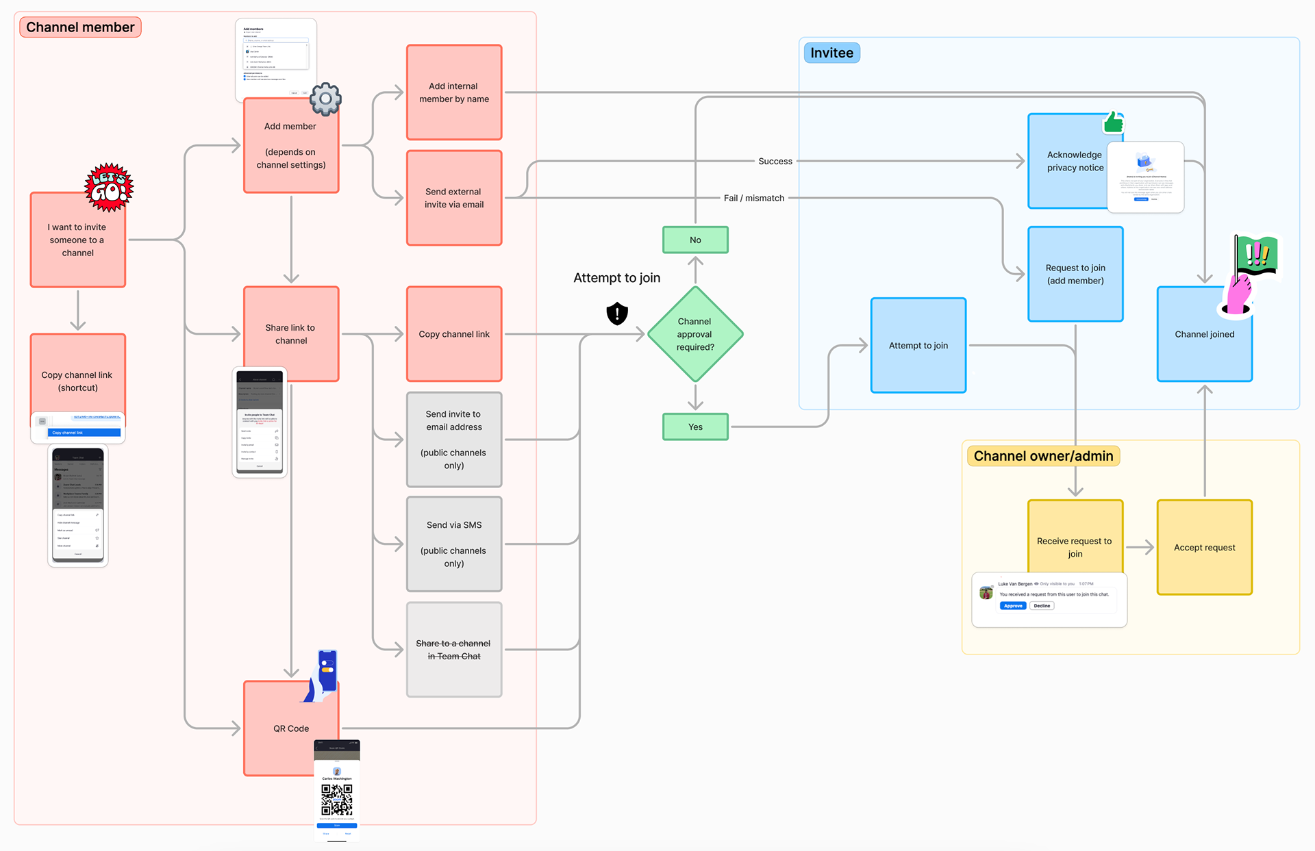
End-to-end journey across five surfaces
Our product area spanned five surfaces and three unique personas. I tackled each of these experiences individually while keeping in mind the broader end-to-end user journey.
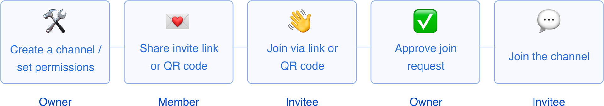
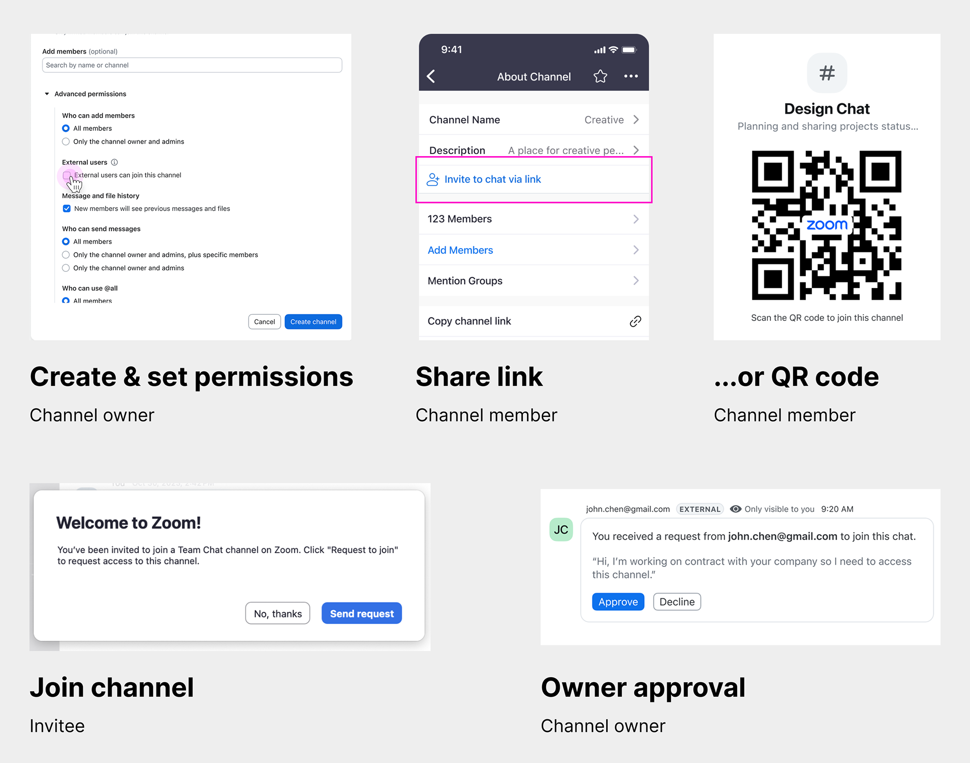
1. Owner sets channel permissions
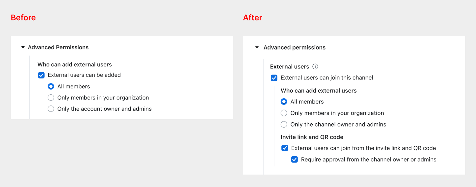
Problem: Owners required control over invite links and QR codes so they could manage who was allowed to join their channels. They also had to abide by all existing channel permissions.
Solution: I partnered with my product manager to define how this feature would interact with channel permissions. This process took several weeks of back-and-forth discussion due to the highly complex logic and potential for setting conflicts.
Ultimately, we settled on the simplest possible approach: invite links and QR codes could only be controlled for external users, and they were always on for internal users. To solve for this, I added a pair of checkboxes to the "External users" section, tweaking the formatting and content to improve clarity.
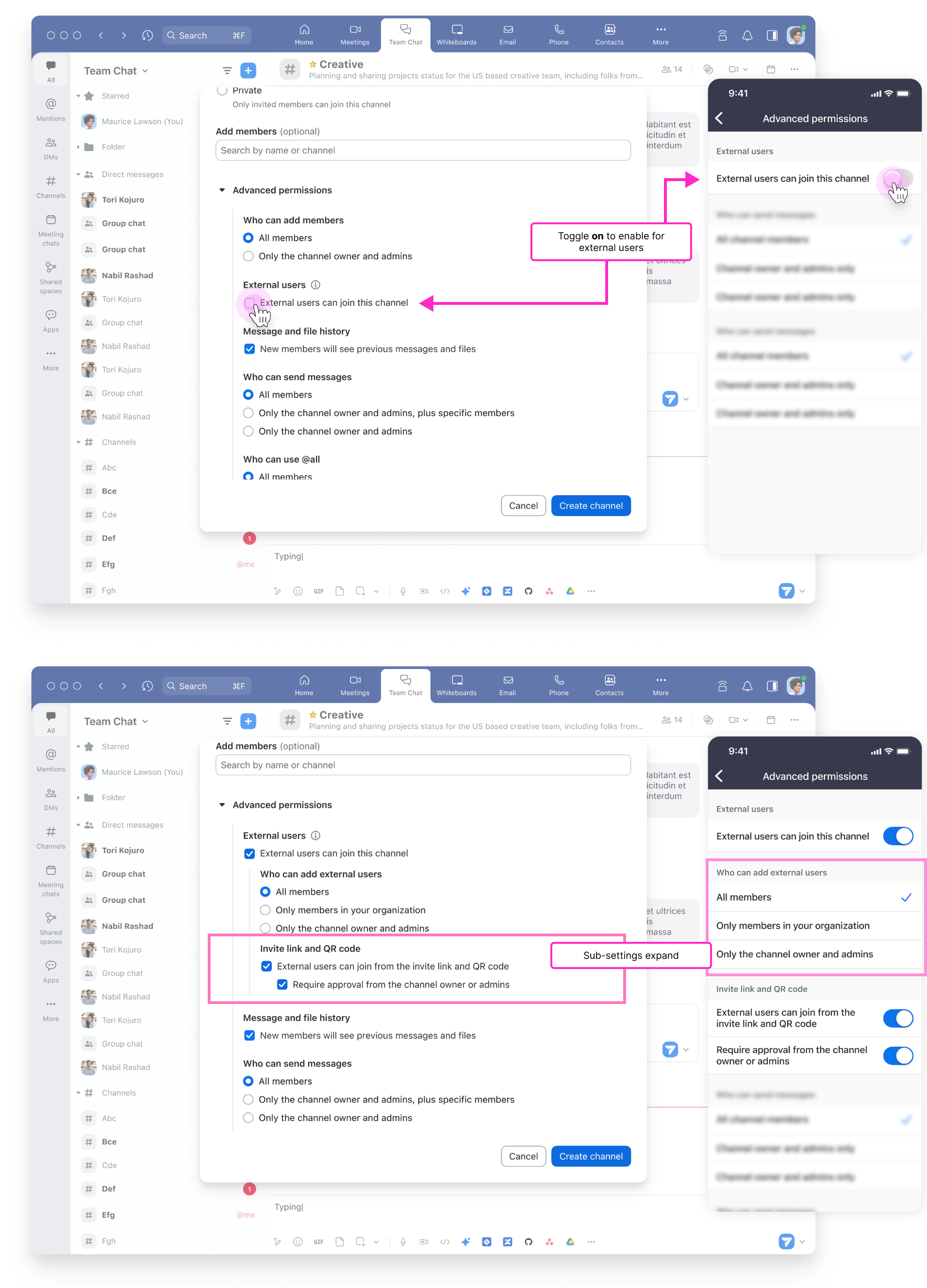
Result: The expanded settings give necessary control over how external users can join channels. This was the simplest possible implementation given the extreme constraints.
Reference sheet: setting interactions
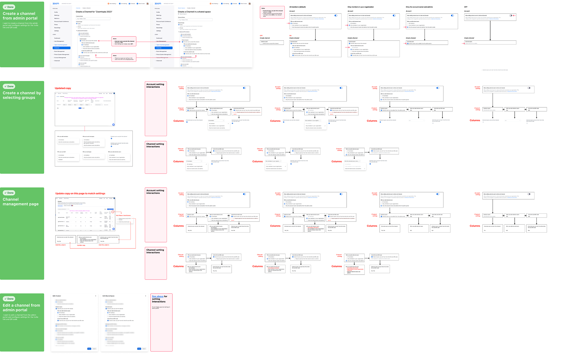
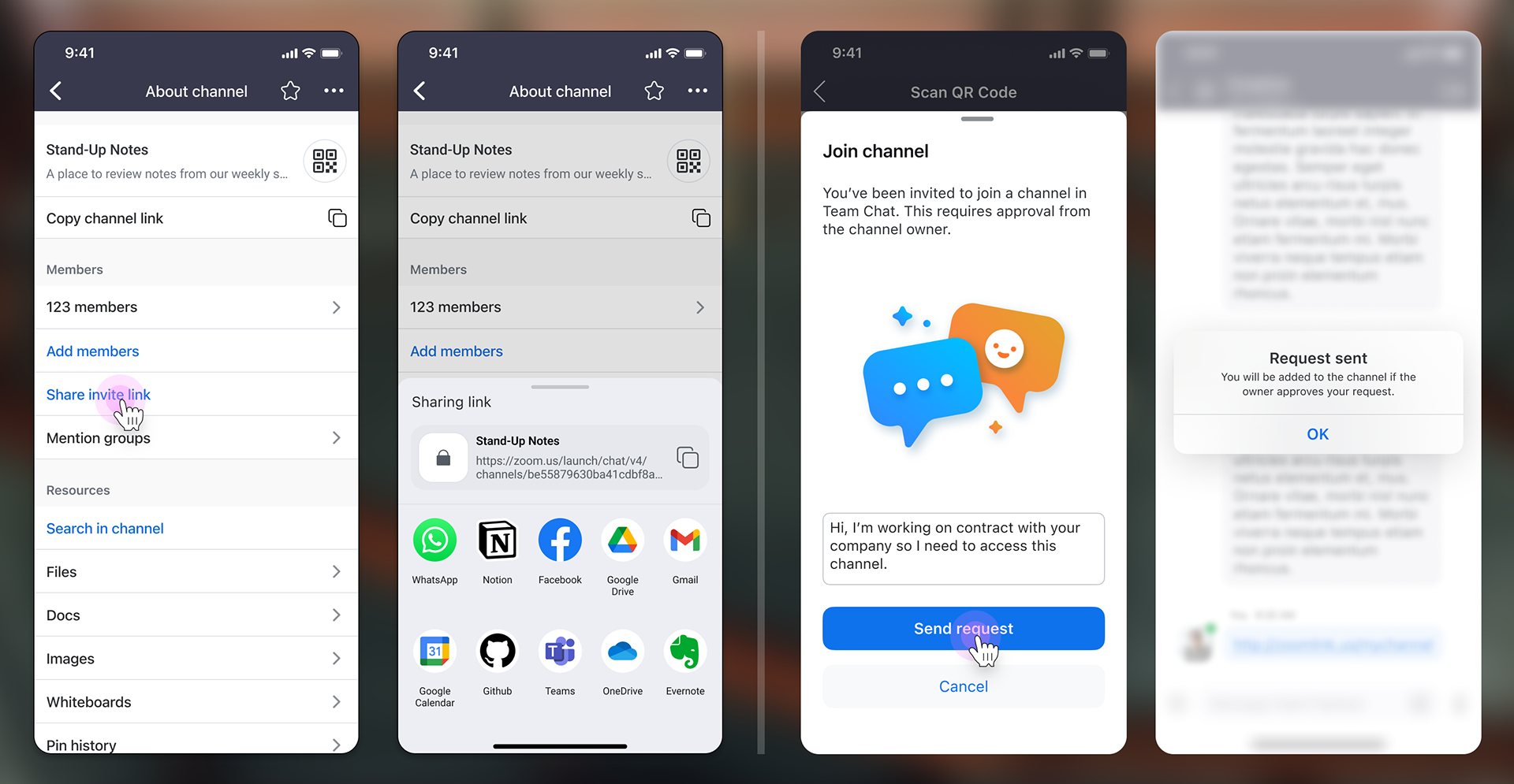
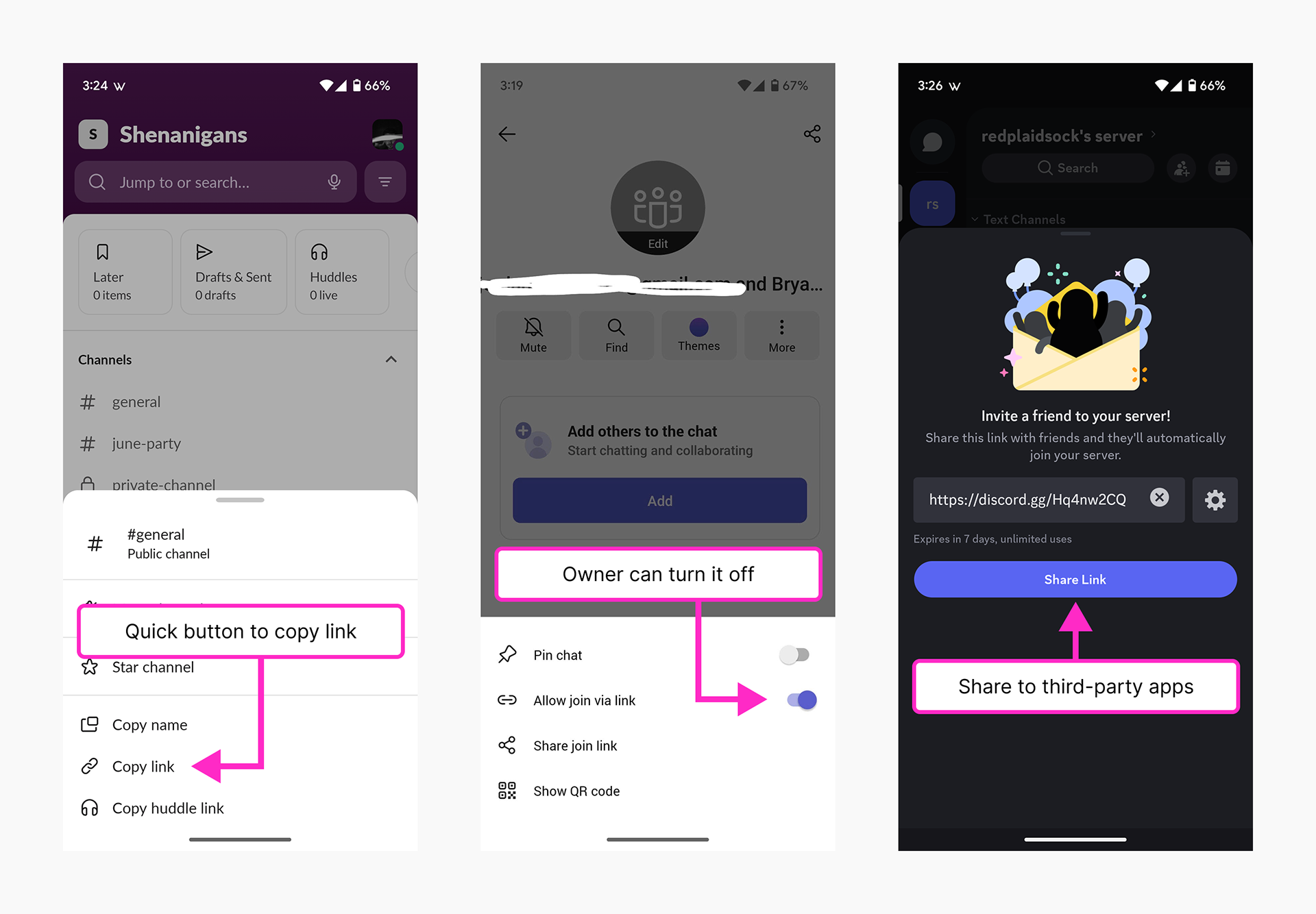
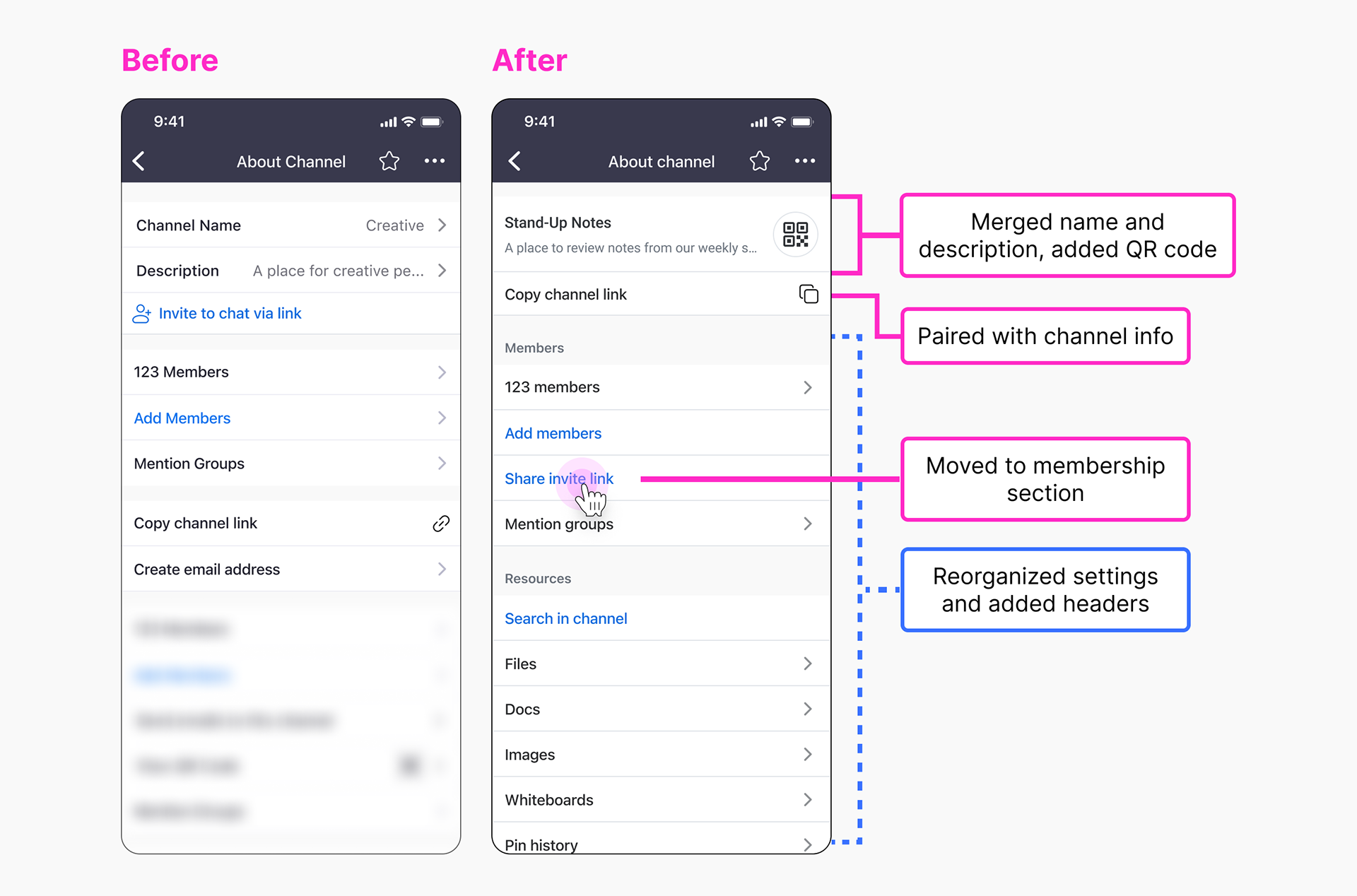
2. Member shares the invite link
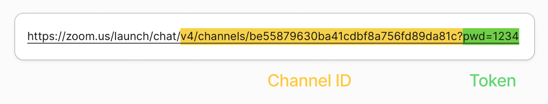
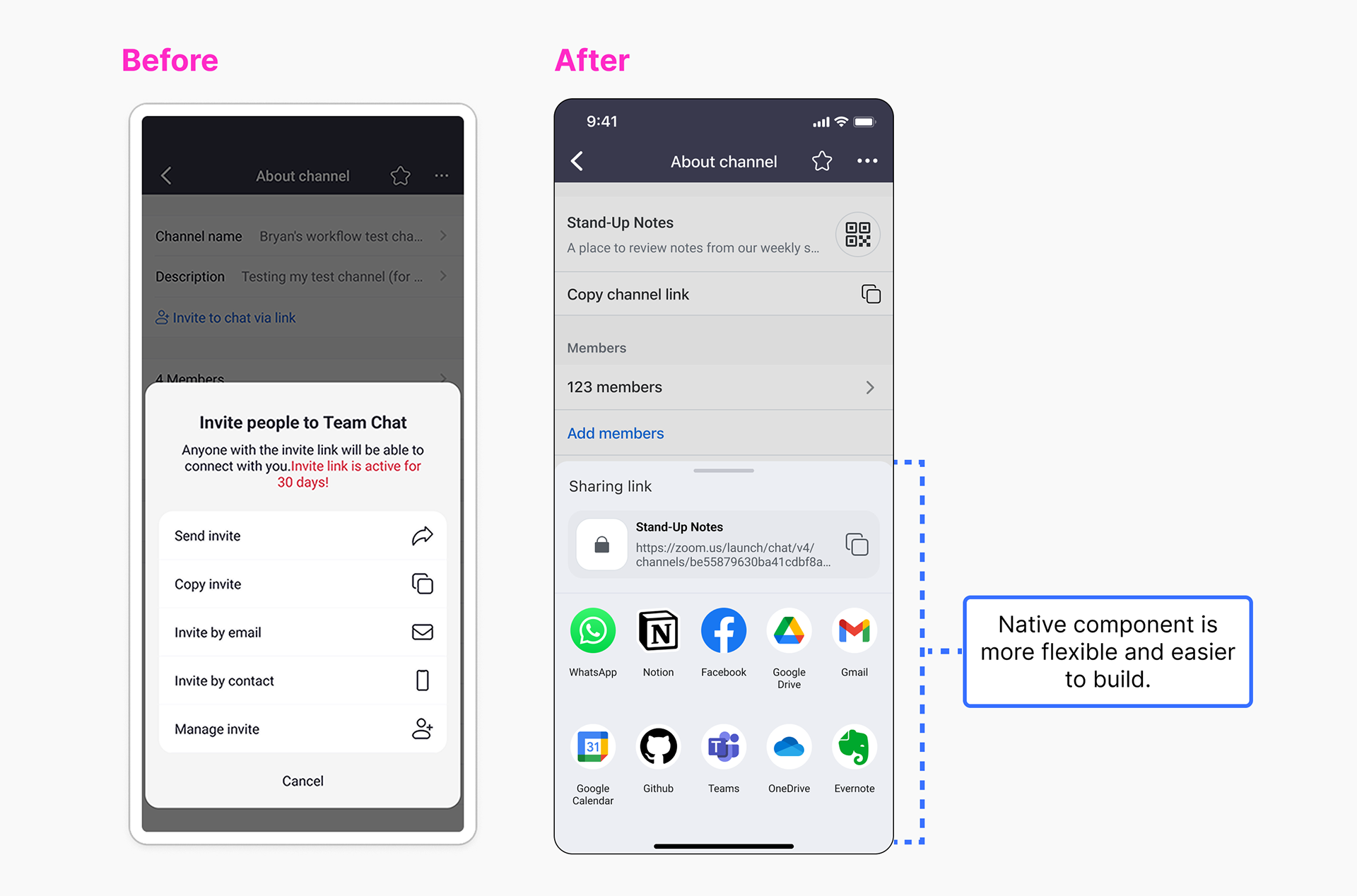
Problem: Users expected a single, consistent invite link that could easily be shared with others. However, the existing invite link was only usable when external users were allowed to join. This represented hidden logic. Furthermore, the share sheet featured a custom design that was difficult to maintain and restricted options for external sharing.
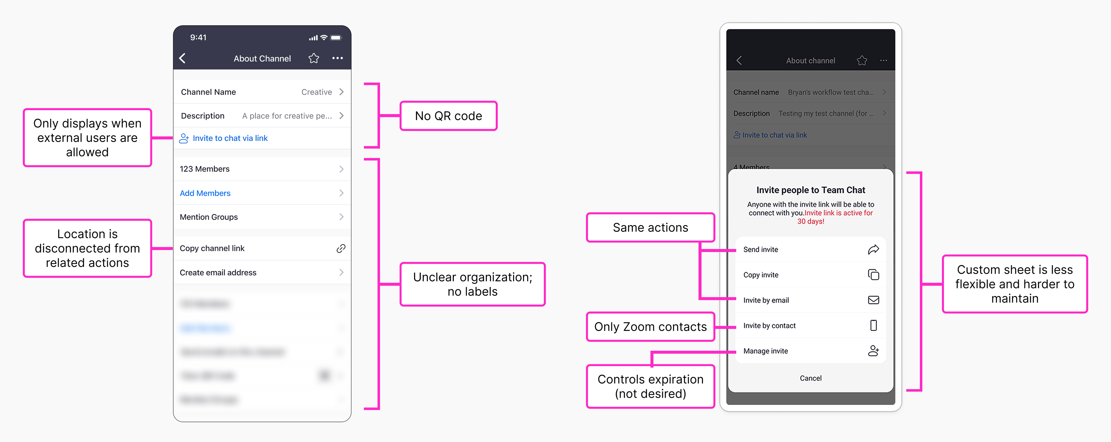
Solution: I took the initiative to reorganize the "About channel" page, creating a stronger distinction between the channel link and invite link. I explored several variations of this layout, reviewing them with my partners before settling on a final preferred solution.
– The invite link was moved to a new membership section, reinforcing its primary use for adding new members.
– The channel link was moved underneath the channel name and description, reinforcing its permanent status.
– Added section headers and reorganized the About page, adding logic and clarity to the setting groups.
Next, I replaced the custom share sheet with the native iOS/Android share sheet, enabling more flexible sharing options tailored to each user. Our engineering team greatly appreciated the added efficiency of using a native component, and users appreciated the more personalized, platform-consistent approach.
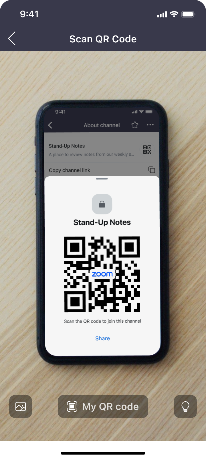
3. Show and scan the channel QR code
Problem: Users couldn't join channels via QR code, a feature our competitors all supported.
Solution: Thankfully, I previously worked on Zoom's personal QR code feature. This familiarity allowed me to quickly adapt the existing design to channels by replicating the QR code icon and modifying the resulting sheet.
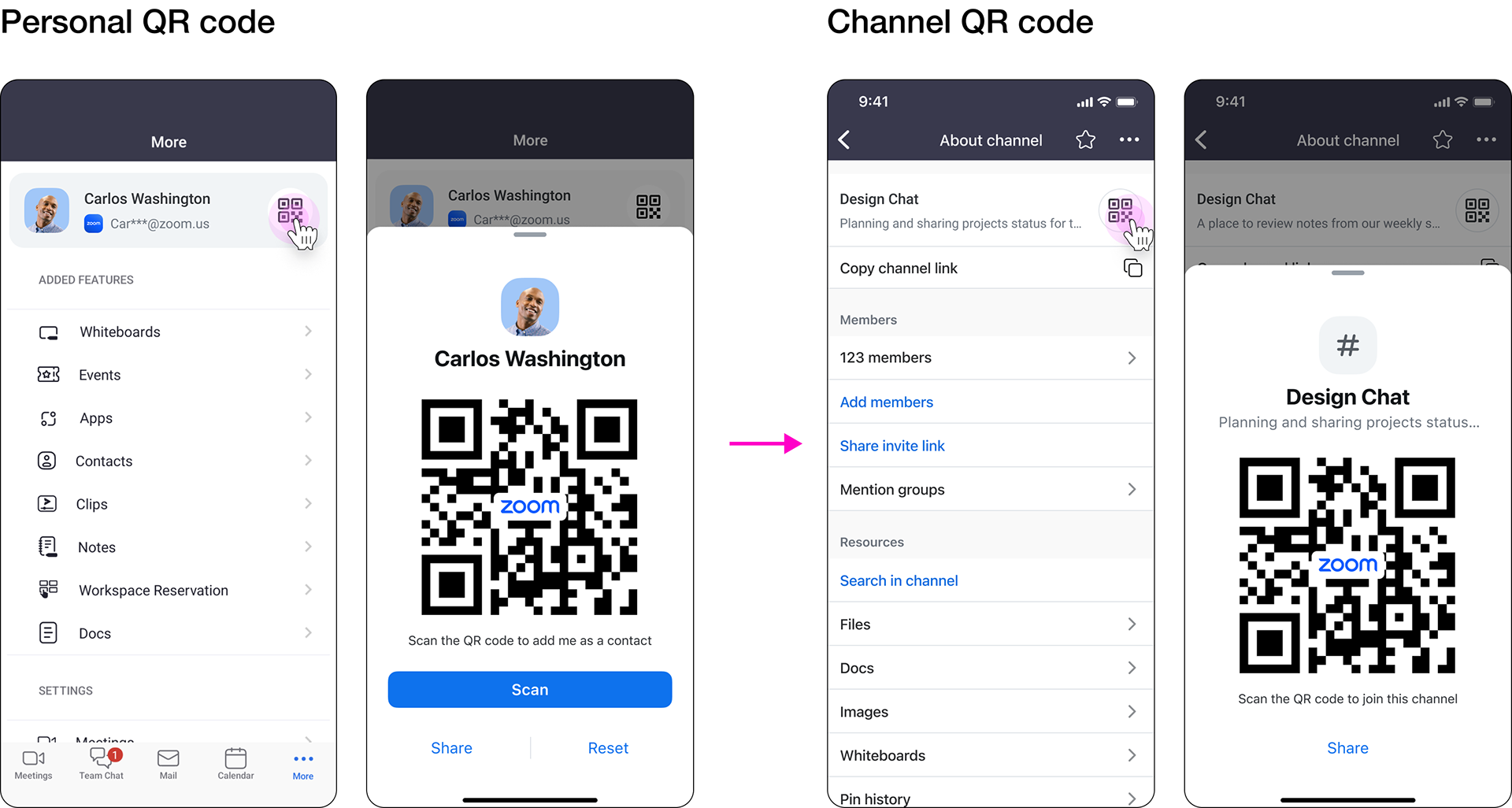
Example: Scan the QR code and send a join request.
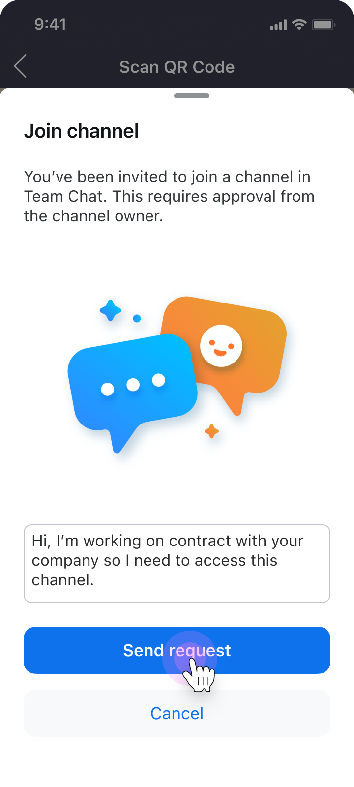
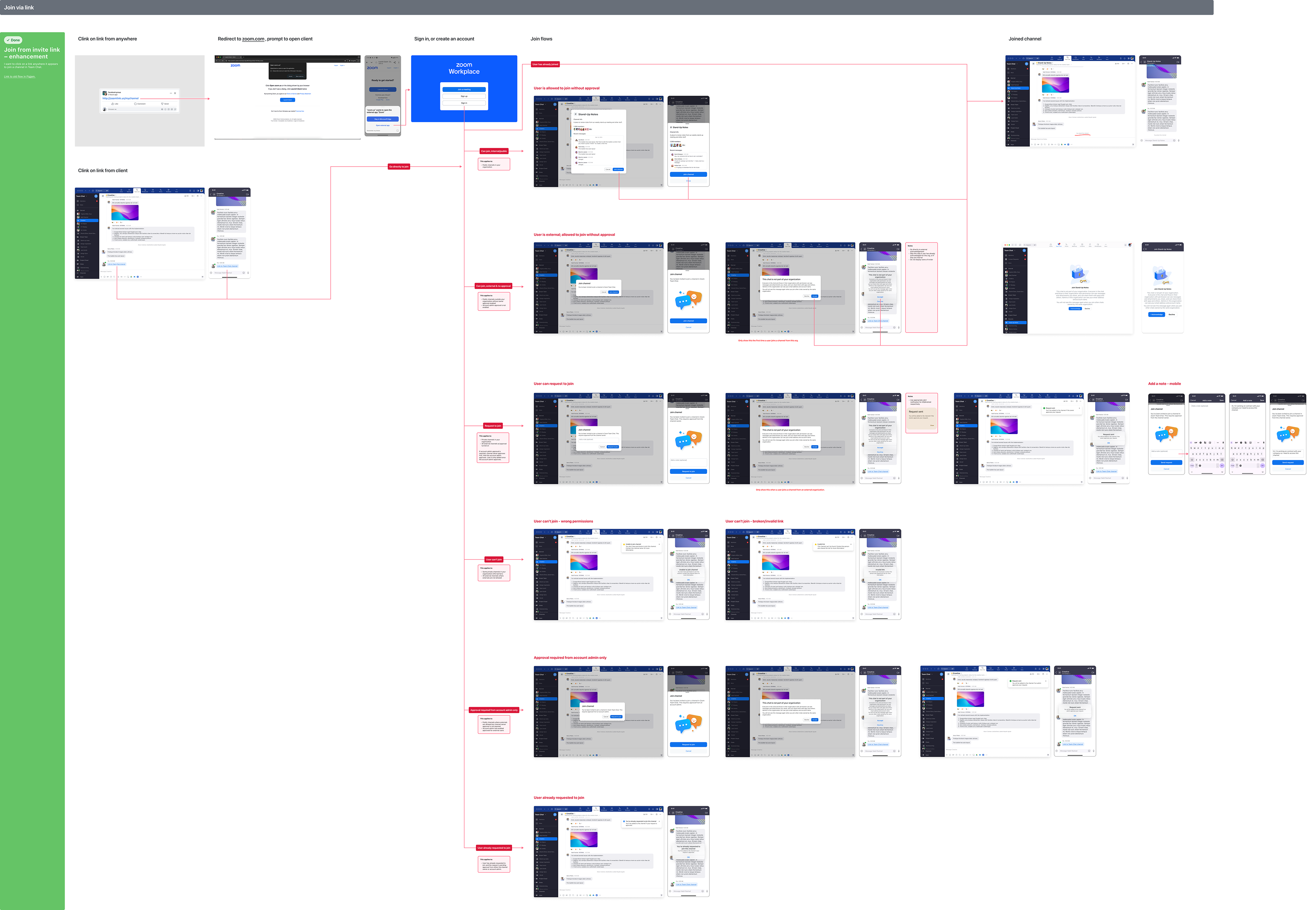
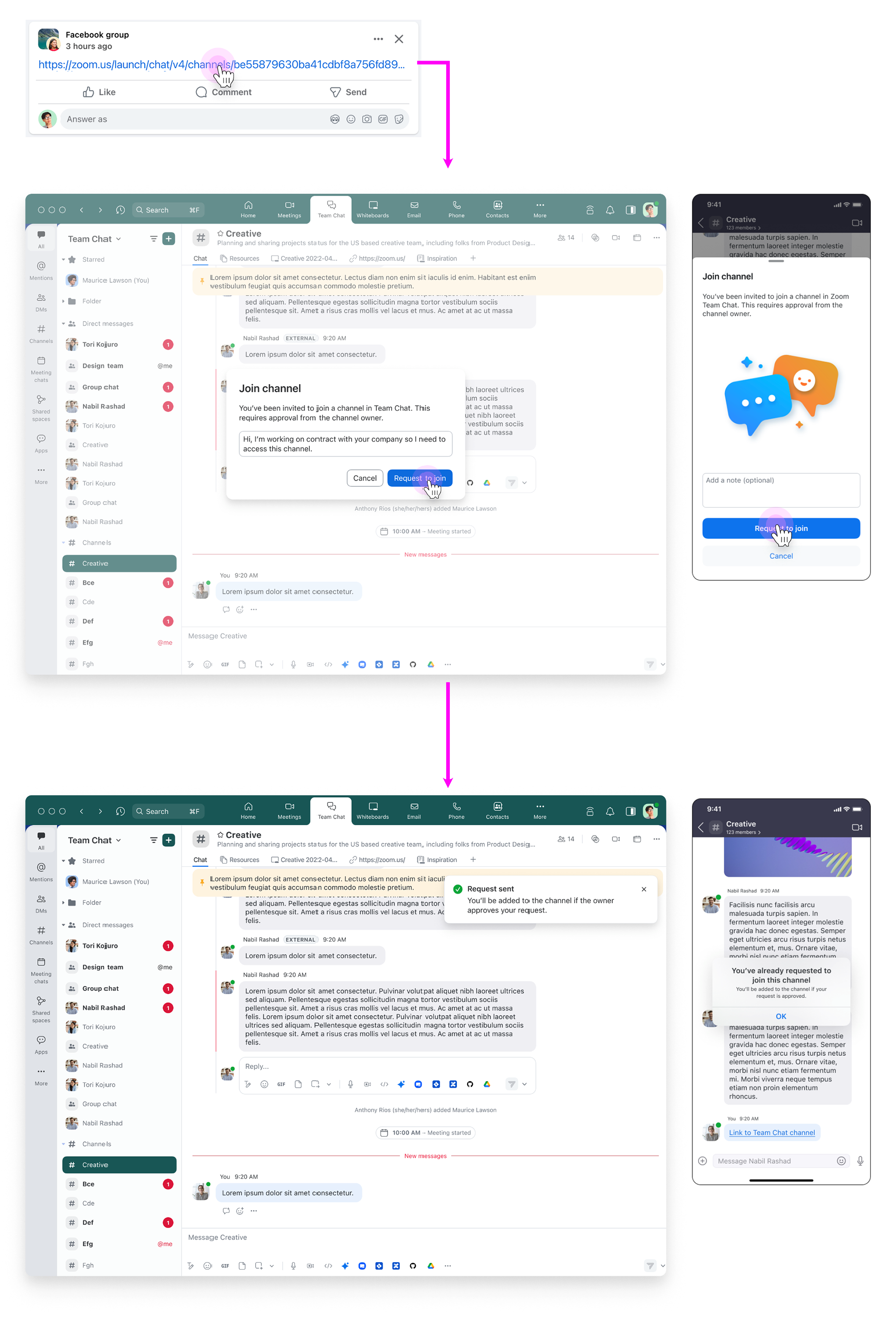
4. Join via link or QR code
Problem: The experience when joining from a channel link contained redundant steps, sloppy messaging, and was inconsistent between mobile and desktop.
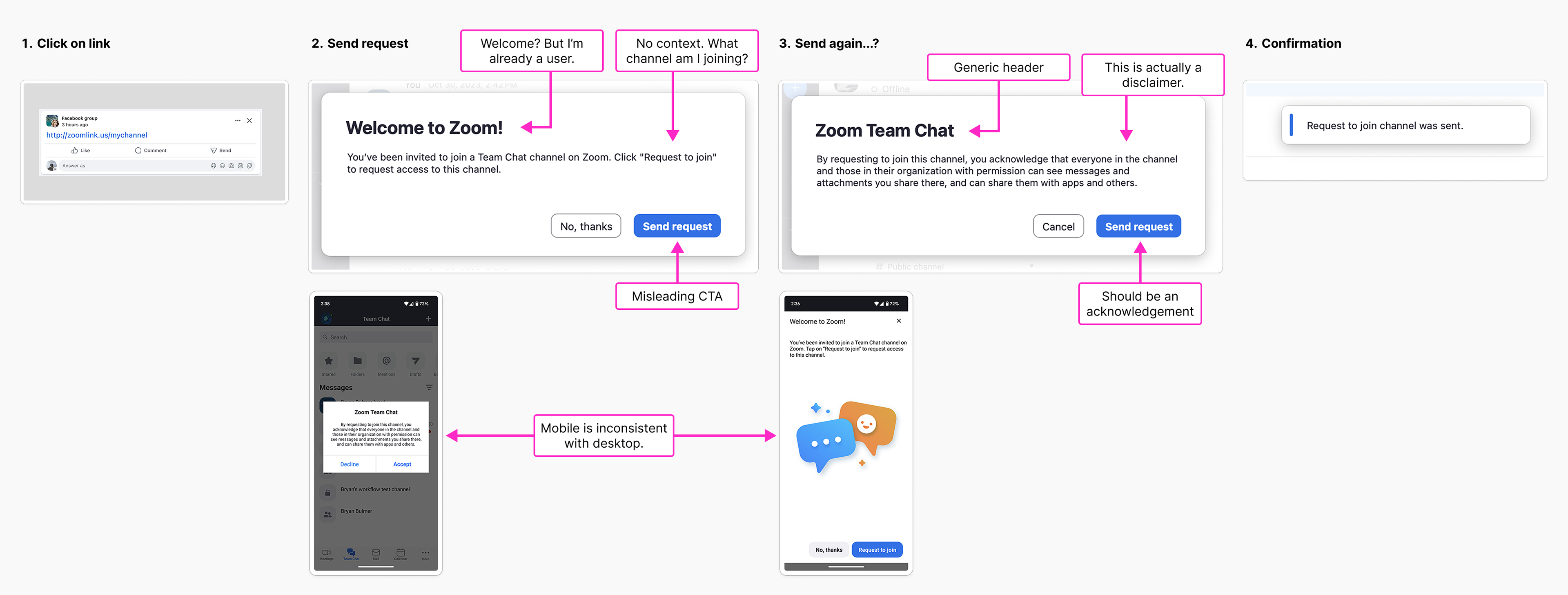
Solution: I mapped out every scenario across desktop and mobile, including flows for the QR code, consolidated unnecessary steps, and ensured each flow provided a consistent experience regardless of permissions or platform. Every invitee would know what channel they were joining and which actions were required.
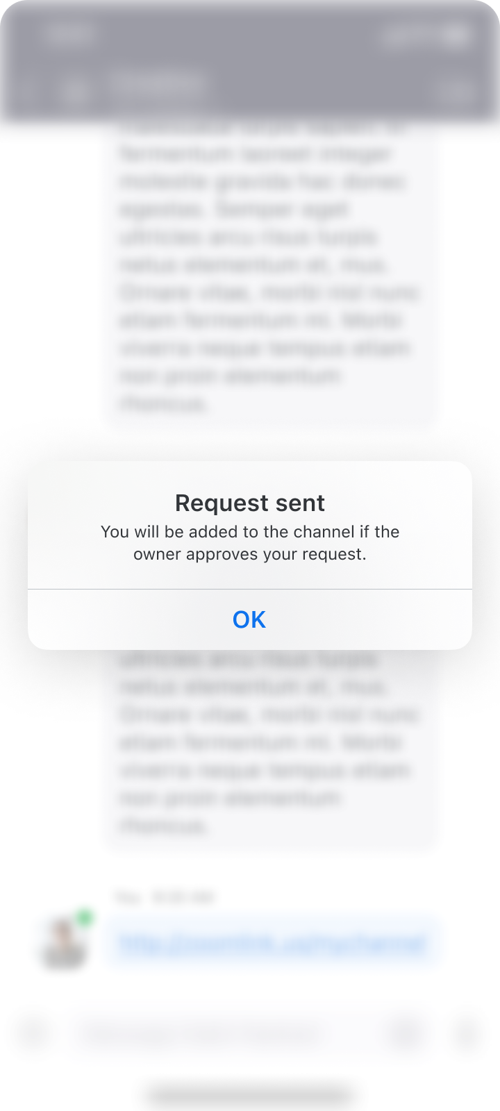
Result: Happy path for an external user.
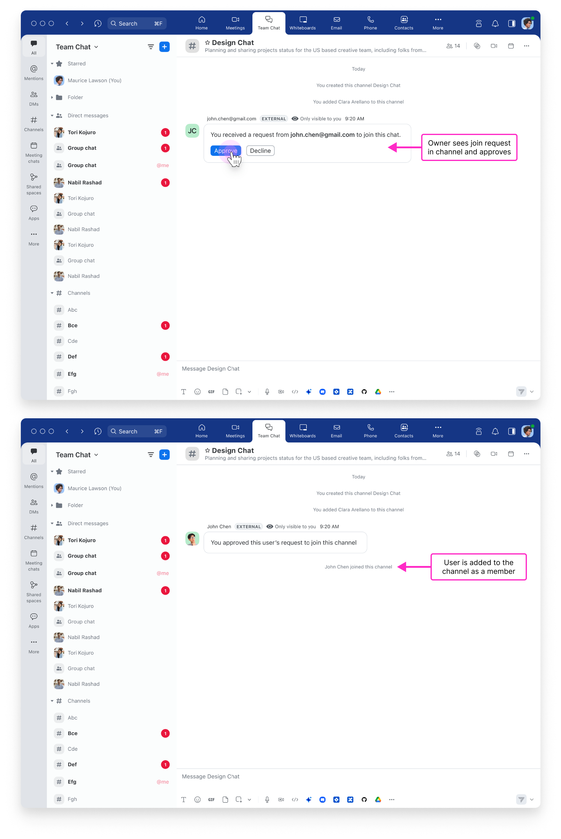
5. Channel owner approves
Problem: Channel owners must give approval for external users to join.
Solution: This experience had already been designed for Team Chat, so I simply had to factor it into the new join flows. Finally, something easy!

Video: key flows
In preparation for our product review, I built prototypes of key flows in Figma and then assembled them into a brief video using iMovie. The result was quick and dirty, but time was of the essence. The video helped illustrate the changes we made, earning the seal of approval from leadership.

What I learned
This project challenged me to lead through ambiguity across multiple platforms and personas, mostly without research support. I sharpened my ability to advocate for design decisions using intuition, competitive analysis, and close collaboration with PMs and engineers.
One key takeaway: My concept for streamlining the experience down to a single link became relevant again during final reviews when one of our leaders questioned the logic of users having to choose which link to share. In retrospect, while there was great hesitance amongst my team to drop one of the links, I could have advocated for running an experiment to test the concept.