Crowd-source ideas from a community of engaged customers
Led end-to-end design and strategy for a new community website that replaced ineffective third-party tools. My work simplified how customers share ideas while empowering teams with superior tools, helping them triage feedback and deliver meaningful improvements.
Highlights
– Conducted early generative research with stakeholders to uncover key pain points across legacy tools
– Simplified navigation to eliminate silos, reduce duplicates, and improve discoverability
– Added voting, moderation, and customizable branding
– This product is now used to collect feedback for products like Teams, Outlook, Xbox, and Copilot
Project details
Role
Product designer (UI/UX, strategy, components, accessibility, user interviews)
Product designer (UI/UX, strategy, components, accessibility, user interviews)
Platforms
Responsive web
Responsive web
Tools
Figma, Photoshop, pen & paper
Figma, Photoshop, pen & paper

How it all started
A few months after joining Microsoft on a long-term contract, I was shifted to a newly formed team to help design a new product. Working with a lead designer and a small team of product managers and engineers in a startup-like environment, we set out to build a new, unified community experience, laying the foundations for a product that could eventually be sold to other companies. Having previously worked at a startup, I was extremely eager to make my mark, own the front-end consumer experience, and launch a new product for a worldwide company.

Problem
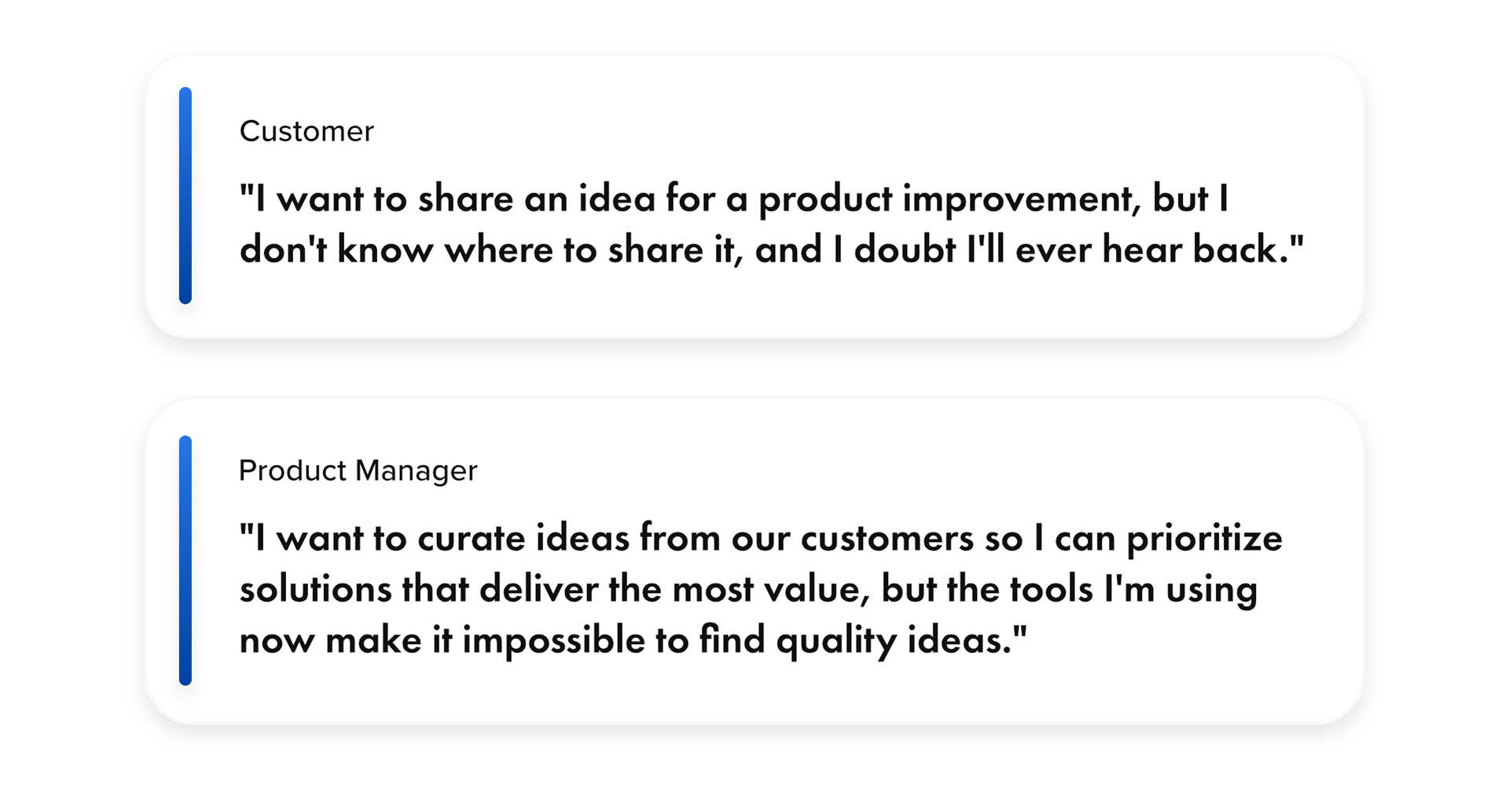
Microsoft relied on a patchwork of outdated feedback tools to gather feedback from customers. These tools were disjointed, hard to use, and ineffective at surfacing valuable insights. Customers often submitted duplicate or miscategorized ideas, product teams struggled to triage and act on feedback, and engagement declined due to a lack of visibility and follow-up.
Goals
✴️ Replace ineffective tools
Design an improved community where customers can share their ideas for product improvements and vote on ideas from other users.
Design an improved community where customers can share their ideas for product improvements and vote on ideas from other users.
⚙️ Easy to manage
Make it easier for companies to review, moderate, and triage ideas to prioritize the most valuable product improvements demanded by their customers.
Make it easier for companies to review, moderate, and triage ideas to prioritize the most valuable product improvements demanded by their customers.
📈 Drive meaningful improvements
With the help of this new experience, we expect to deliver meaningful product improvements to Microsoft customers.
With the help of this new experience, we expect to deliver meaningful product improvements to Microsoft customers.
💵 Sell to other companies
Ultimately, we hoped to scale this product beyond ideas and sell it as a template, allowing other companies to build communities for their own customers.
Ultimately, we hoped to scale this product beyond ideas and sell it as a template, allowing other companies to build communities for their own customers.

Uncovering problems via research
Before anything went into code, I partnered with a fellow designer to conduct focus group interviews with stakeholders at Microsoft. These interviews uncovered fundamental issues with the products they used:
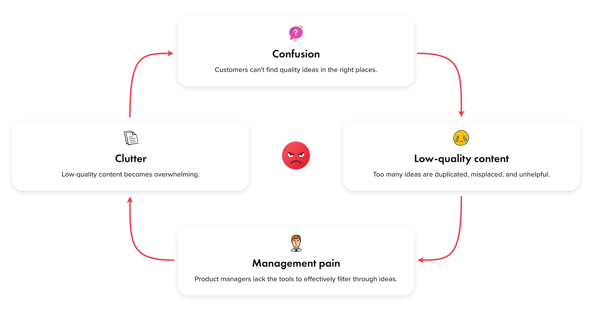
🗑️ Clutter
Customers tended to post new ideas rather than vote on existing ideas, which led to a buildup of clutter—duplicates, low-quality, and misplaced ideas.
Customers tended to post new ideas rather than vote on existing ideas, which led to a buildup of clutter—duplicates, low-quality, and misplaced ideas.
😓 Management pain
Product managers lacked effective tools to sort through this clutter and respond to the most valuable ideas.
Product managers lacked effective tools to sort through this clutter and respond to the most valuable ideas.
📣 Lack of feedback
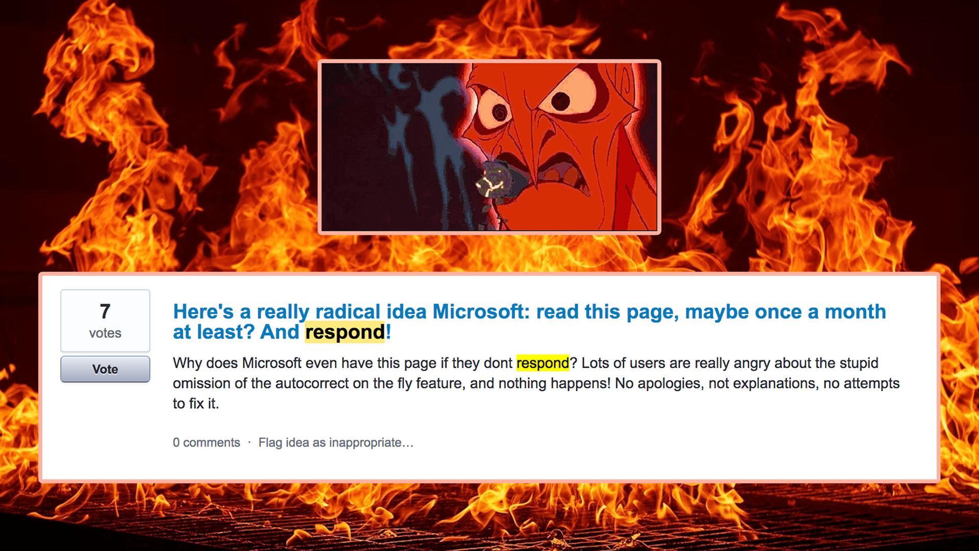
Customers felt ignored because their ideas were not being responded to.
Customers felt ignored because their ideas were not being responded to.
🤬 Negative perception
As these issues compounded, customers began to lose faith in the product, thus damaging its value and potential impact.
As these issues compounded, customers began to lose faith in the product, thus damaging its value and potential impact.
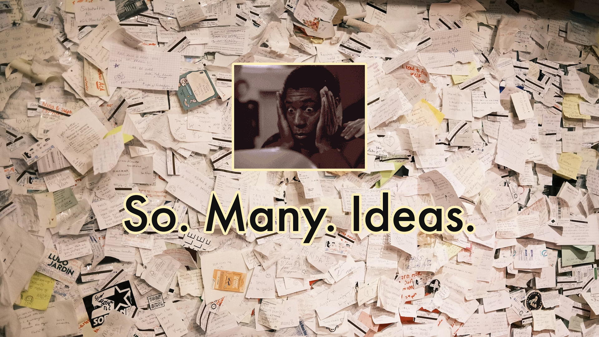
Emotional cost
These problems created a downward spiral. In some forums, over 10,000 ideas were posted without a response. Customers were furious at the lack of feedback, causing them to lose trust in the company. It was like throwing ideas into a black hole.
Not good, folks.

Imagining a better community
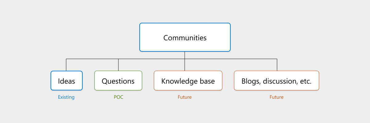
To address Microsoft’s fragmented feedback experience, we aimed to build a new community product from the ground up, starting with a lightweight, testable MVP. The vision was simple: create an intuitive, scalable, and customizable web experience that could replace outdated tools across Microsoft and eventually be sold to external companies.
As this vision developed, our leadership realized that Ideas alone wasn't enough. They urged us to expand beyond ideas into a self-service hub that would better fit under the Dynamics 365 umbrella. Now it was a true challenge—the MVP had to scale seamlessly to future topics without a drastic redesign.
As the sole designer in charge of the customer-facing experience, it was up to me to define the front-end UI, account for accessibility, and collaborate with researchers and engineers to validate early concepts.
It was a challenge, but one I was up for.
I completed the first MVP design sprint in just a few weeks, which allowed us to test real workflows with users and identify key usability issues.
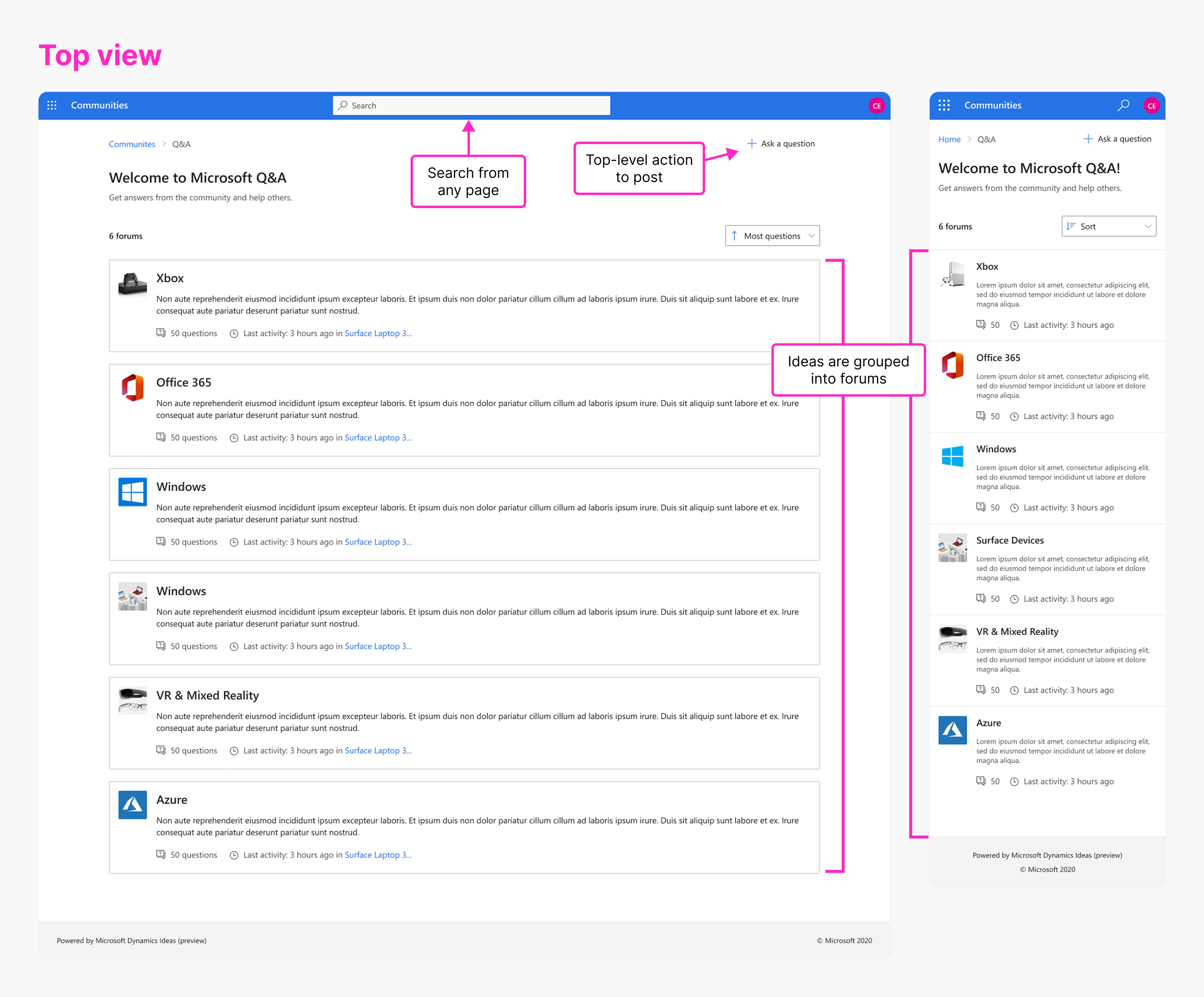
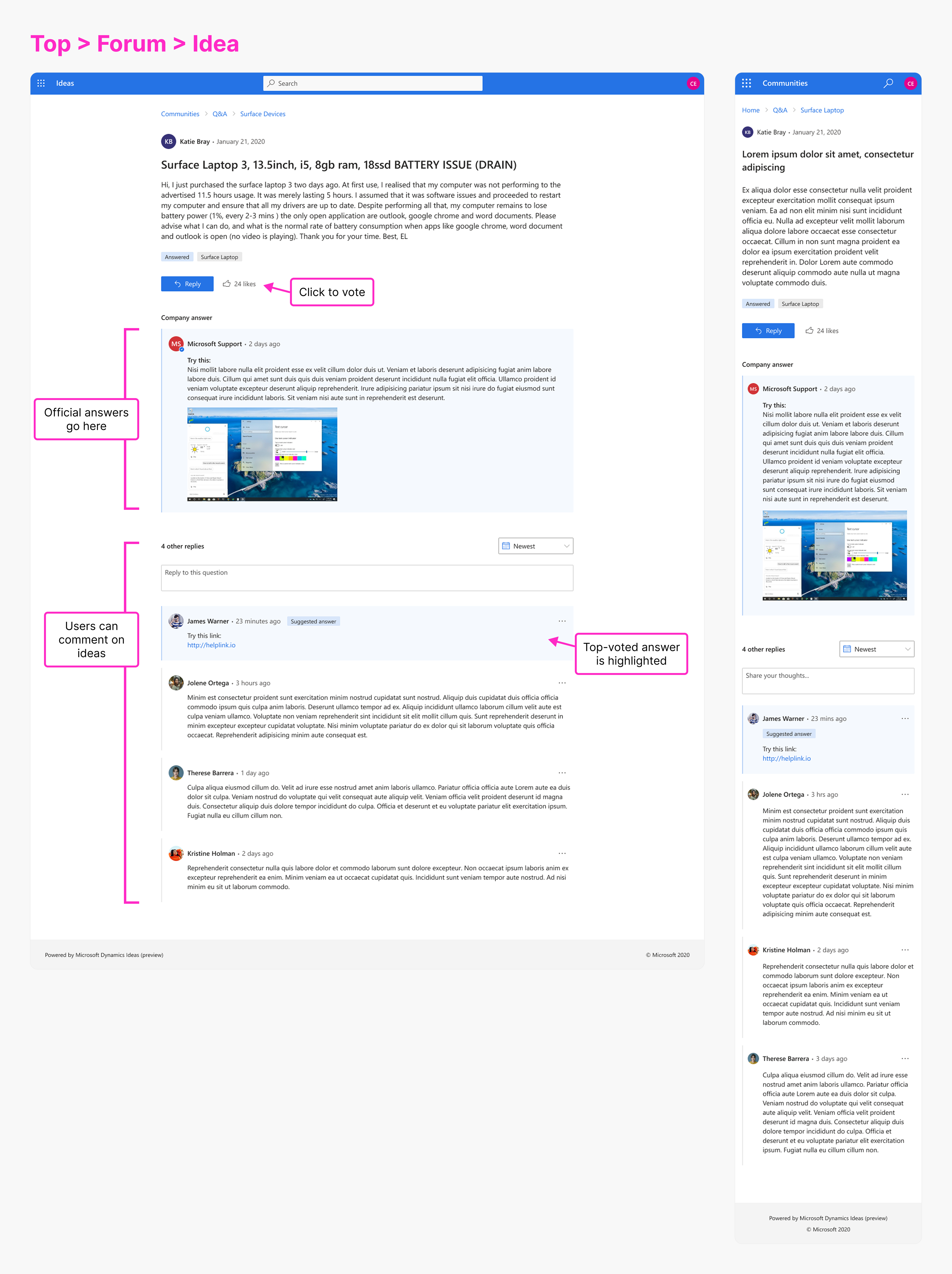
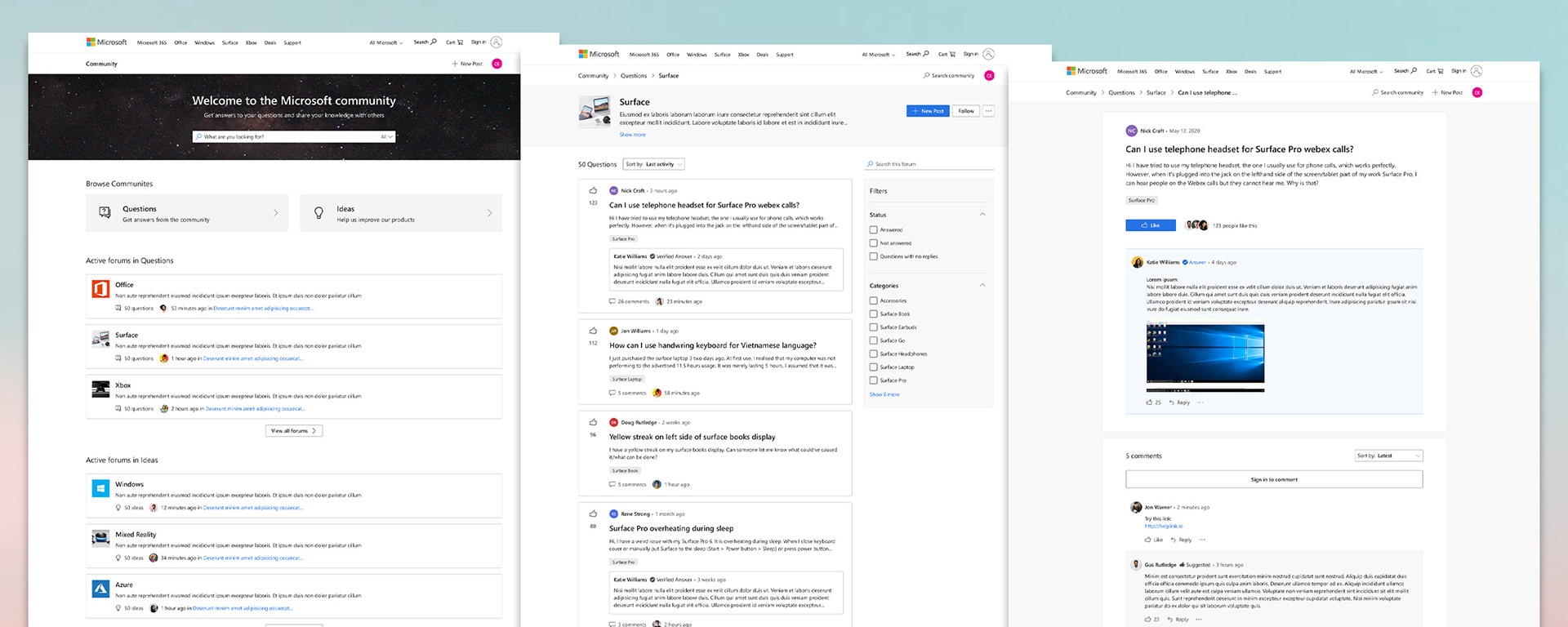
🧭 Simplifying navigation to make ideas more discoverable
Problem: Competing products had excessive navigation, separating ideas into a complex hierarchy of siloed categories. Customers were forced to choose a category when posting a new idea, but many didn't know which categories to select. Their ideas were inevitably submitted in the wrong forums, disappearing into the ether of the internet, never to be seen again (or at least by the right stakeholders). Even worse, the restrictions of the Dynamics platform prevented us from transferring ideas to different forums without erasing all votes and comments.
The end result: Disorganization, a buildup of clutter, and users never getting the feedback they sought.
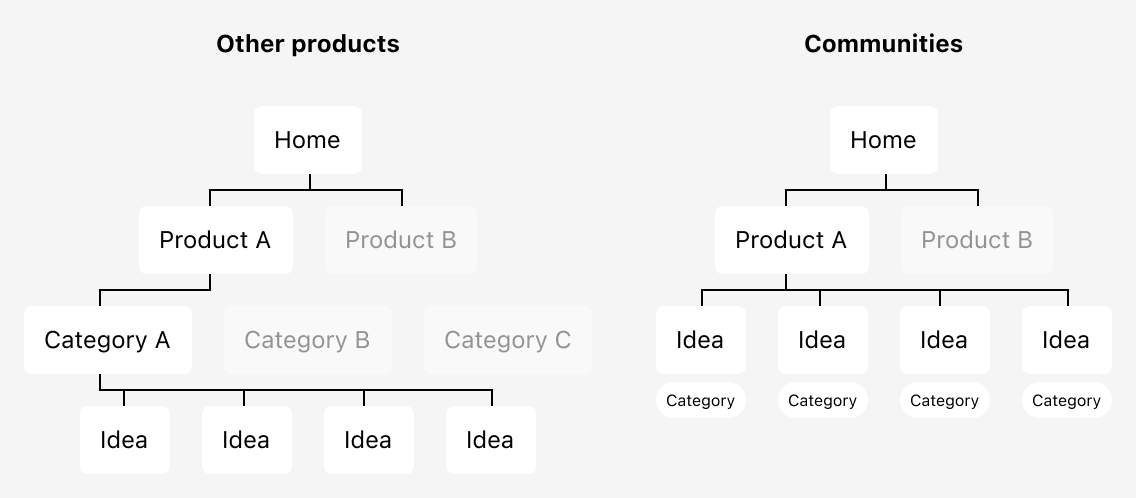
Solution: I recognized this as a structural issue. To prevent ideas from becoming miscategorized and lost, I flattened the hierarchy and implemented simple filters, allowing users to easily narrow down results without having to navigate away. While this change required merging multiple topics, it prevented ideas from becoming lost—a compromise we believed was worthwhile.
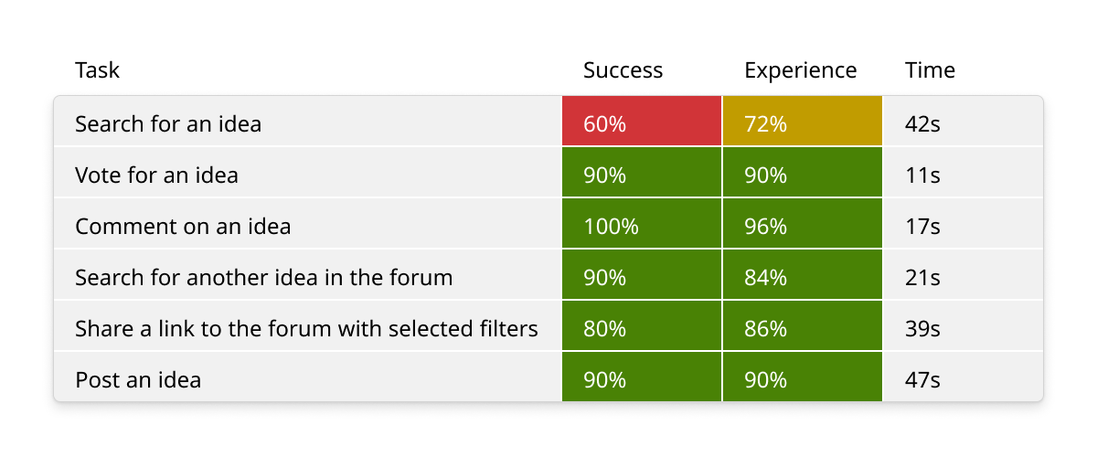
📈 Benchmark testing
With the MVP in hand, I partnered with a user researcher to conduct a benchmark tests of the experience. Participants were strictly screened and recruited via UserTesting. They ran through a series of simple, unguided tasks until they either succeeded or gave up. After each task, they were asked to rate the quality of the experience.
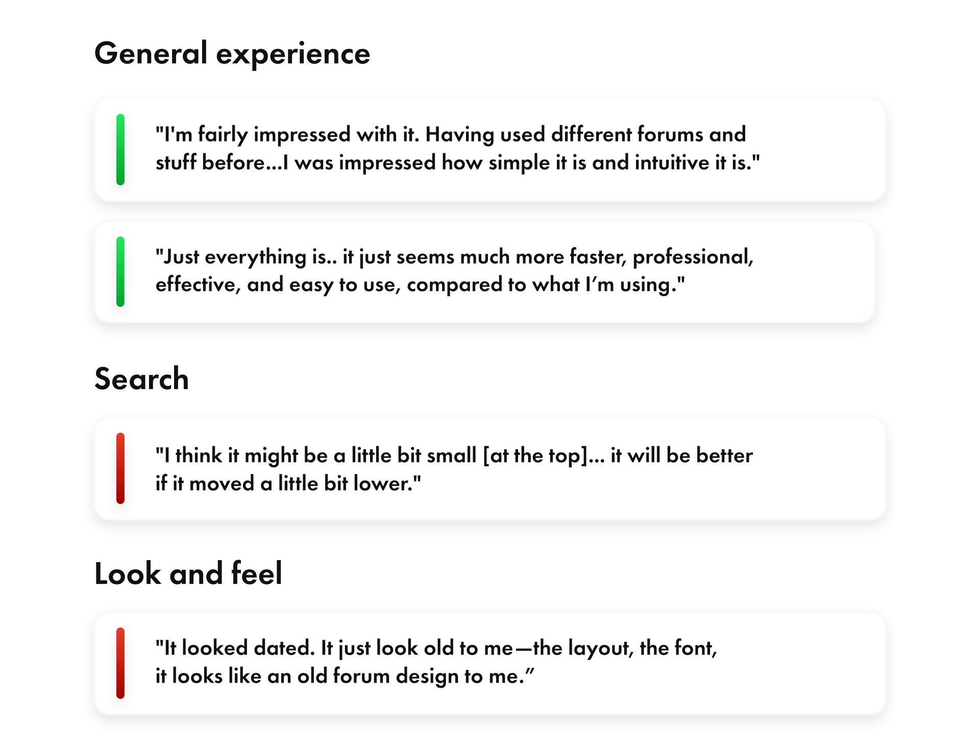
Result: I was pleased to see results that were overwhelmingly positive—far above the average score for our product org. More importantly, we identified search as an area for improvement.
Some users also complained about the UI, saying it felt generic and dated. At the time, I feared we'd create too much of a "branded" experience if we strayed too far from Fluent components. In retrospect, I wish I had focused more on this issue, as I am not fully satisfied with the look and feel of the final product.

Next stop: public preview
We had a long-term roadmap planned out for public preview and GA. Following our usability benchmark, I continued implementing new features and improvements in preparation for broader adoption. Key solutions included:
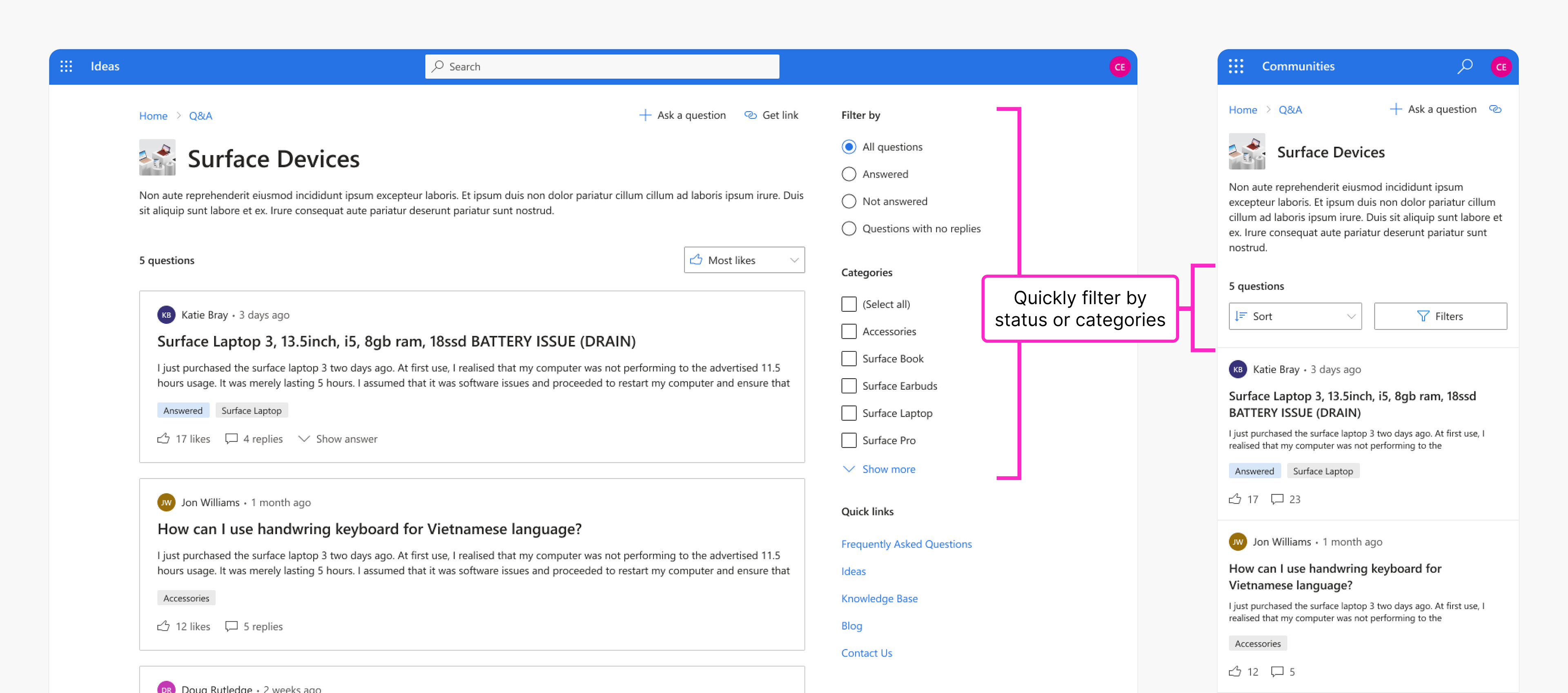
🔎 Improving search usability
Emphasized the search field to address low benchmark scores.
Emphasized the search field to address low benchmark scores.
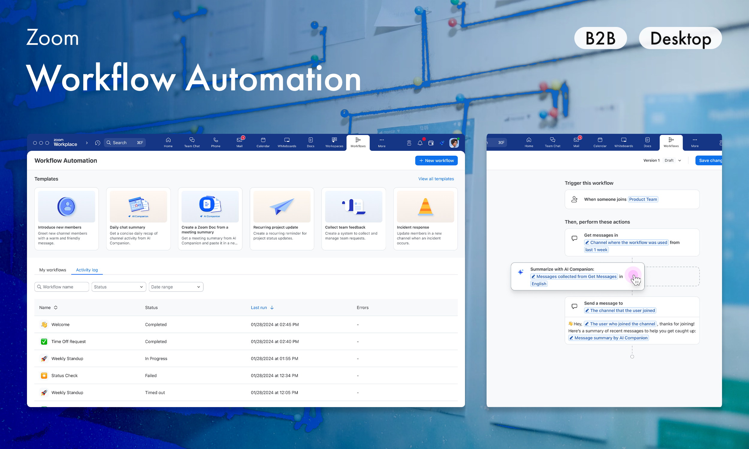
🗳️ Encouraging voting to reduce duplication
Guided users to vote on similar ideas before submitting new ones.
Guided users to vote on similar ideas before submitting new ones.
🛡️ Enhancing community safety
Introduced basic moderation tools.
Introduced basic moderation tools.
🎨 Enabling customization
Defined customizable UI elements that allowed third-party companies to brand and tailor the experience to their needs.
Defined customizable UI elements that allowed third-party companies to brand and tailor the experience to their needs.
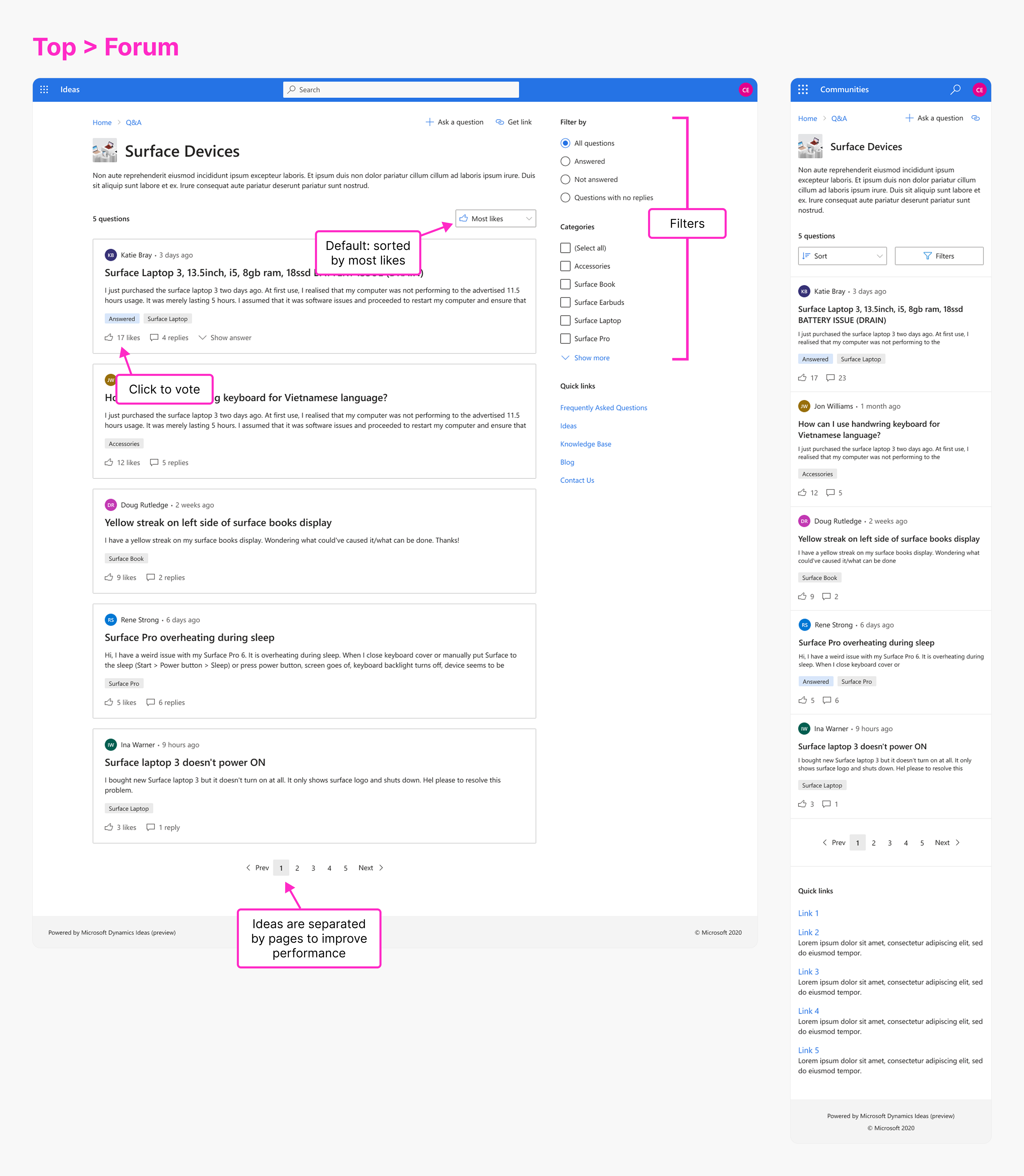
🔎 Improving search discoverability
Problem: Benchmarks showed that only 60% of participants successfully searched for an idea. If customers didn't search for ideas, they were less likely to find relevant content and more likely to post duplicates. Whatever happened, we couldn't afford to open another black hole of dissatisfaction.
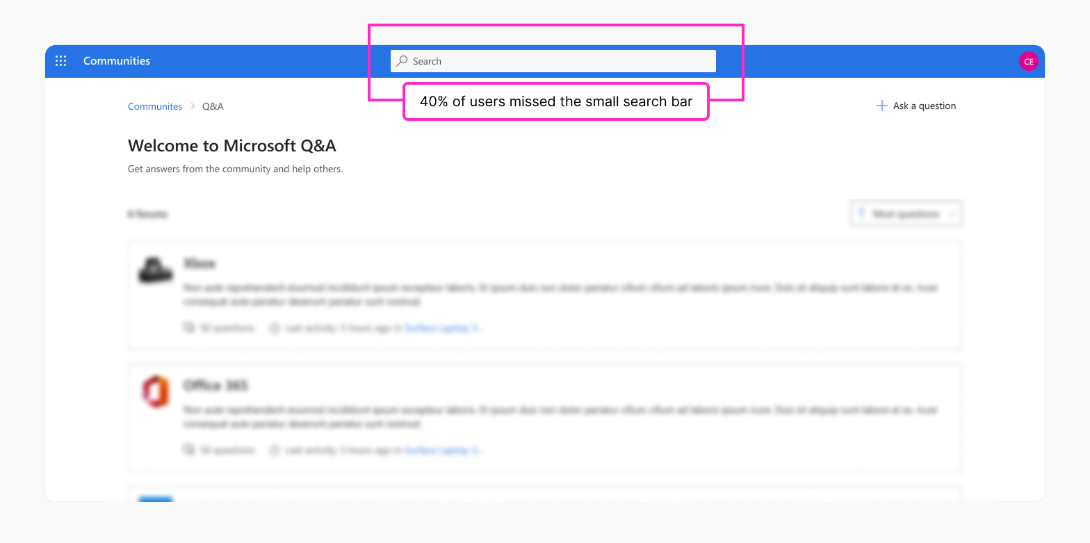
Solution: To resolve this issue, I prioritized making search more visible and accessible. I redesigned the search bar as a prominent welcome banner, placing it at the top of the page so it was the first thing users saw.
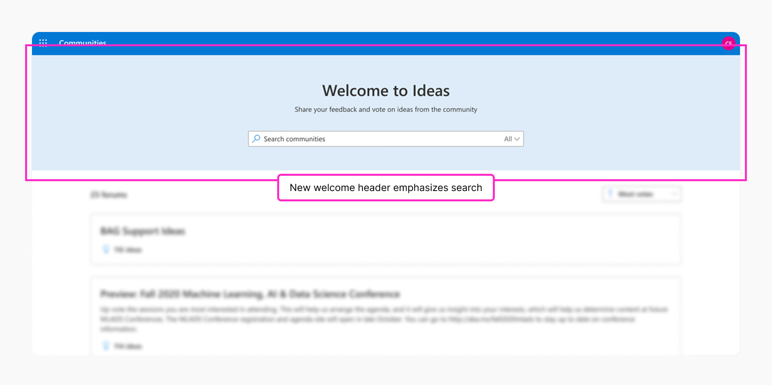
Result: This simple change dramatically increased visibility. Users immediately noticed the friendly welcome banner and enhanced emphasis on search, improving their impressions of the product and encouraging them to search for ideas. This led to a noticeable increase in search usage.
Sometimes making it bigger and bolder actually works!
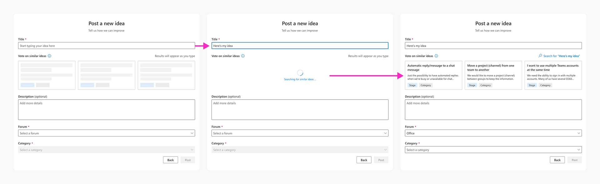
🗳️ Encouraging voting to reduce idea clutter
Problem: Users often submitted duplicate ideas rather than voting for existing ideas. This contributed to a buildup of clutter. While search somewhat alleviated this, I brainstormed other opportunities to drive attention to existing ideas.
Solution: I conceived a new submission page that surfaced related ideas as users typed. This was essentially a gentle nudge for them to vote or comment on similar ideas before creating a new one.
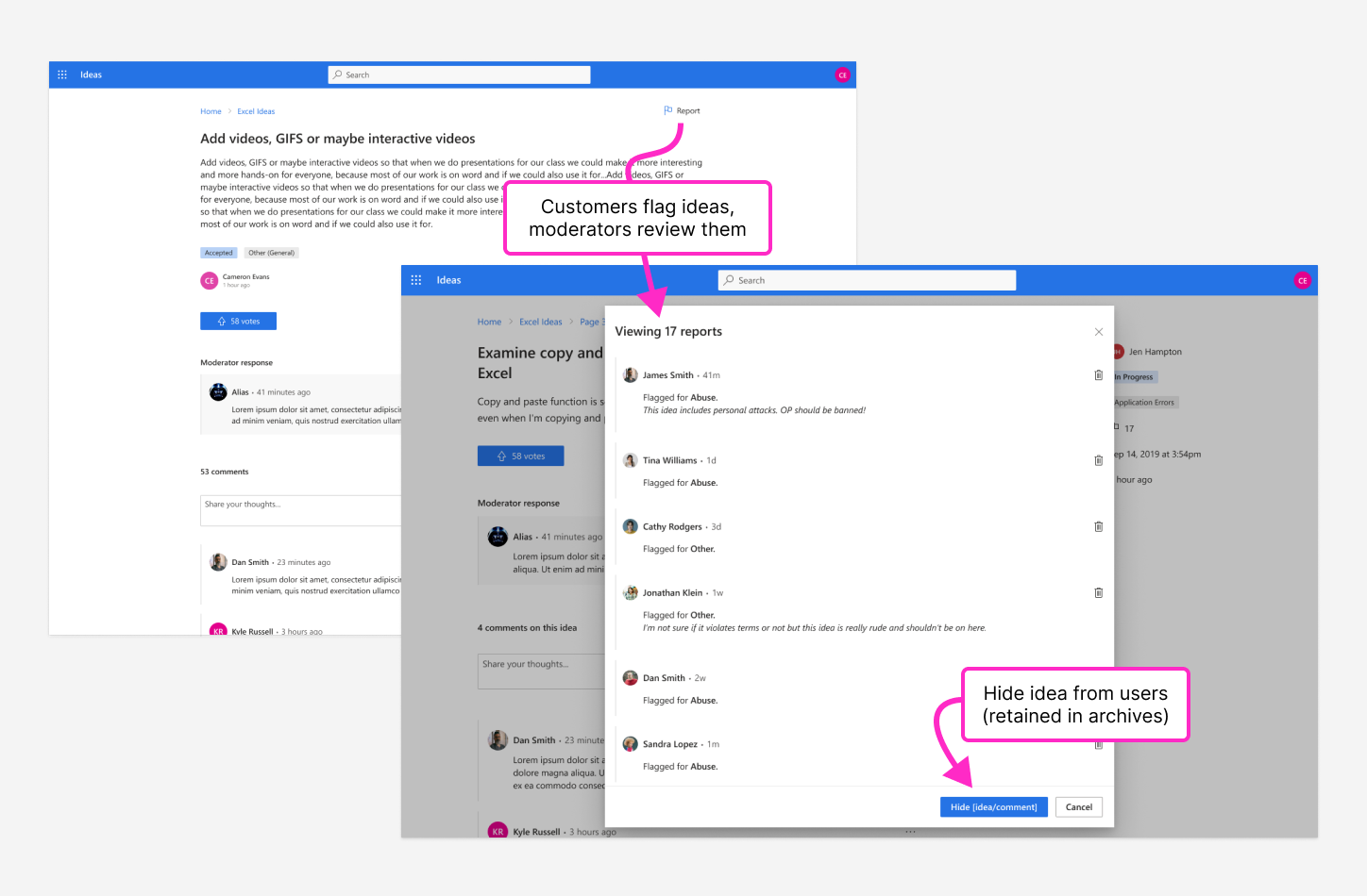
🛡️ Implementing moderation for safer communities
Problem: Because this was a public, consumer-driven experience, there was a risk of abuse and spam. Without moderation tools, admins would not be able to enforce a safe community.
Solution: I consulted with engineers on methods to mitigate problematic content. We ultimately agreed on a moderation system allowing users to flag posts for review. Flagged ideas were routed to the admin dashboard in Dynamics, where admins could then review and remove them if deemed necessary.
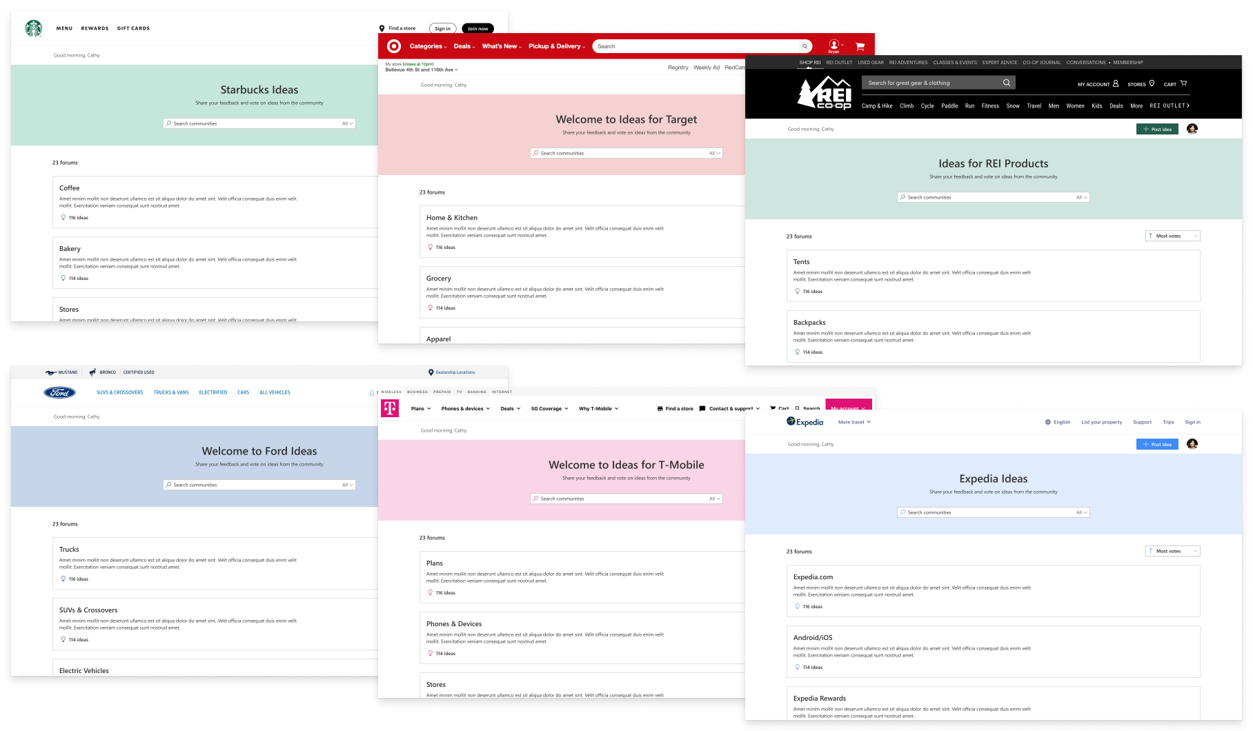
🎨 Designing for external brand customization
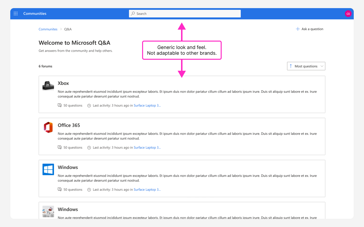
Problem: The Ideas Community used generic components and branding from Microsoft's Fluent design system. To be adopted by third-parties, the community needed to adapt to their website styles and brand guidelines, not Microsoft's.
Solution: I identified UI elements that could be made customizable through the admin portal. These included elements such as banners, forum images, and component colors. To ensure these patterns were scalable, I tested a variety of branded examples to see how components scaled across third-party visual identities.
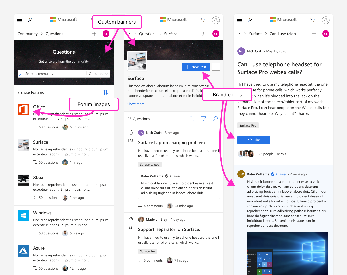
Mazda—because I recently bought a new hatchback.
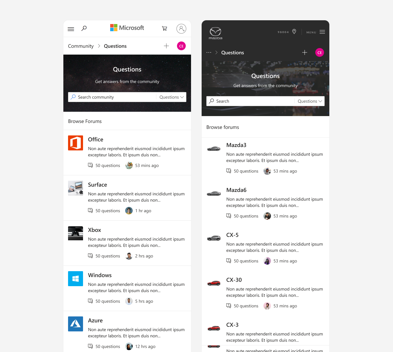
Various examples on desktop.

Public release & long-term impact
After completing MVP design and usability validation, I handed off a refined, scalable experience that the team continued to build upon after I left in early 2021.
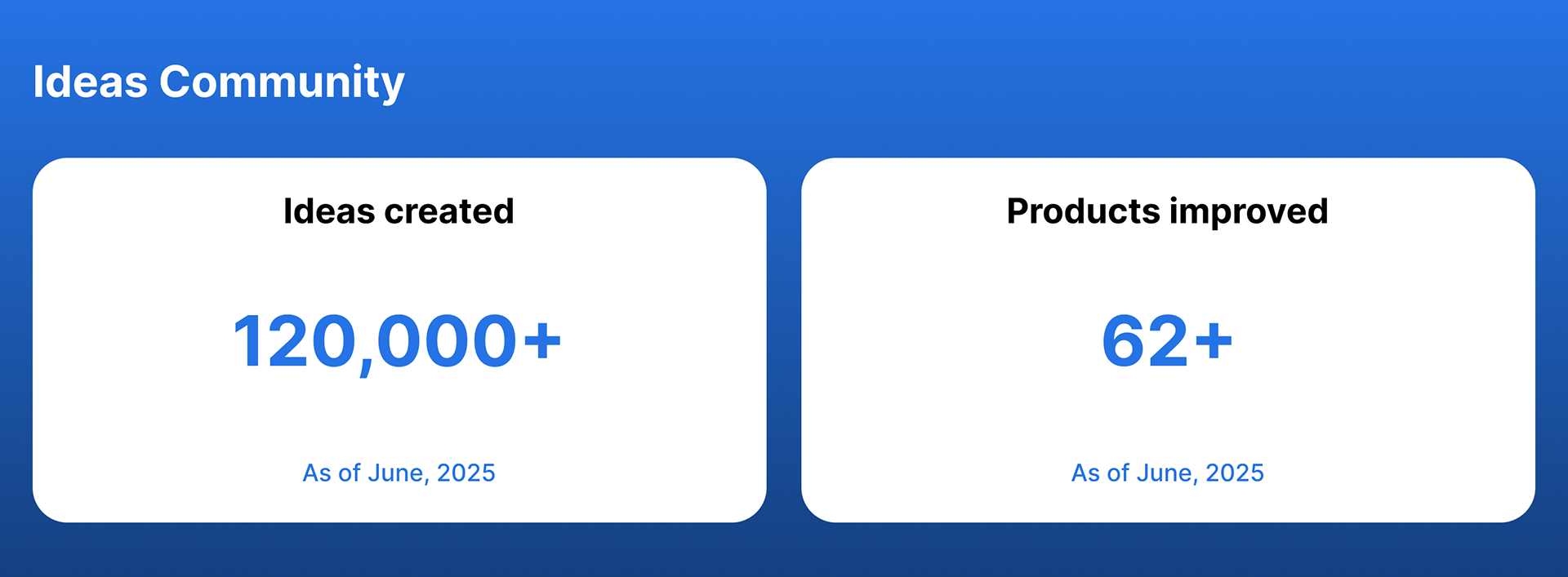
The Ideas Community platform is now used across Microsoft to collect and address feedback at scale. It supports some of the company’s most high-profile products including Teams, Xbox, Outlook, and Copilot.
What began as a basic idea submission tool is now a vital piece of Microsoft’s user engagement strategy, helping teams prioritize meaningful enhancements based on real customer input.
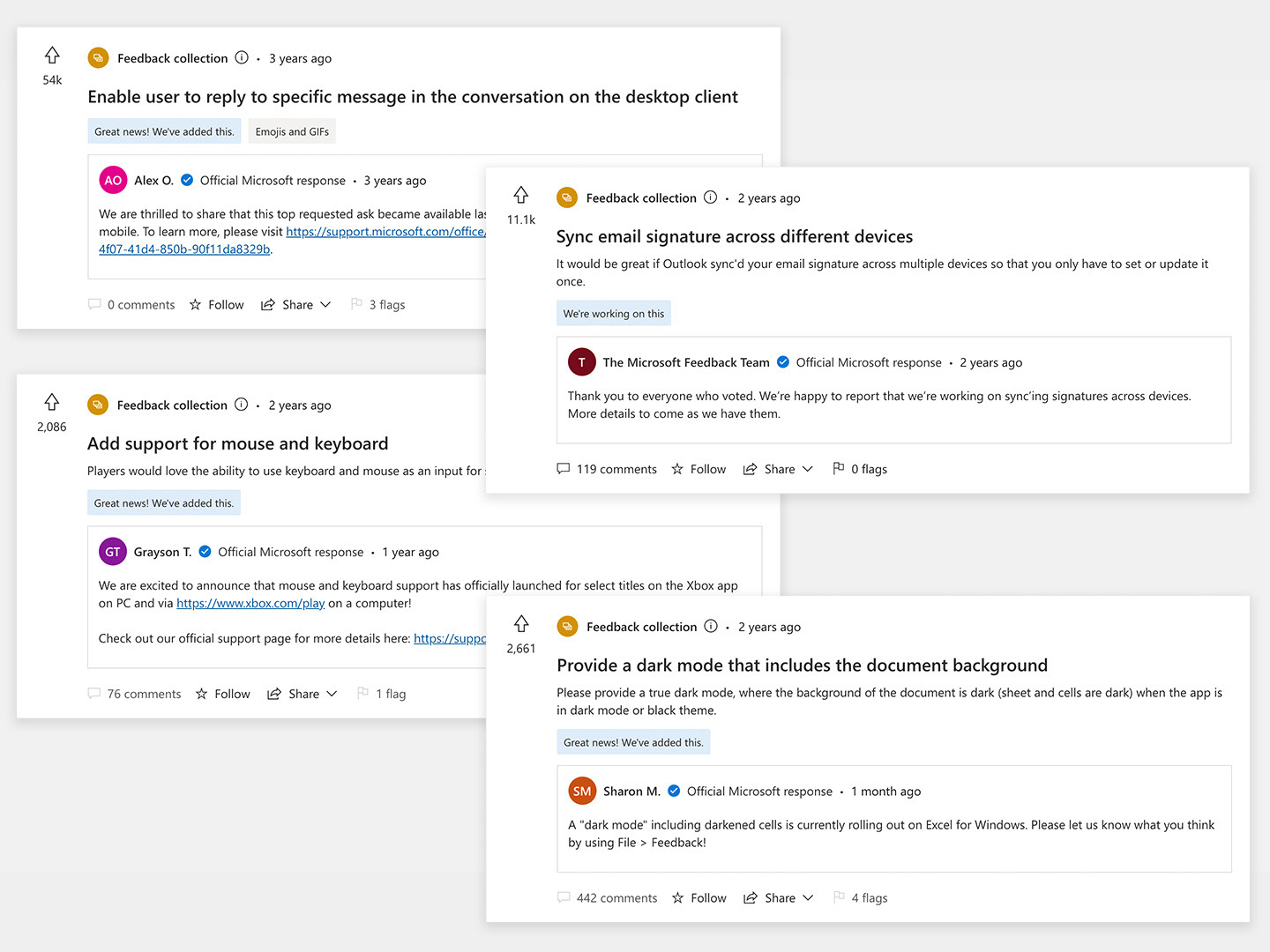
Examples of features shipped thanks to the Ideas Community.

What I learned
This project taught me the power of early, generative research. Partnering closely with UX researchers helped uncover unexpected user pain points and guided more effective, user-centered solutions.
I also deepened my understanding of accessibility, working toward AAA compliance—an unusually high bar that sharpened my attention to inclusive design.
Looking back, I recognize I was still growing as a strategic thinker. While I executed well, I could have more actively shaped strategy. For example, users complained that the UI looked dated. I agreed with this at the time, but I was concerned that creating a unique visual style would clash with our plans for a white-label, customizable UI. In retrospect, I don't believe these goals are mutually exclusive—I'm certain I could have crafted a beautiful product that was also scalable.