Every game, every goal, and every story in one app
Overhauled the National Lacrosse League’s mobile streaming app to improve game discoverability, unify the design across iOS and Android, and enable in-app purchases.
Highlights
– Conducted competitive audits and user analysis to identify pain points and align the experience with top-tier sports apps.
– Redesigned navigation, emphasizing discovery and engagement.
– Unified iOS/Android design using a scalable, platform-neutral system.
– Implemented in-app purchase flows, reducing friction and improving conversion.
– Official streaming app for 2017–2019 seasons.
Project details
Role
Sole product designer (UI/UX, design system, icons, components, motion design)
Platforms
iOS, Android
iOS, Android
Tools
Sketch, Photoshop, Illustrator, Principle, After Effects, pen & paper
Sketch, Photoshop, Illustrator, Principle, After Effects, pen & paper

How it all started
Our tiny startup was approached by the National Lacrosse League who asked us to build mobile apps that would allow their fans to watch full games. Due to tight resources and a short turnaround, we split responsibilities. I was tasked with designing the Android app, whereas our lead designer handled iOS. There was limited PM involvement, and both apps were developed by a remote team, which required us to manage both design and coordination.
But urgency required compromise. These apps were required on a very tight deadline so they'd be ready for the start of the season—just two weeks—forcing us to ship only the most basic features. Unsurprisingly, this rushed approach resulted in numerous usability issues.

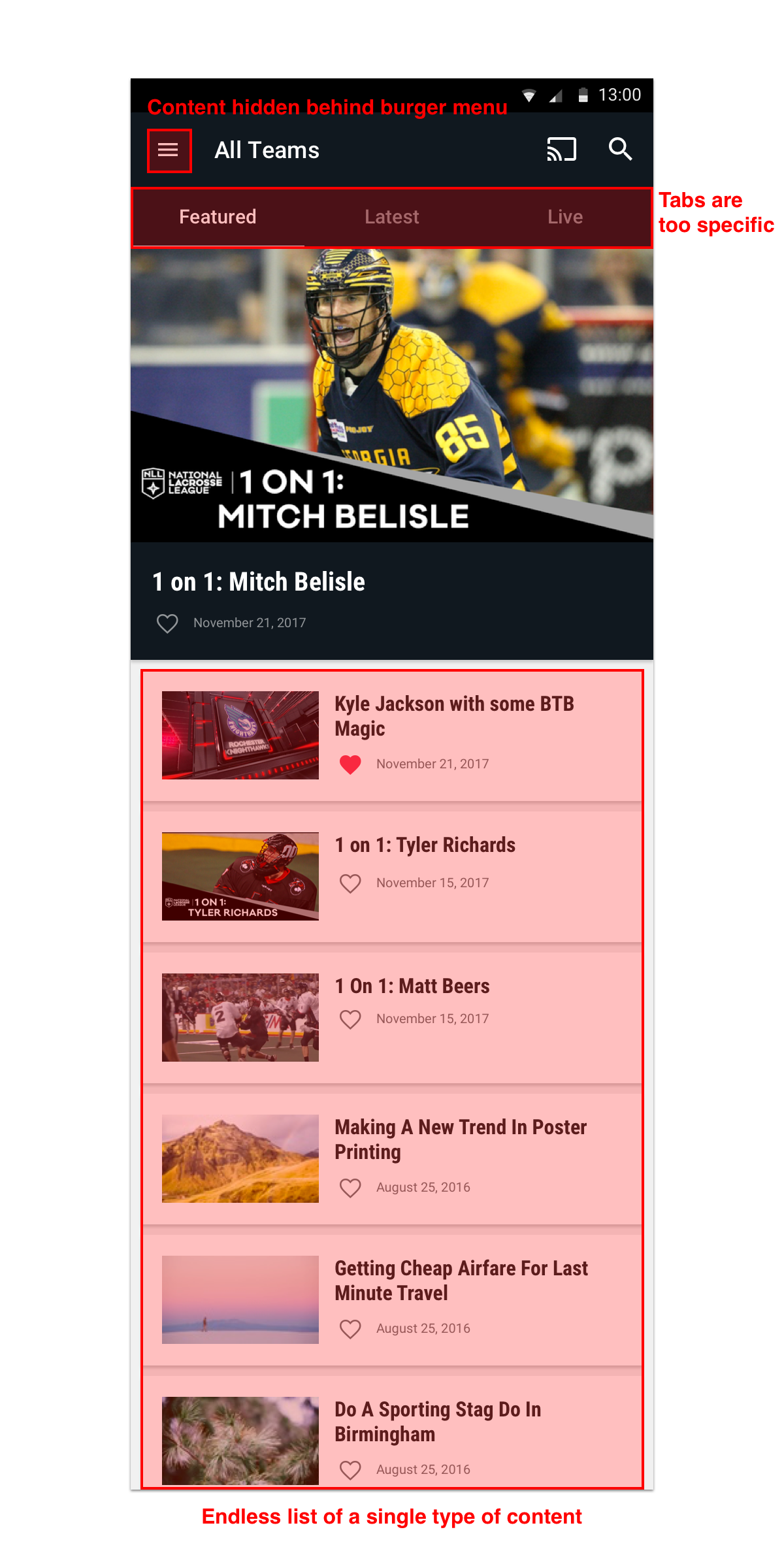
Problems uncovered during season one
To better understand our users' pain points, I analyzed end-of-season surveys and app store reviews, searching for any trends that emerged. Very quickly, I noticed several key areas for improvement.
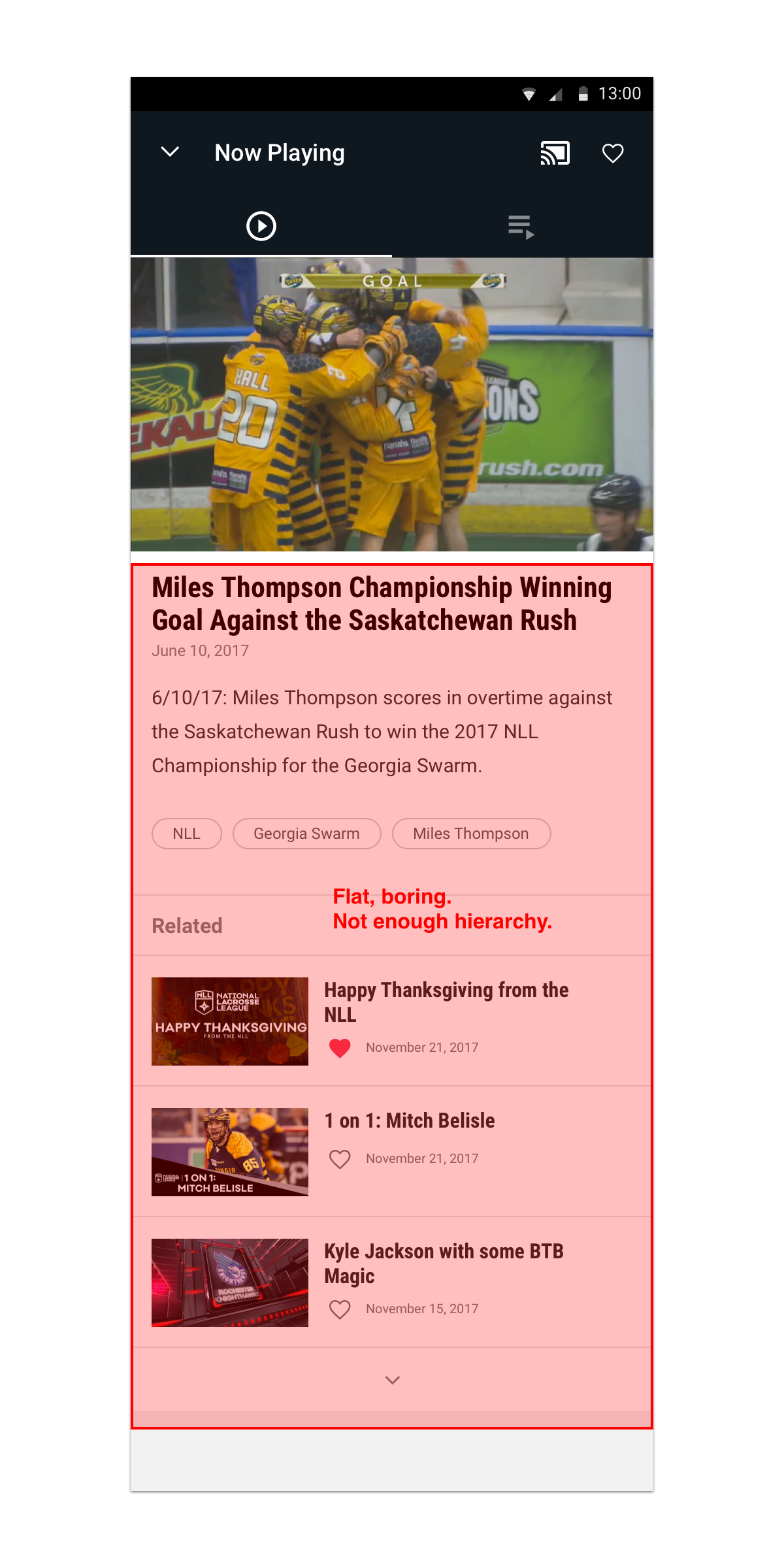
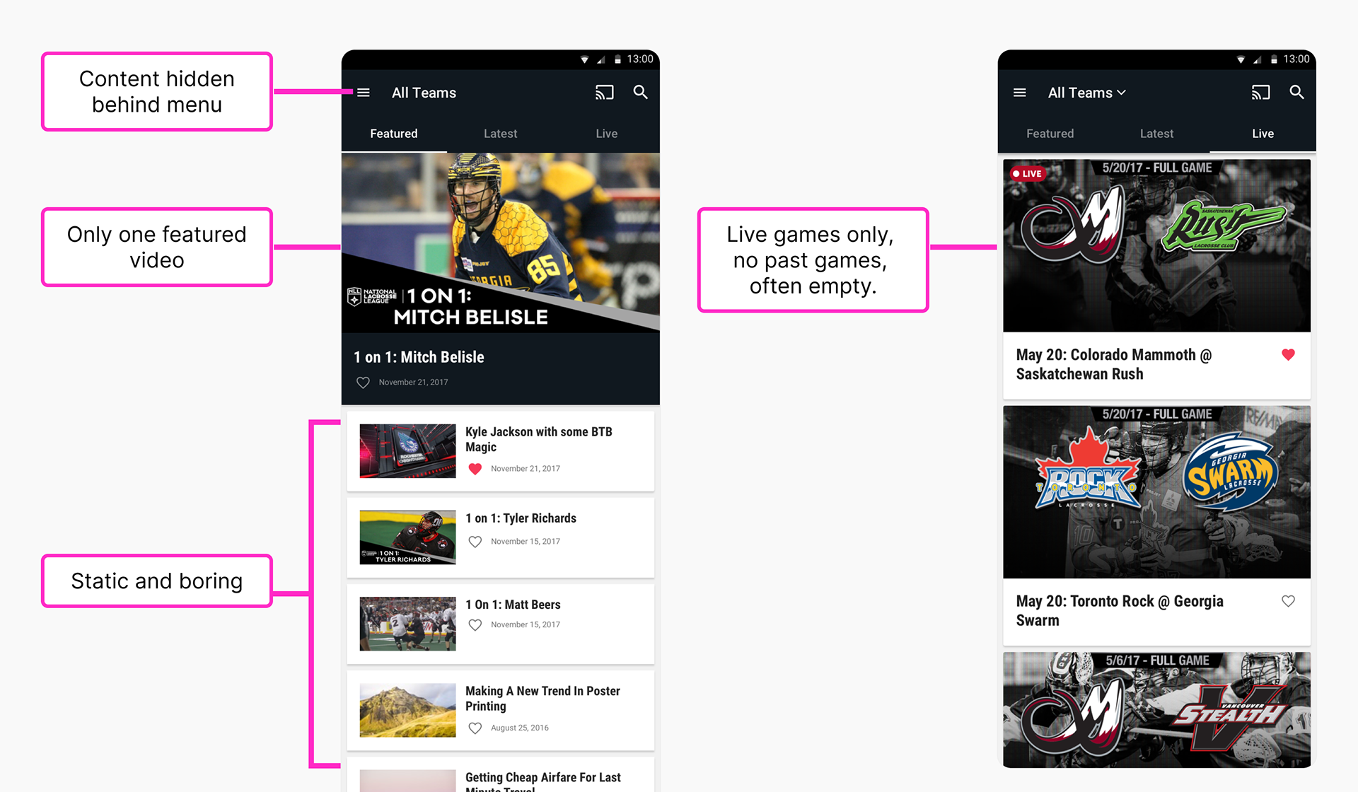
🥱 Static content
The primary Featured tab had to be manually updated by editors. This added unnecessary effort and hindered engagement with new and relevant content.
The primary Featured tab had to be manually updated by editors. This added unnecessary effort and hindered engagement with new and relevant content.
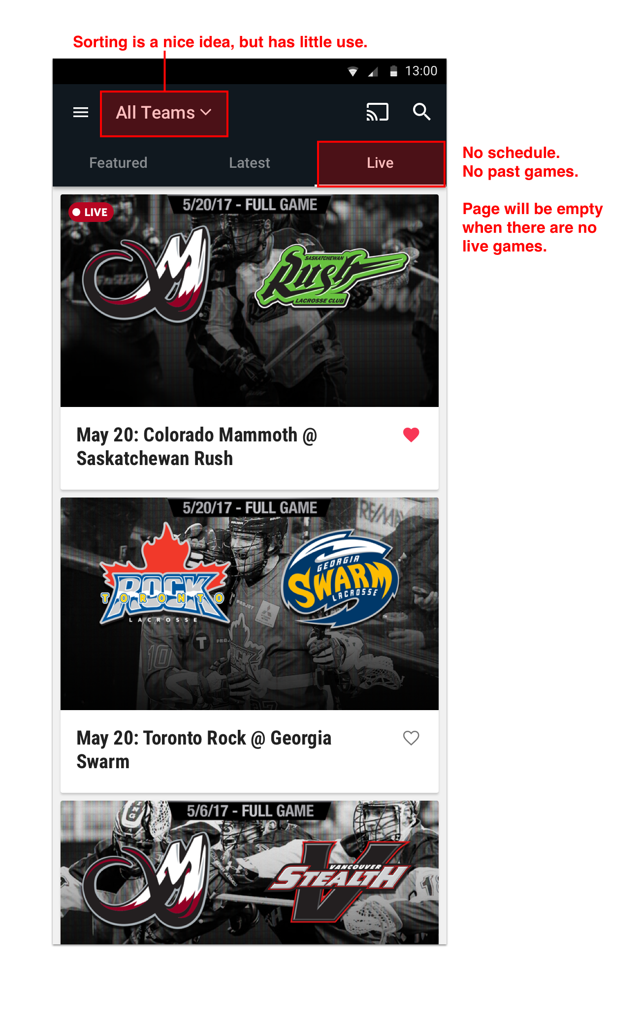
🕵🏻♂️ Hard to find games
Fans said it was difficult to find upcoming and past games.
Fans said it was difficult to find upcoming and past games.
💸 No way to pay
Payments could only be made via our website, forcing users to leave the app to purchase match passes and subscriptions.
Payments could only be made via our website, forcing users to leave the app to purchase match passes and subscriptions.
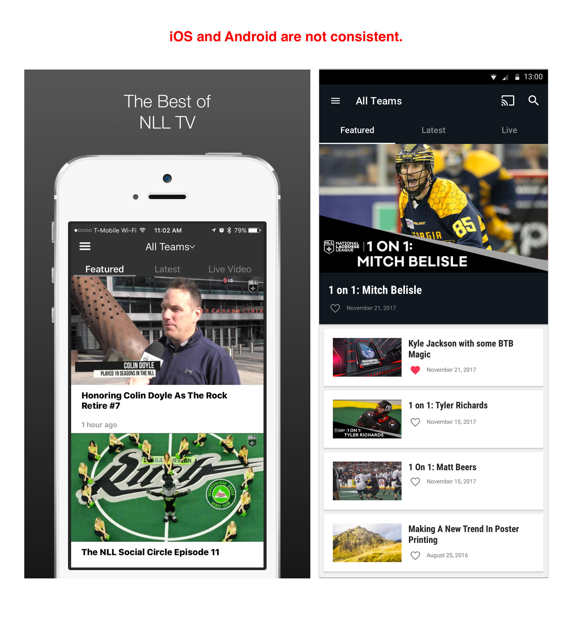
⛓️💥 Inconsistency
There was no shared design between iOS and Android, leading to an inconsistent experience across platforms and increasing development effort.
There was no shared design between iOS and Android, leading to an inconsistent experience across platforms and increasing development effort.
😓 Emotional impact
These flaws were a major source of frustration for fans who urged us to raise the bar for season two.

Season two: designing an experience on par with top leagues
I wanted to do justice to the many lacrosse fans who felt their league wasn't getting the attention it deserved. I started by conducting a thorough audit of top-tier sports apps—the NFL, NBA, NHL, Premier League, and MLS—analyzing their structure, navigation, and key features. Clear patterns emerged, such as tabbed navigation and dedicated sections for games, scores, news, and stats, which helped inform a more intuitive and competitive redesign.
Goals
🧭 Improve discoverability
Make it easier to discover live games and other video content, thus increasing user satisfaction and engagement.
Make it easier to discover live games and other video content, thus increasing user satisfaction and engagement.
🥍 Personalize the experience
Allow fans to engage more deeply with their favorite teams.
Allow fans to engage more deeply with their favorite teams.
💵 Subscribe in-app
Allow users to purchase subscriptions and match passes without leaving the mobile app.
Allow users to purchase subscriptions and match passes without leaving the mobile app.
❤️🩹 Unify the design
Establish a consistent design and implement NLL's identity across iOS and Android.
Establish a consistent design and implement NLL's identity across iOS and Android.
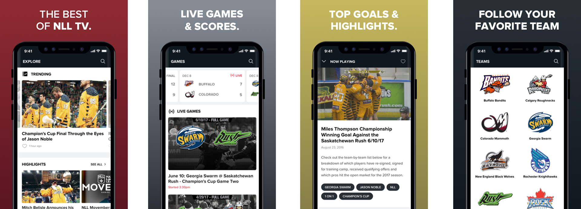
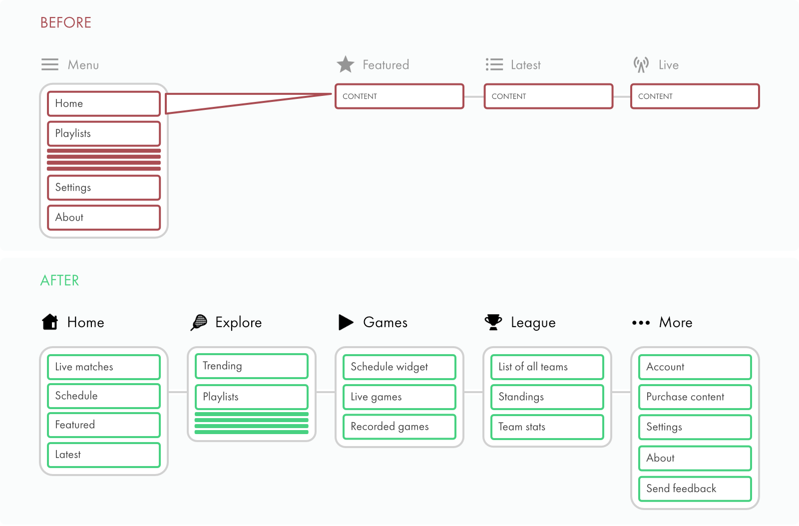
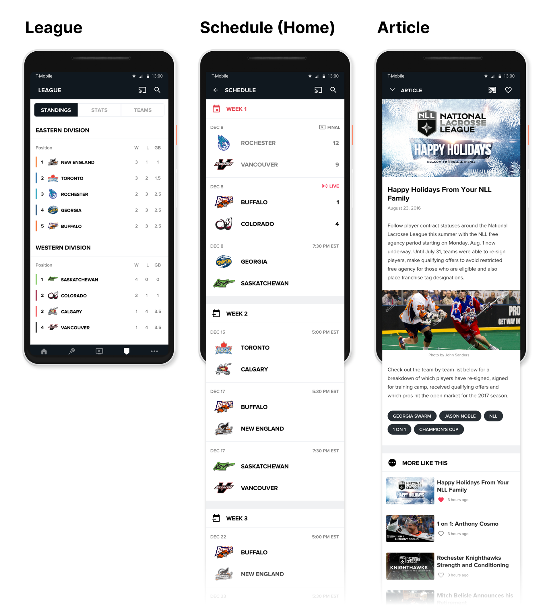
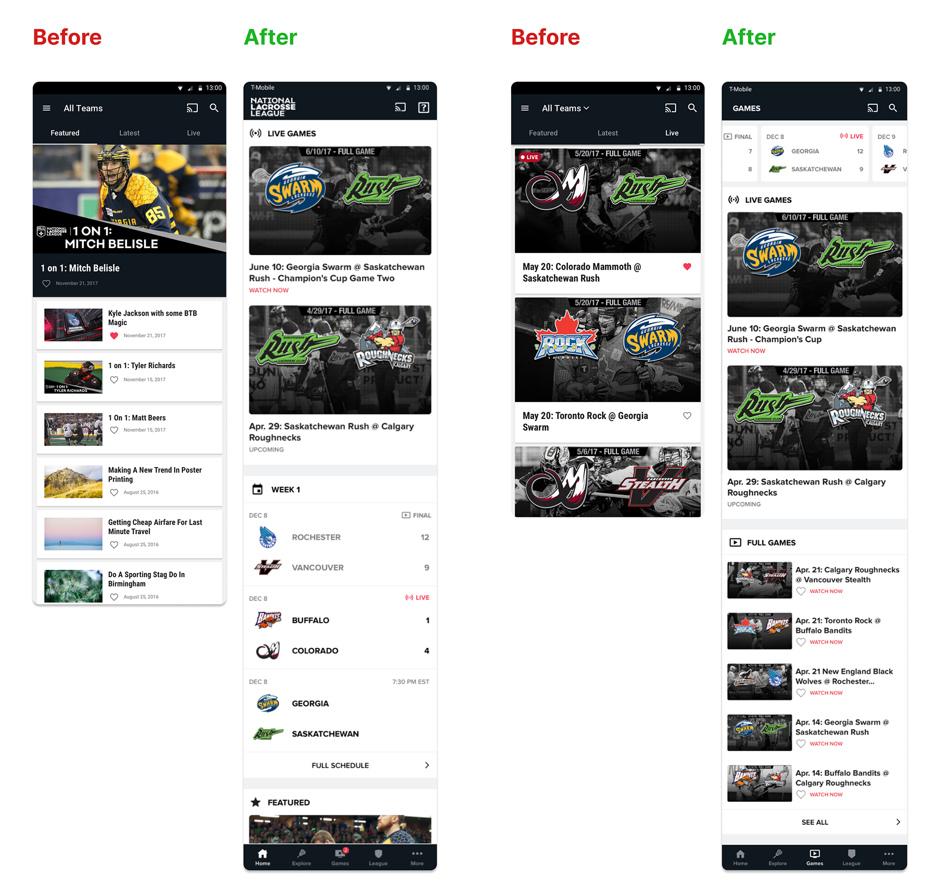
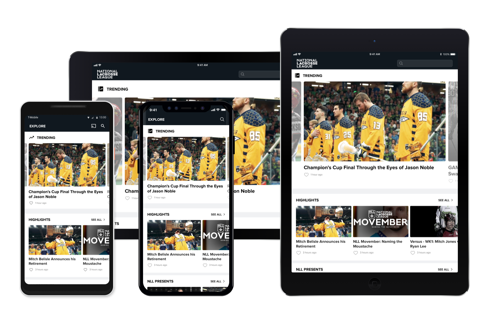
🧭 Making content more discoverable
Problem: Fans complained that it was difficult to find engaging content. The home page was static, past games didn't have a clear destination, and the Live page was frequently devoid of content.
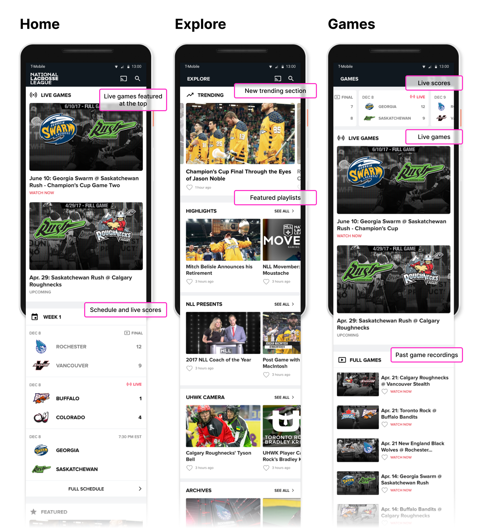
Solution: I updated the navigation to make it easier to find relevant videos, flattening the hierarchy and switching from a hamburger menu to bottom tabs so users could more easily discover content. After extensive brainstorming with my product team, I also introduced new sections for live and upcoming games, trending content, and a league tab containing standings and stats. Our hope was that these new section would provide exciting and dynamic ways for fans to discover and watch new content.
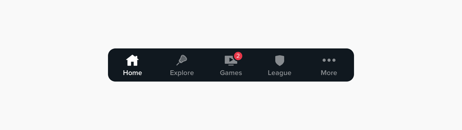
Updated bottom navigation
Result: This overhaul dramatically improved content discoverability and user satisfaction. Fans praised the streamlined structure. App reviews highlighted the ease of finding relevant content, bringing the experience in line with expectations for a modern, professional sports app.
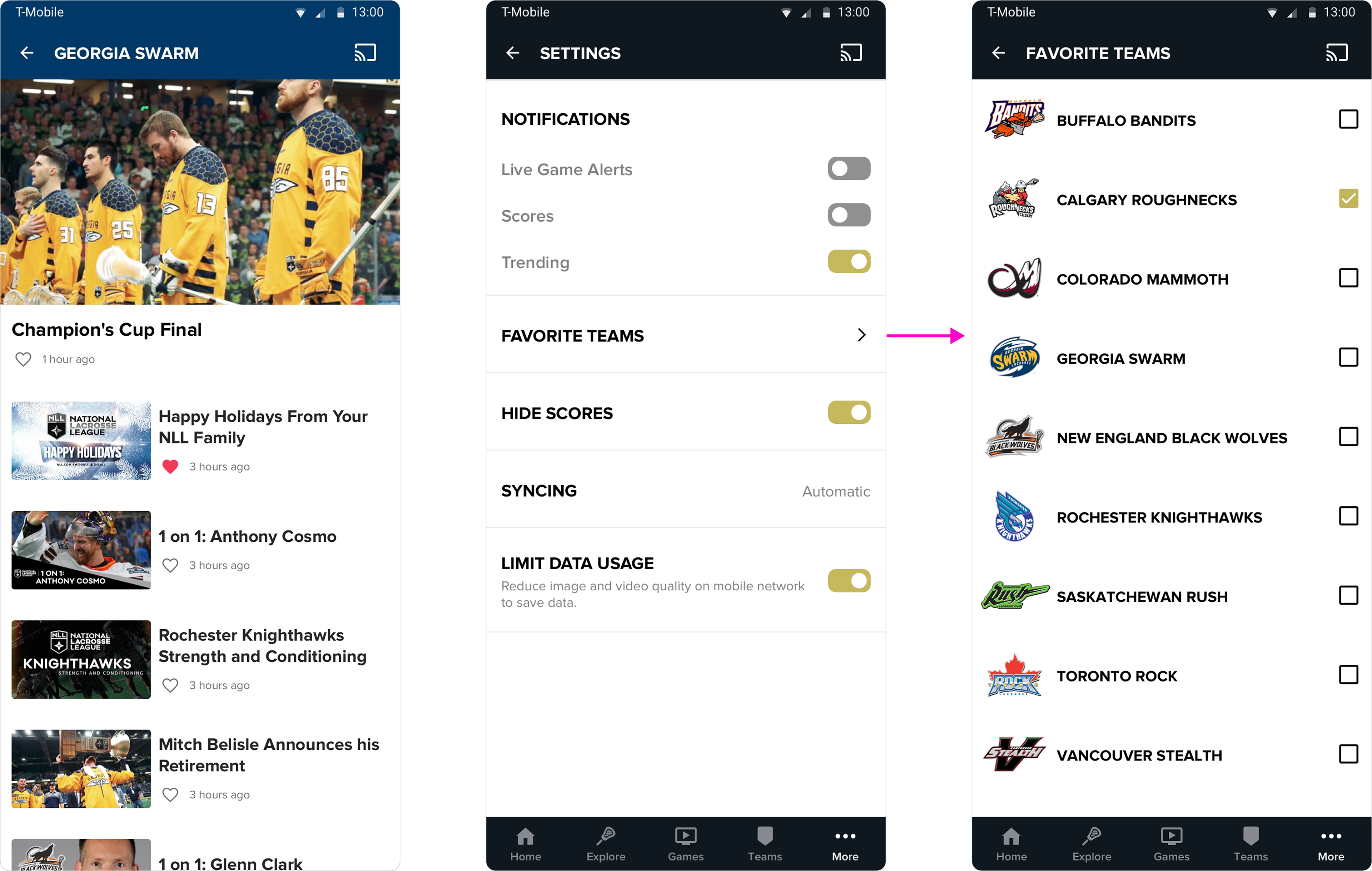
🥍 Personalizing the experience for dedicated fans
Problem: Fans struggled to follow their favorite team due to content overload and a lack of personalization.
Solution: To make the experience a little more unique, I introduced team preferences, prioritized related content and alerts, and created custom hub pages with themed colors to help users feel more connected to their teams.
Result: Fans found it easier to stay updated, and the themed hubs helped reinforce team loyalty within the app experience.
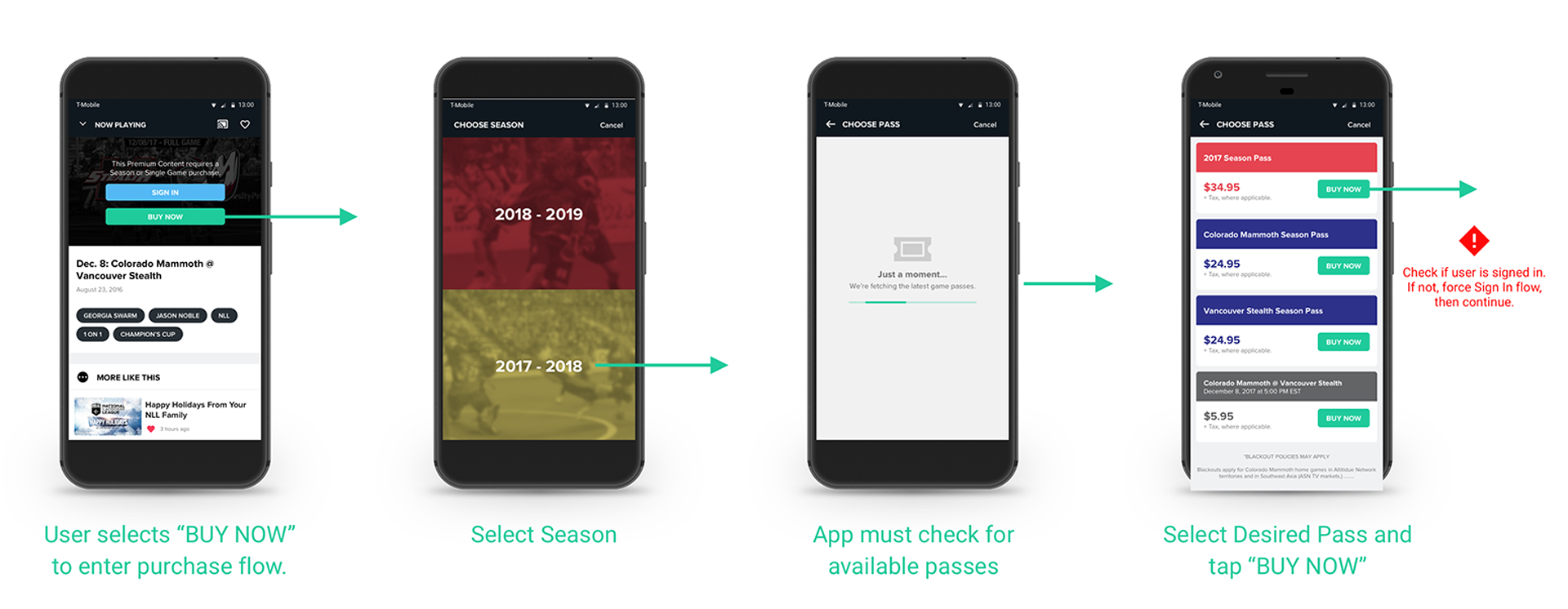
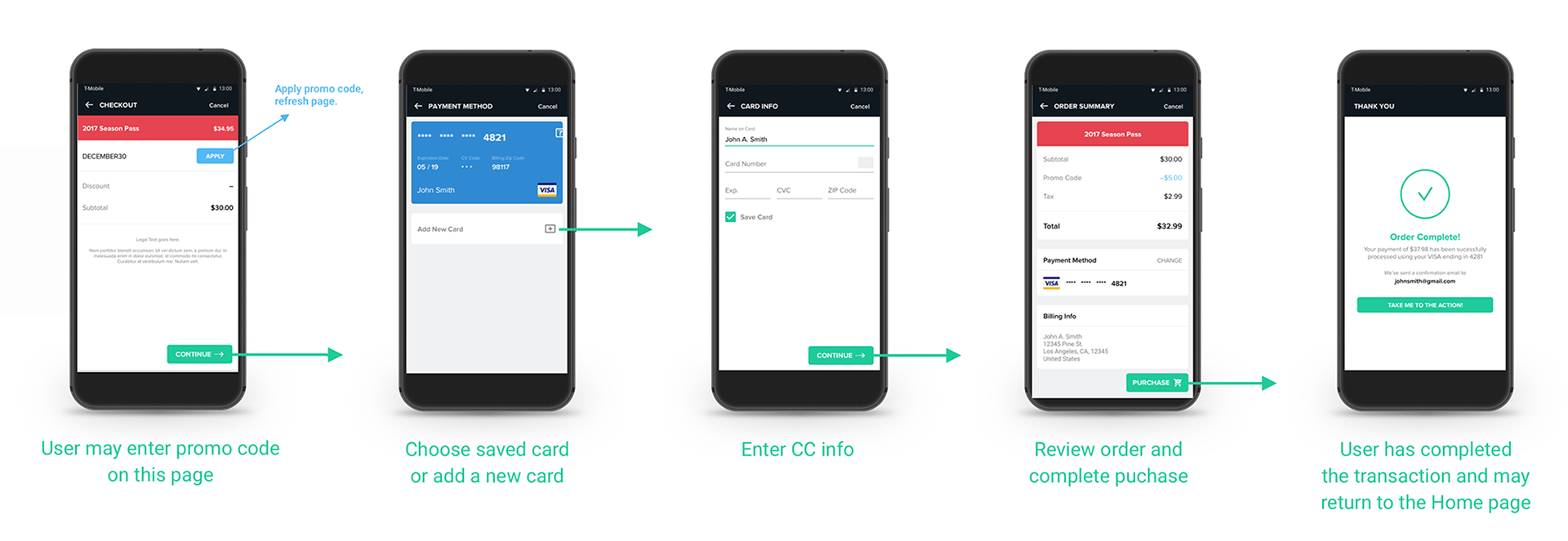
💸 Subscribe in-app to watch every game
Problem: In season one, users could only purchase subscriptions through our website, forcing them to leave the app and redirect back. This added friction to the experience and led to high drop-off rates.
Solution: For season two, we aimed to improve conversion by introducing in-app purchases, meeting users where they already were. This was a crash course learning experience for me, having never designed a checkout flow before. I researched countless e-commerce apps to build familiarity with industry patterns. Ultimately, I streamlined the mobile purchase flow, minimizing taps and optimizing keyboard interactions to keep key actions visible and accessible throughout the process.
Result: The new flow reduced friction, allowing users to subscribe directly within the mobile experience. While we didn’t have access to full conversion metrics, early feedback highlighted the ease and convenience of the new process, helping improve the overall value and accessibility of the app.

Unified design philosophy
Problem: The original iOS and Android apps were built separately due to resource constraints, leading to inconsistent user experiences and doubled engineering effort.
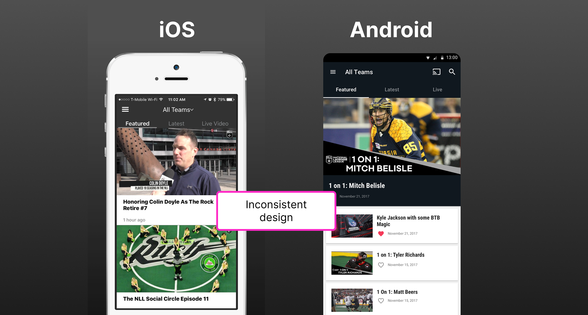
Solution: I created a unified, platform-neutral design system, blending elements from Material Design and Apple’s human interface guidelines, ensuring consistency and compliance across both platforms. Next, I layered in NLL’s branding, creating a strong yet platform-neutral design system.
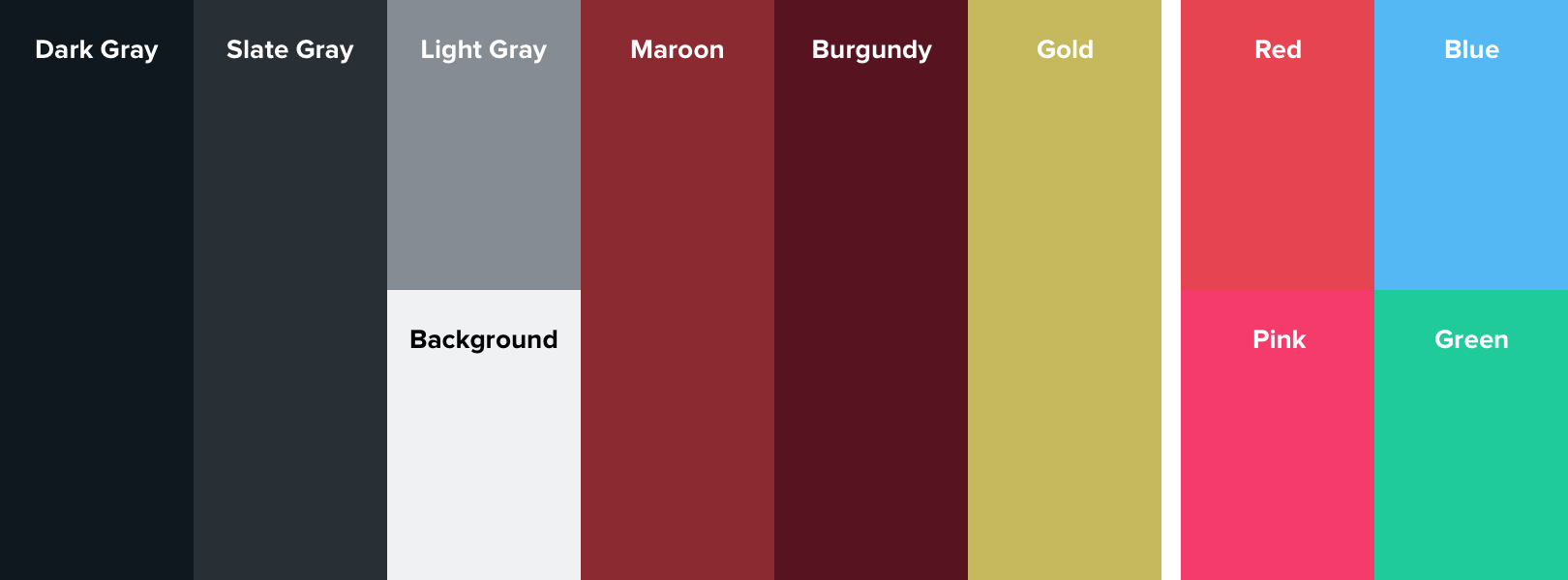
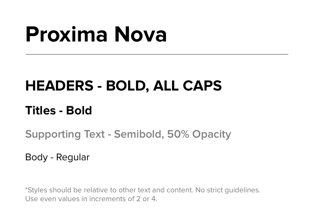
Result: The new design system created a seamless and cohesive user experience across iOS and Android at all screen sizes. It reduced implementation effort, improved design clarity, and helped elevate the app to meet the expectations of professional sports leagues.
Organic animations
In addition to the design systems, I designed slick and delightful animations in Principle/After Effects, adding polish and personality to the app experience.


Kicking off another (final) season
The redesigned app launched on iOS and Android for the 2018–2019 season, serving as the league’s official streaming platform. Feedback from fans and stakeholders was overwhelmingly positive, with consistent praise for improved game discovery, streamlined navigation, and seamless subscription flows. The app successfully positioned NLL alongside top-tier sports leagues in terms of digital experience.
Our deal with the NLL expired following the second season, after which we hung up our boots and retired the app.


What I learned
This is the longest project I've worked on, spanning roughly two years. It was rewarding having the freedom to identify user issues, prioritize them, and work closely with engineers to implement polished solutions without hard deadlines.
That being said, there are a few things I could have done better. Onboarding was one aspect of the experience I planned to account for, but it was never prioritized. We also discussed conducting proper user research and A/B testing. If I worked on this project again, I'd take a leadership mentality and strongly advocate for both.