Scan a QR code to connect and collaborate on Zoom.
Problem
Colleagues meeting face-to-face desire an easy solution to connect on Zoom and start chatting. Competing products such as WhatsApp allow users to connect by scanning a QR code, but the only solution on Zoom is to send a contact request via email. This process is slow and requires disclosing one's email address.
Goals
– Provide a personal QR code to every Zoom user that's easily accessible.
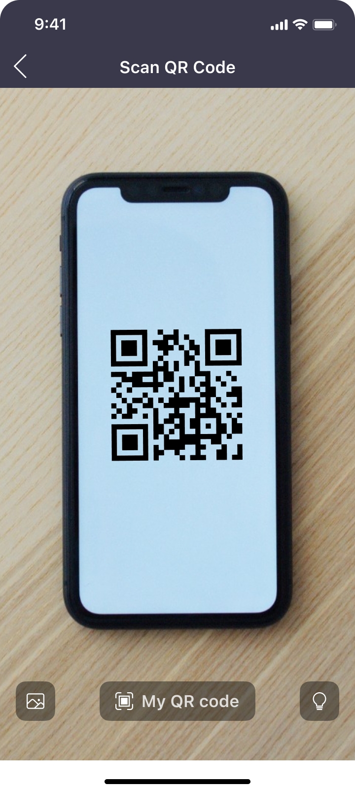
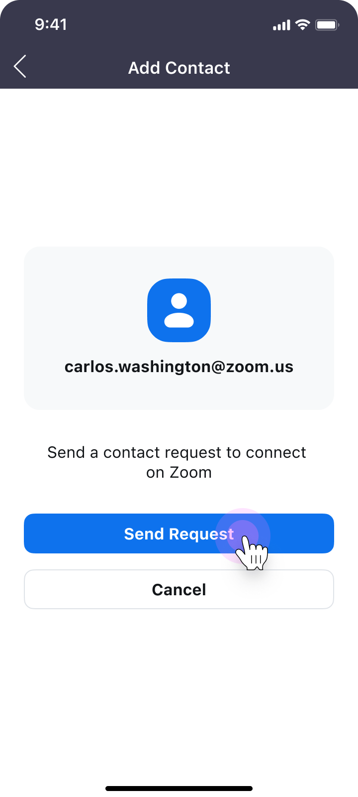
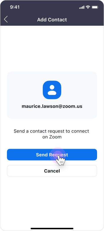
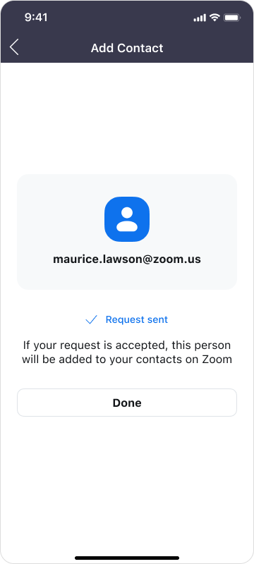
– Allow users to scan a QR code from their camera or the Zoom app to send a contact request.
– Let users download and share their QR code through other apps.
– For security, let users reset their personal QR code at any time.
– Allow users to scan a QR code from their camera or the Zoom app to send a contact request.
– Let users download and share their QR code through other apps.
– For security, let users reset their personal QR code at any time.
MVP designs
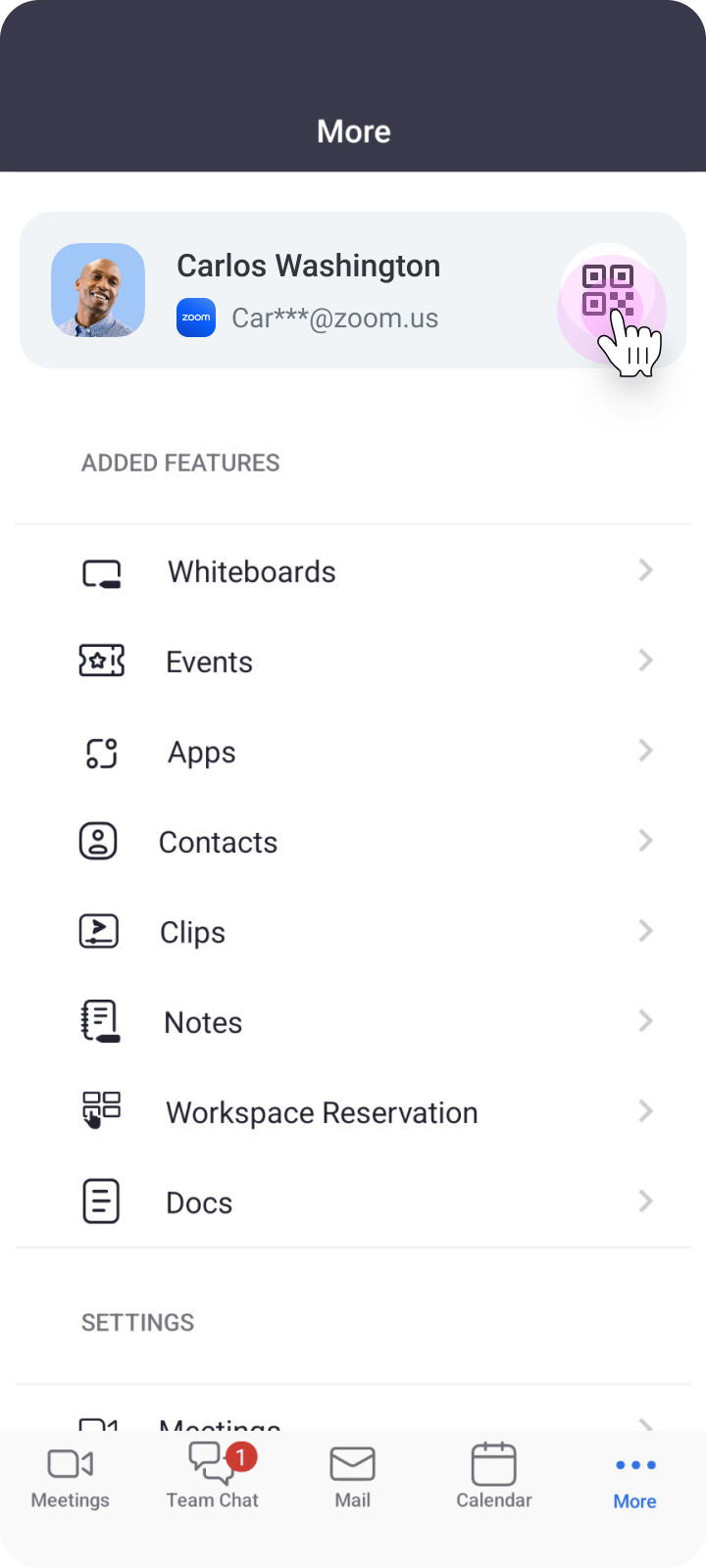
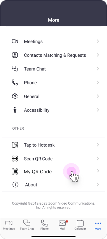
As this was an urgent request, I moved quickly to produce MVP designs built on the existing QR code scanner for Zoom Rooms. A new entry point for "My QR Code" was added under the More page. Tabs were added to the scanner, allowing easy switching between Scan and My QR Code.
Show and share QR code
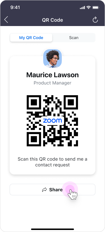
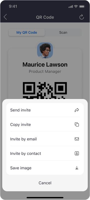
Scan and send contact request

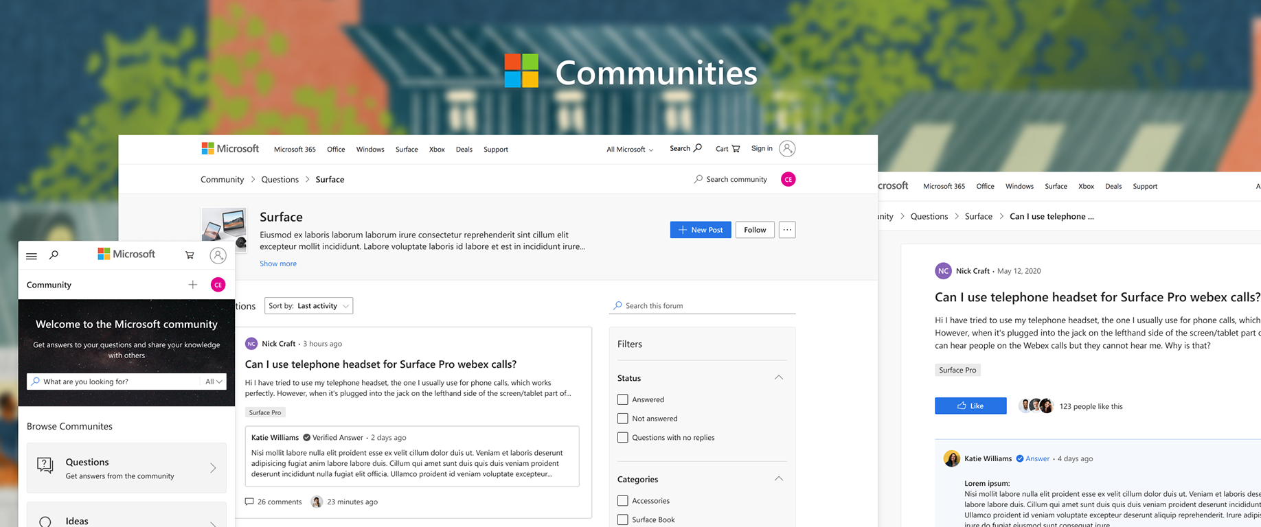
All entry points
There are multiple paths to add contacts in Zoom. The QR code had to be worked into all paths.
Learnings and final designs
I took the MVP designs through multiple reviews at Zoom, then quickly addressed the feedback I received:
The entry point for "My QR code" was difficult to find below the fold, and users confused it with the "Scan QR Code" action.
I moved the entry point for "My QR Code" to the user profile card at the top of the screen where it was easier to find. I also changed the page to a bottom sheet to simplify navigation.
I moved the entry point for "My QR Code" to the user profile card at the top of the screen where it was easier to find. I also changed the page to a bottom sheet to simplify navigation.
The tab switcher was hard to use with one hand.
This was changed to a single button and moved to the bottom of the screen where it was easier to tap.
This was changed to a single button and moved to the bottom of the screen where it was easier to tap.
The "My QR Code" view was cluttered with too much UI.
Unnecessary UI was eliminated to emphasize the most important information. Reset was changed to an explicit text button and placed next to Share.
Unnecessary UI was eliminated to emphasize the most important information. Reset was changed to an explicit text button and placed next to Share.
